eBay Adds Quick View Add To Cart Button To Search Results, Bypassing Listing Pages
eBay is testing new ways to streamline the purchase process, adding an Add To Cart Button in search results that opens a Quick View window, allowing buyers to skip the listing page.
eBay first introduced the Quick View pop up in stores in early 2023 and then also tested adding it to search later in the year.

But the previous iteration in search required the buyer to hover over the main image and click on magnifying glass to pop up the Quick View module.
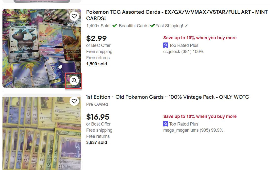
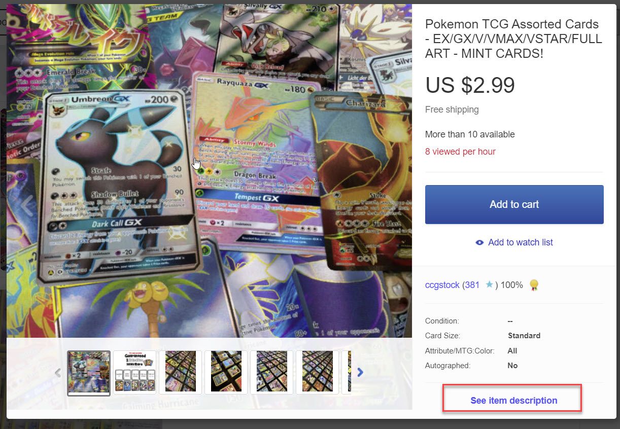
That design wasn't very obvious to buyers and was easily missed if you didn't happen to hover over the image thumbnail, but eBay's latest version is not subtle at all with a big "Add To Cart" button added to every item returned in search results.
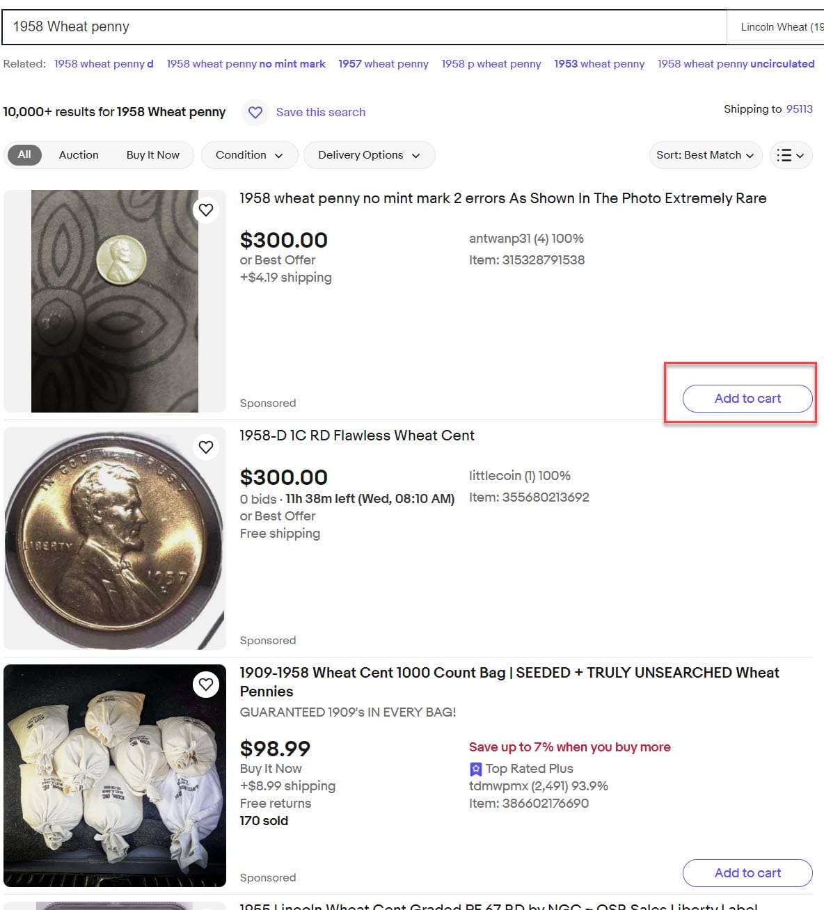
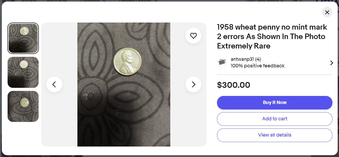
If a buyer clicks the Add To Cart button, it pops up the Quick View window showing the title, images, and the option to Buy It Now, Add To Cart, or View All Details.
Sellers have been critical of eBay's various attempts to make it easier for buyers to complete a transaction without ever actually visiting the listing page, worrying that buyers will miss crucial seller-provided description details and that may lead to increased return requests and negative feedback.
This is particularly concerning for sellers because Not As Described claims count against their seller metrics and if they are rated "very high" eBay will charge them an additional 6% penalty fee on top of the regular final value fees.
But inserting the Quick View into search through an Add To Cart button like this could also risk irritating buyers as the typical user would likely expect Add To Cart to actually mean Add To Cart, not pop up another window which requires at least one more click to really Add To Cart.
What do you think of eBay's Add To Cart button in search? Let us know in the comments below!


