eBay Evo: Does New Modern, Simple Design Still Deliver Experience Users Need?
eBay is rolling out a new simplified, modernized brand design system aimed at attracting younger shoppers, but does eBay Evo still deliver on critical functionality that longtime buyers and sellers need from the platform?
Evo, short for evolution, is being touted as a complete overhaul of eBay's global brand experience, touching every corner of the site to "foster a delightful discovery experience for eBay enthusiasts."
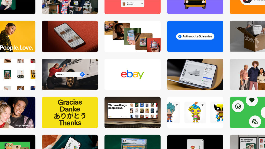
The launch of eBay Evo marks a significant milestone, representing years of dedicated in-house work to deliver a cohesive story across our global experiences while allowing flexibility to adapt for local markets and audience relevance...
...The ongoing evolution of eBay through the Evo initiative aims to keep the platform innovative and relevant to the needs of its users. This includes a continuous cycle of learning, product development, and enhancement to foster a delightful discovery experience for eBay enthusiasts globally.
eBay's approach with Evo is to humanize and simplify interactions, making the platform more engaging and accessible to a broad audience...
...This initiative has culminated in the creation of the eBay Playbook, a comprehensive guide designed to empower our internal teams and agency partners with over 280 pages of guidance, more than 2,700 images and videos, and interactive tools for color selection, type testing, iconography, and accessibility.
Our strategy ensures consistency across our universe of touchpoints, enhances the shopping experience with a feeling of love and discovery, and puts our customers at the center of the eBay story. Our new brand strategy comes to life within a new creative platform: Things.People.Love.
The Evo Playbook is a visual smorgasbord showcasing eBay's design vision from colors, fonts, icons, and buttons to photography, graphics, "voice and tone", and of course, generative AI.

Generative AI may seem like an odd thing to include in this list, if the aim of Evo is really to "humanize and simplify interactions" on the site - as of course it lacks the "human" element of that statement.
Unfortunately, in many cases it also lacks the "simplify" part of the goal as well - especially with image recognition and AI search functionality that far too often returns wildly irrelevant and unhelpful results.

The section on illustrations shows how eBay is using artwork created by Mason London, designed to "express authentic connection and relatability."
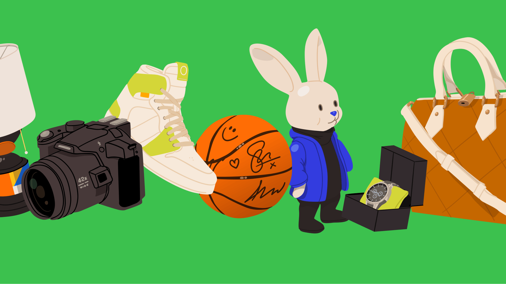
That style may appeal to some of eBay's target demographics, but it also caught some longtime users off guard as being "off-brand" when it first started appearing randomly in various places across the site.

Is it just me, or does this graphic look incredibly off-brand for eBay? Saw this when I was looking at another seller's store and visited their Sale tab. It's eBay's graphic, not the seller's.
So weird
I saw this for the first time this morning. I agree it is weird. I will always have sale items to ensure my buyers do not have to look at that!
Under the "Design System" heading in the Evo Playbook, we can see that a lot of the tweaks and changes sellers have been seeing in recent months can be directly traced back to this initiative.
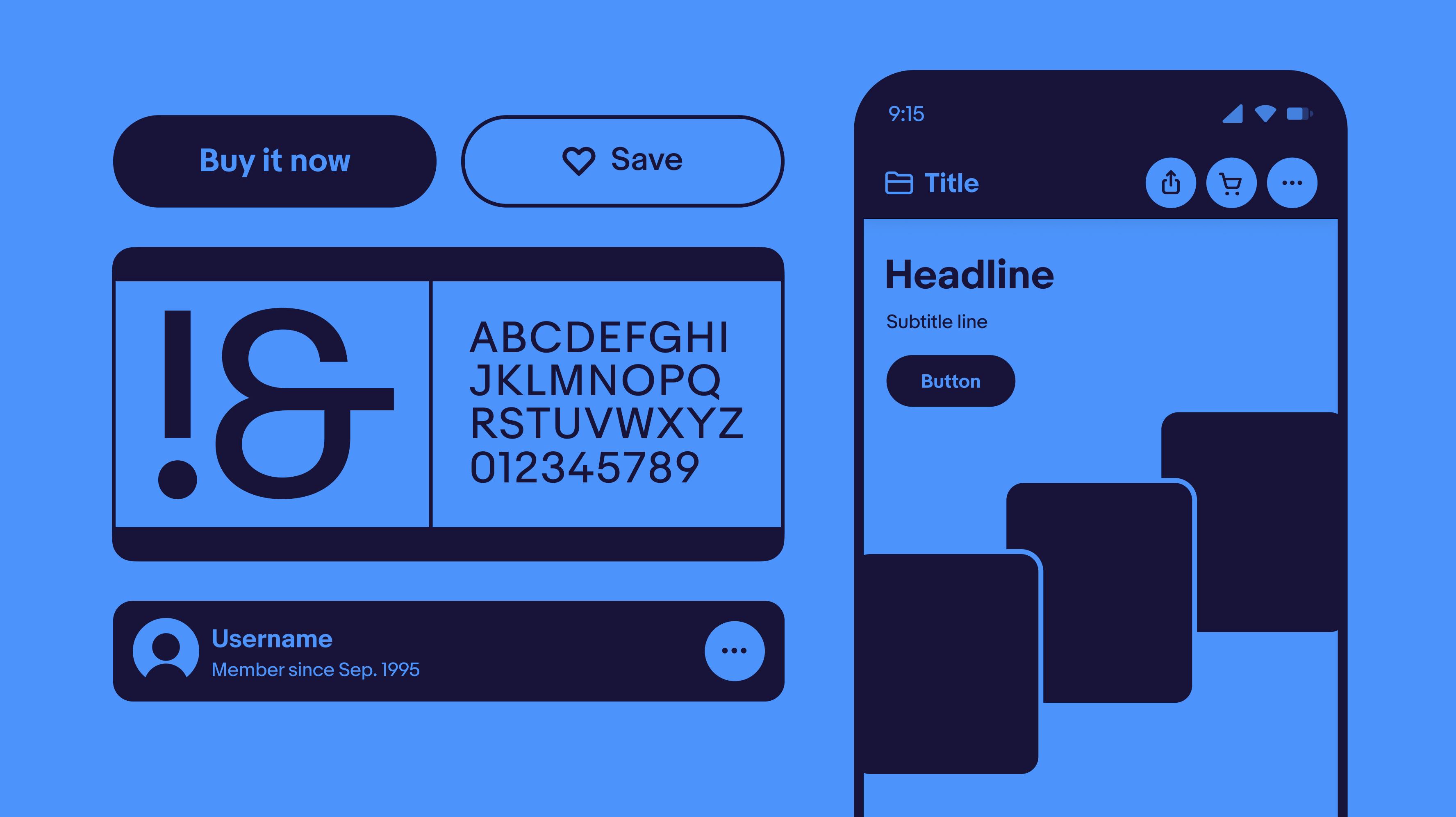
eBay defines "patterns" as "reusable solutions to common user problems" and this section includes things like form building, file uploads, and bulk editing - all of which have been in play with recent changes to various aspects of the Seller Hub that have caused technical glitches and user frustration as additional clicks and effort definitely do not make using these pages more simple.

The Components section reveals Evo is also responsible for things like buttons, badges, carousels, filters, pop ups, search bars, tabs, toggles and more!

That also includes another sore point for sellers with graphs and visualizations - including the recent changes to the Promoted Listings ad dashboard and traffic reporting that many sellers say are less transparent, more difficult to read/understand, and missing critical data that the previous reports used to show.
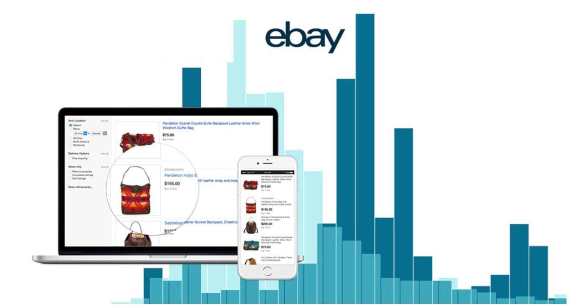
And the pièce de résistance? eBay Evo also touts the "new" view item page design as a shining example of their new, modern, simplified design - with a mockup that does not include any of the many distracting ads you'll find filling the page, if you're brave enough to test the actual user experience with ad blockers turned off.
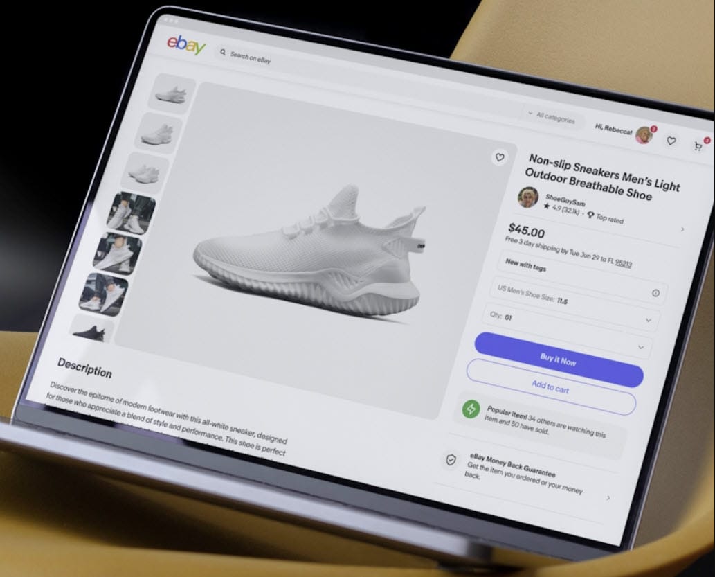
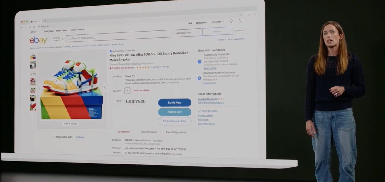
VP Buyer Experience Blair Ethington tried to pull the same charade during her presentation at this year's eBay Open and at the time, I thought it was very telling (and very disingenuous) that the screenshot shown on the screen while she was talking about the new item page were completely absent any ads.
Here's what Blair showed:
And here's what an average listing page actually looks like with a competitor banner Promoted Display Store ad at the top, at least one row of Promoted "Similar" items, and a scrolling carousel with at least 12 more sponsored competitor ads all showing before you even get to the seller provided description (ads highlighted in pink.)
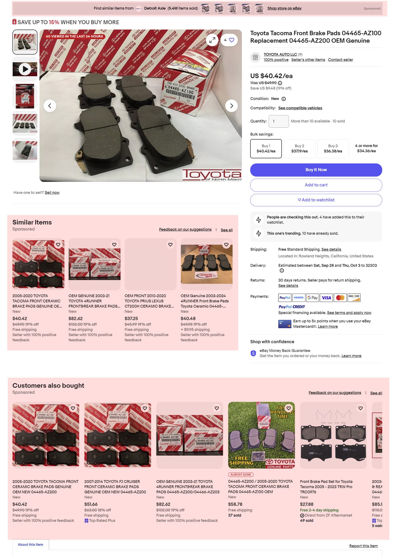
And it gets even worse than that - if you keep scrolling past the description, you may find 300+ additional ads depending on how many modules eBay has placed on the page and whether they have engaged the "infinite scroll" option to keep showing more.
How is that cluttered and confusing mish mash of competing items a more simplified experience, exactly?
When eBay first announced they were undertaking this new design for the view item page, they explicitly promised sellers that it would "bring critical information like Item specifics and seller description higher up on the page before any modules that show other items & ads" - but they reneged on that promise and while they have said they still plan to do it at some unspecified time in the future, sellers are not holding their breath.
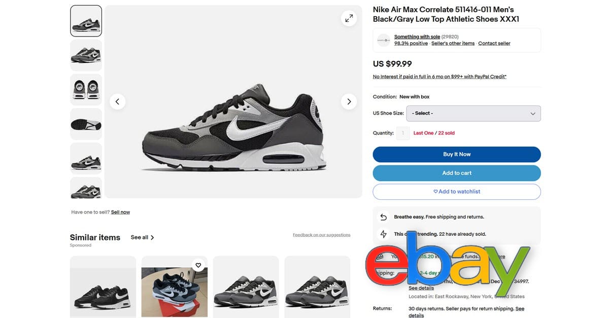
Ultimately, much of eBay Evo is relatively harmless tinkering, like giving boxes round corners instead of sharp angles.
But even those minor things have opportunity costs in the fact that resources were devoted to this project rather than the myriad glitches and lingering tech debt that needs to be addressed, neglected tools and functionality that has been pushed to the back burner like Stores and newsletters or personalization for custom made items, or years old feature requests that could actually make the user experience more efficient for both buyers and sellers.
There's almost nothing most sellers hate more than eBay making unannounced changes to business-critical functions - especially when those changes create more clicks/work in the name of "simplification" and even more especially when those changes are made during the Q4 holiday selling season.
What do you think of eBay's Evo design evolution? Let us know in the comments below!


