eBay Hides Listing Descriptions Behind Show More Button
UPDATE 4-18-23
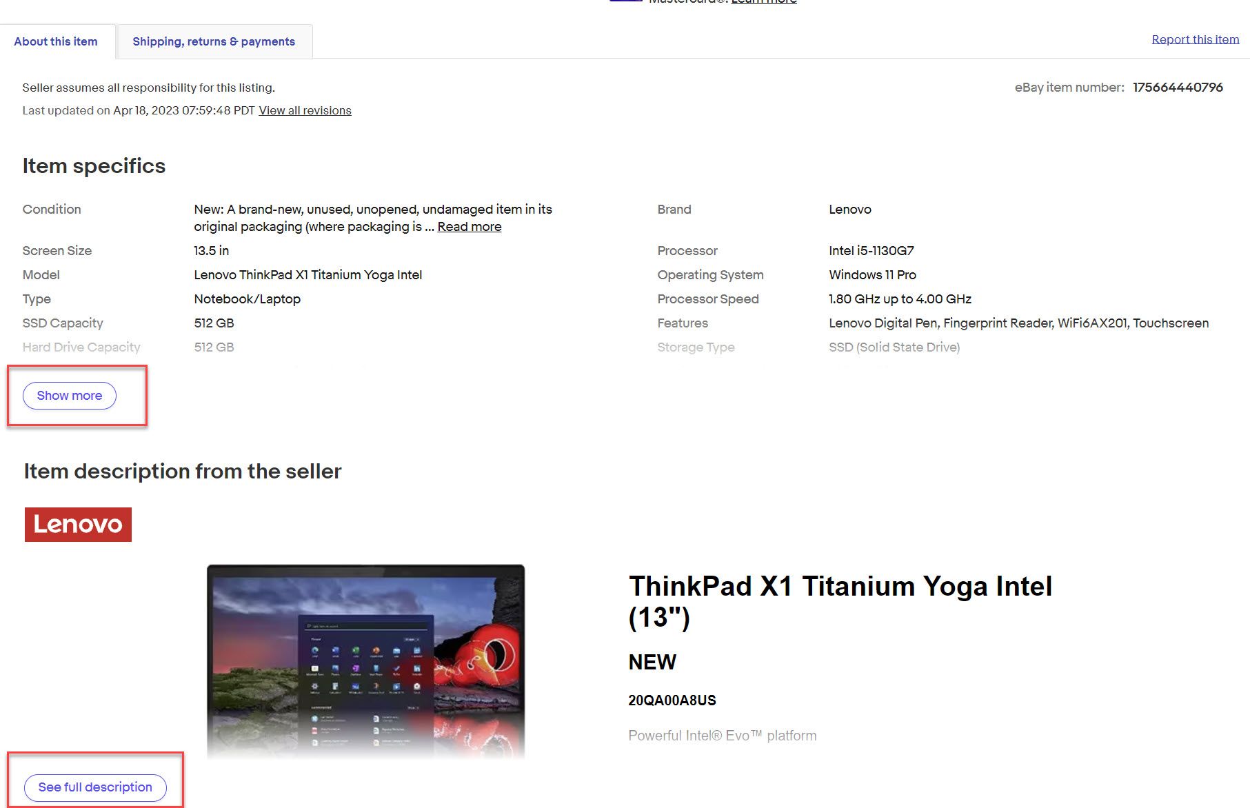
eBay is now displaying a "show more" button for item specifics and a "see full description" button for the description, hiding even more critical seller provided information.
UPDATE 3-20-23
The "show more" button is also being tested on eBay.UK, causing similar concerns and frustrations for UK sellers as well.

One seller brought up an interesting point about eBay's disclaimer that puts all responsibility for the listing on the seller.
I wonder how ebay could justify Significantly Not As Described refunds if the description details are hidden. Expecting sellers to refund if it is evident the buyer hasn't read the description in these new circumstances would be completely unreasonsable, even for ebay.
Another voiced concerns that this design choice could increase Item Not As Described claims which count against Seller Metrics and put sellers at risk for paying additional "penalty" fees.
Can someone remind me please. Are INAD returns part of Service Metrics, where if a seller gets too many they have to pay extra FVFs?
Selling Collectables, or trying to, amongst the ruins of the market-place left by the removal of most of the categories, I can see ebays point.
With the combination of new categories and IS, most listings are never going to sell anyway. Many probably won't even get viewed unless stumbled upon by accident. So not much chance of any FVFs for ebay. In such a situation doesn't it make perfect sense to hide descriptions that probably won't be read and make use of the space for raising money another way?
Perhaps if enough sellers beg, for long enough, ebay might be persuaded to show the full description again, for a fee perhaps.
Ebay isn't a selling site any more, deriving its income mostly from fees based on sales. It's an up-front fee generating site. Far less risky and more rewarding for ebay to collect fees that aren't related to sales in any way. It's about all it can be these days, having spent years making it increasingly difficult for sellers to sell anything.
eBay is once again making unannounced changes to sellers' listing pages, this time truncating important seller-provided description information with a "show more" button to view the full description.

Seems eBay is hiding descriptions again and making buyers click a 'Show More' button to see it. Can anyone explain what the benefit of hiding the seller's description might be? We just go through the effort of making that so they don't see it? It's already bad enough that so many people don't read anyway.
They experimented with this before and I thought it resulted in problems.

note the "show more" and the lighter line at the bottom (not enough coffee to figure out what to call it)
this is on a pc, not mobile........ What now?
It appears this may be a test at this point - I'm personally seeing it when viewing listing in FireFox but not on the same listings in Chrome.
Here's what it looks like - if you're a brand that has invested in custom templates with banners and images, you're not going to be happy about what eBay has done here.
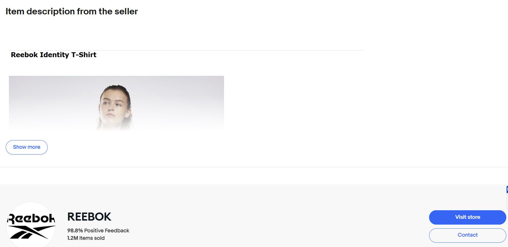
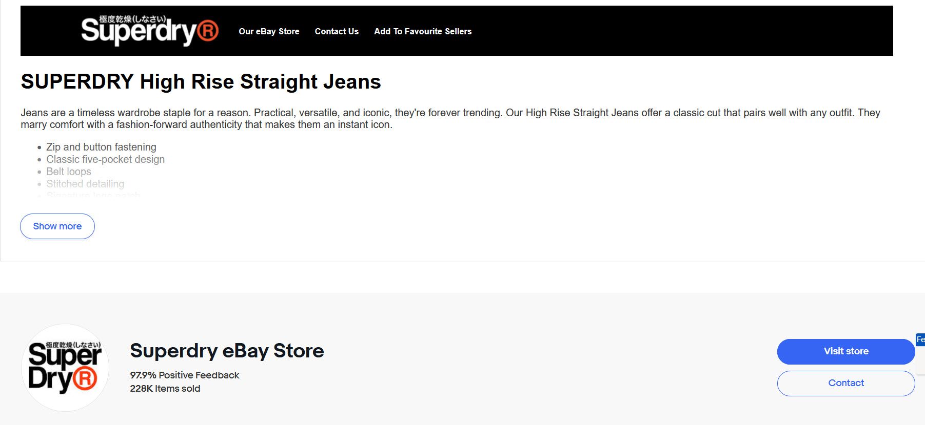
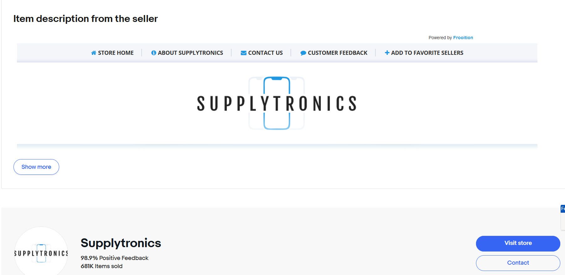
But it's not just listings with custom templates and images, even listings with just text will find their descriptions cut off at a certain point - of course eBay has not yet bothered to tell sellers exactly where that point is.
You can see how eBay starts to make the text fade to transparent after a certain length. If this description had gone on for another line, it likely would have had a "show more" button added.
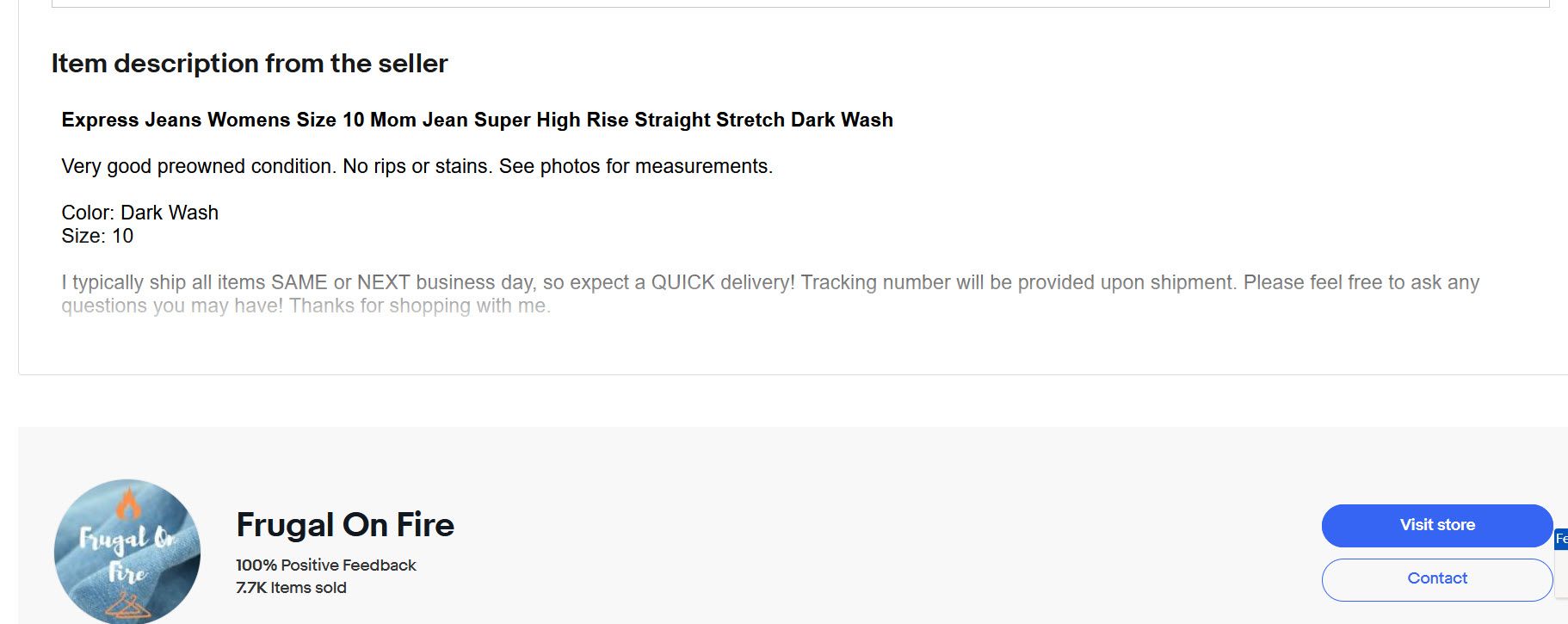
If this looks and sounds familiar, you might remember eBay has tried this tactic in the past under ex-CEO Devin Wenig's leadership - and sellers did not like it.
A few excerpts from eBay community posts on the topic from 2017-2018:

The "See full item description" button is one of the worst ideas eBay has ever implemented. I am a top rated seller and have been ever since the program was introduced. Part of what makes me a top rated seller is my big, beautiful pictures and my complete descriptions of what is included and what the condition of the item is.
Now all of that is hidden and prospective buyers need to click another button to see the full description. I would be willing to bet that that button does not get clicked by over half the people that view the listing and that most of those that do not click it either do not see it or have no idea what it is for. I would also not be at all surprised if eBay sees a sharp increase in the number of item not as received cases because you are hiding the seller’s description of that item from prospective buyers.
Let’s just put it in terms that management should be paying attention to: more item not as described cases means more man hours devoted to resolving these cases which in turn leads to more labor cost for eBay. Further, an increased number of item not as received cases leads to an increased number of buyers who had a bad experience on eBay and are therefore less likely to return to eBay.
Less traffic leads to fewer bids which leads to lower final sales prices which leads to lower revenue for eBay from final value fees. So by hiding seller’s descriptions of the item they are selling from prospective buyers eBay is effectively raising the company's overall operating cost while lowering overall revenue.
One of worst ideas ever to make someone click for item details and description. They tried this in 2015 and it was a disaster and they recinded this. Bad for buyers and and even worse for sellers, and will vastly increase bad buying experiences and people leaving EBAY, which is not good for anybody including EBAY stockholders and employees.
We could even take it one step further and say that they are breaking an agreement with the sellers by changing the description of a item. eBay instructs us to give a complete and full description of a item or customers can request refunds if it does not match, but the short description above the Full Description button has been clipped and mangled from radom sections of our description and there is no way it would match your product. If a customer says the item does not match the description eBay rearranged and retyped then they are responsible for the refund not the seller.
As both a buyer and a seller...this is horrendous. It will definitely slow down or make me loose interest in my buying that is for certain...
I have to agree that this will have a chilling effect on my listing sales. If I can't be certain buyers are seeing critical details of a used item, it just sets me up as a seller to have requests for item returns, disputes, and unhappy customers.

I cannot stand it......are they (eBay truly trying to send us 'round the bend? It's BAACK! The Full Item Description. I noticed this again yesterday, when I was trying to buy something. It looked like the seller was high on fumes with what eBay chose to cut n paste out of their description! Good grief. This is ridiculous!
I spend a lot of time giving buyers information (AT eBAY'S REQUEST) regarding the item description (Clean with NO ODORS, or Previous Owner was Smoker), when I expect payment, non-payment claims, ETC. It's bad enough we have buyers that skim what we take all this time to type, but now expecting them to press another button for it???? Please!! Stop the madness and eBay, please appreciate the hard work we SELLERS do on each and every listing from which YOU profit!
I could give many more examples, but you get the point - this is a design choice that has been tried by eBay several times before and been soundly rejected by both buyers and sellers.
Why is eBay doing the same thing over and over and expecting different results? As I said about eBay's recent Promoted Listings attribution money grab - this move absolutely reeks of desperation.
Not content with already stuffing over 100 competing Promoted Listings ads on every listing page, it appears to me eBay is now willing to sacrifice even more of the user experience on the altar of creating ever more room to stuff even more ads.

This test is just the latest changes that de-emphasizes or hides important seller provided information.
eBay also recently rolled out Quick View in Stores which allows buyers to bypass the listing page all together and simply skip straight to checkout, with sellers rightfully concerned about the possibility of increased returns and item not as described claims as a result.


While at this point in time Quick View is only showing when navigating to items through a seller's store page, it would not surprise me if eBay eventually expands this view to search results as well.
eBay of course will not immediately bear the cost if these changes increase returns and not as described claims - that will fall squarely on sellers' shoulders.
However, hiding important item information and creating unnecessary friction between buyers and sellers is hardly a long term recipe for success - if enough buyers are disappointed in their purchases due to not user friendly design, they will simply decide to shop elsewhere.
And if sellers fear unannounced and unauthorized changes to their listings will increase their risks and costs when selling on this platform, they may simply decide to go elsewhere as well.
Let us know what you think about this eBay listing design change in the comments below!


