eBay Listing Frame Replaced With Category Module
eBay previously announced the old listing frame was being deprecated and would be replaced by a new category module. We're finally seeing the new category module in the wild and some sellers think it leaves a lot to be desired.

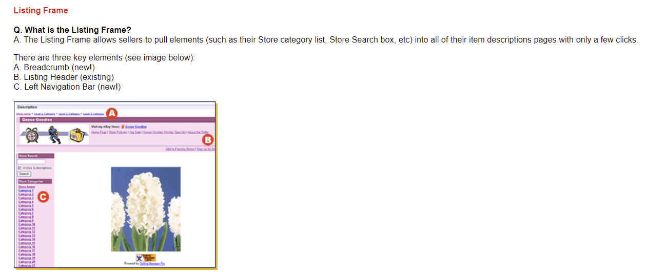
If you're unfamiliar with the old Listing Frame, it was pretty much what the name suggests - a frame that could be added to the listing page with optional features like a header with your logo, store name and link, breadcrumbs and a search bar or left side navigation menu to show your store categories.
Old Listing Frame:

The announcement in March said eBay's data suggested not many users interacted with those frames, which is why they were phased out and replaced.
Introducing a new Store category module
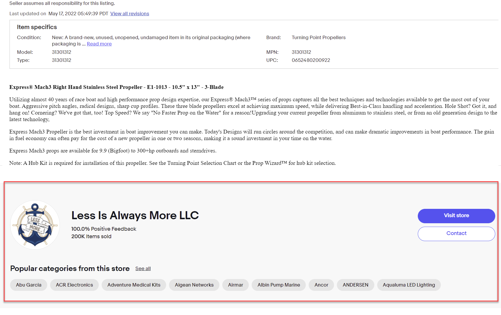
In late March, we’re introducing a new Store category module on your View Item pages. This module will display up to 9 categories from your Store and a ‘See all’ button for buyers to explore all your categories.
This will initially be available to sellers who currently have a listing frame set up on their View Item page. In the coming months, as we phase out listing frames, it will become available to more sellers. Your buyers will see this new module on desktop first—over time we’ll expand this feature to mobile web and the eBay app.
Removal of the View Item page listing frame
Currently, sellers can add a desktop-only frame with category and Store information around a listing’s description. However, our data shows there is little buyer interaction with these frames.
In late March, we’re removing the View Item page listing frame. Most of its features, such as displaying your Store categories and logo, will be moved to other places on the View Item page as part of the updates described above, making them available across platforms and better positioned to drive engagement with your Store.
I had assumed the category module would take the place of the header and be displayed above the description, but that is not the case - instead it has been added below the description.

That may fit more in line with how eBay displays listing information in the mobile app experience, but on desktop it just makes it seem like almost an afterthought, in my opinion.
One reader also pointed out to me that the "popular categories" are in fact not based on popularity at all but simply the first 9 seller created categories listed alphabetically. "See all" doesn't mean see all categories, it takes you to the "see all listings" page.
The category module is not customizable in any way that I can see, unlike the listing frame which allowed for a personal greeting message, links to add to favorite stores, sign up to store newsletter, items on sale and a store search bar.
So far I don't see this as a huge improvement, but hopefully eBay will be adding more customization options "soon".
Have you seen the new category module on listings? If so, do you prefer it or the old listing frame? Let us know in the comments below!


