eBay Listing Tool Changes Frustrate Sellers With Additional Clicks To Manage Images
UPDATE 8-29-24
It appears this new design for uploading images and videos in the eBay listing form is back - and still causing confusion for sellers.

Since yesterday, 27/08/24, it is not possible to rearrange photos, only the main photo. For me it's difficult to arrange photos when I adding them. The earlier version of photo processing was very good and clear, now it takes more time. Is it just temporary or permanent?
Yeah -- I feel your pain.
Something else that changed is the inability to delete ALL the photos simultaneously -- now each photo needs to be deleted individually.
Kind of slows down the "sell similar" process.
Yet another useless change, brought to us by the out-of-control eBay techie department.
I have confirmed the lastest version does provide drag and drop functionality to rearrange the order of the images.
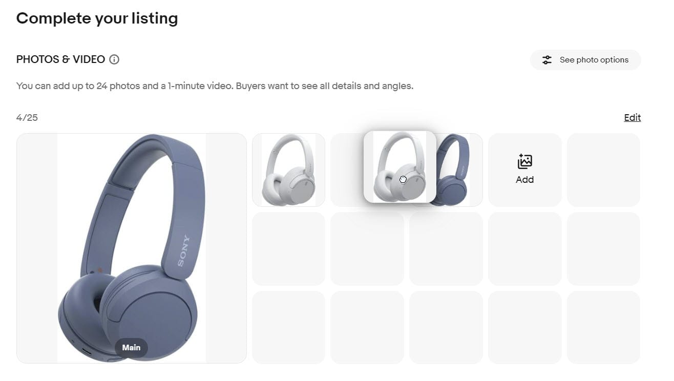
And there is still the ability to delete all images - you just have to click "edit" in the upper right first.
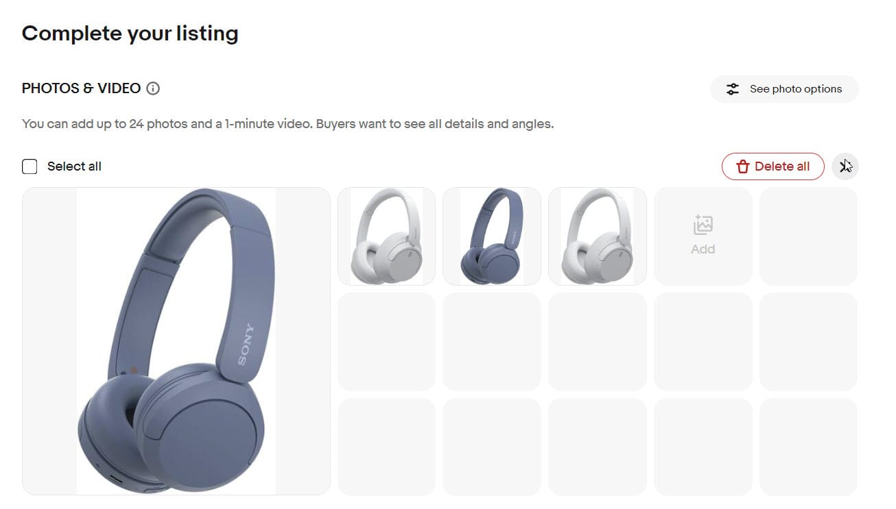
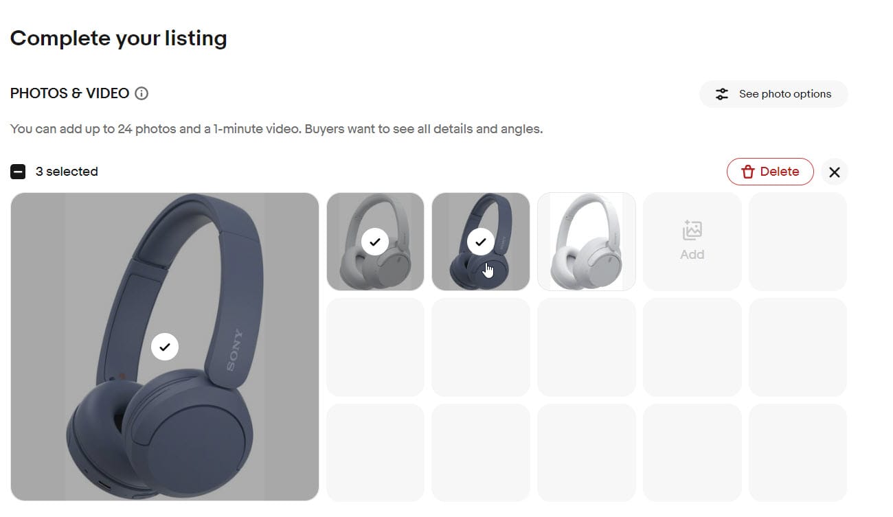
Also, after clicking "edit" you can select just a few images to delete in bulk if you don't want to get rid of all of them.
Unannounced changes to the eBay desktop listing tool are frustrating sellers as photo management tasks that used to take a single click now require multiple additional steps.
Previously, there was a convenient "Remove All" option or if you hovered over an individual image, there was a trash can icon in the upper right - both of which would allow you to delete images with one click when needed.
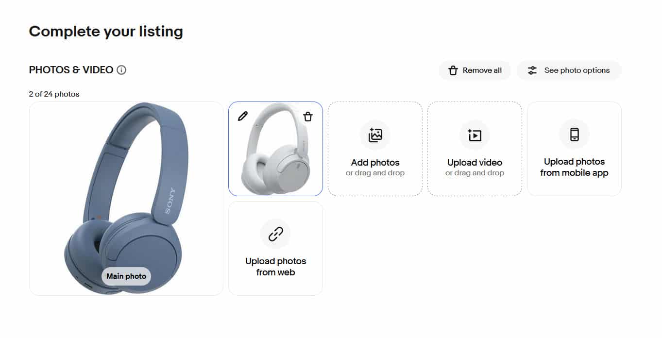
This efficient design has now been replaced for some users, with a new version that is not at all optimized for the standard seller workflow.
What once was a single click to "Remove All" is now a three click process - first on "Edit", then the "Select All" check box on the other side of the screen, and then back to "Delete."

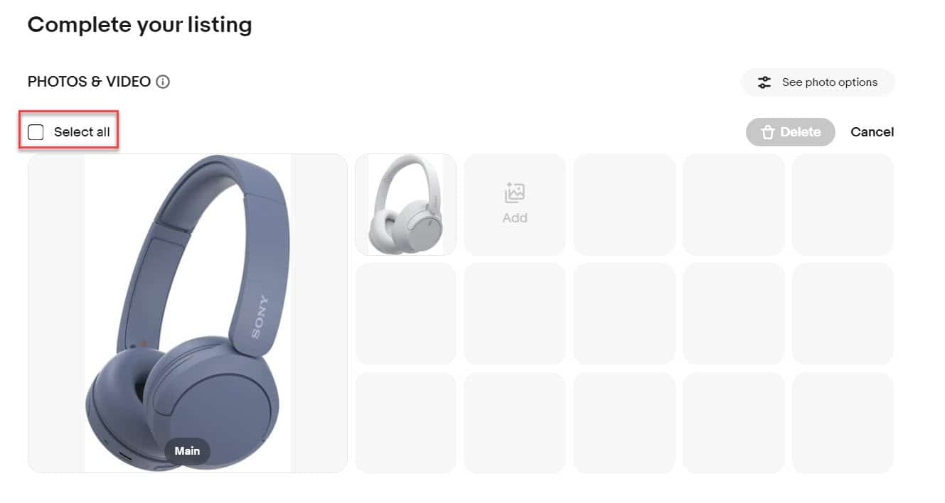
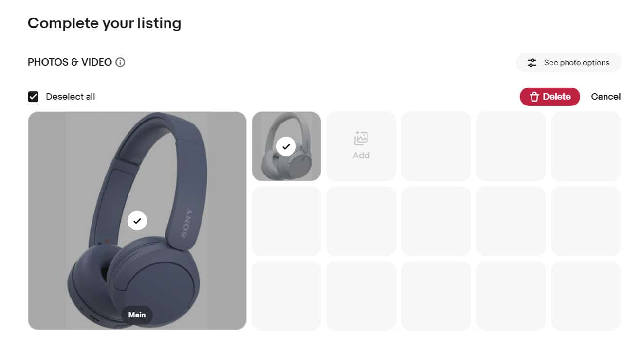
To remove a single image, instead of the single click on the trash can icon, now sellers have to hover and click on three dots, then on "Delete."
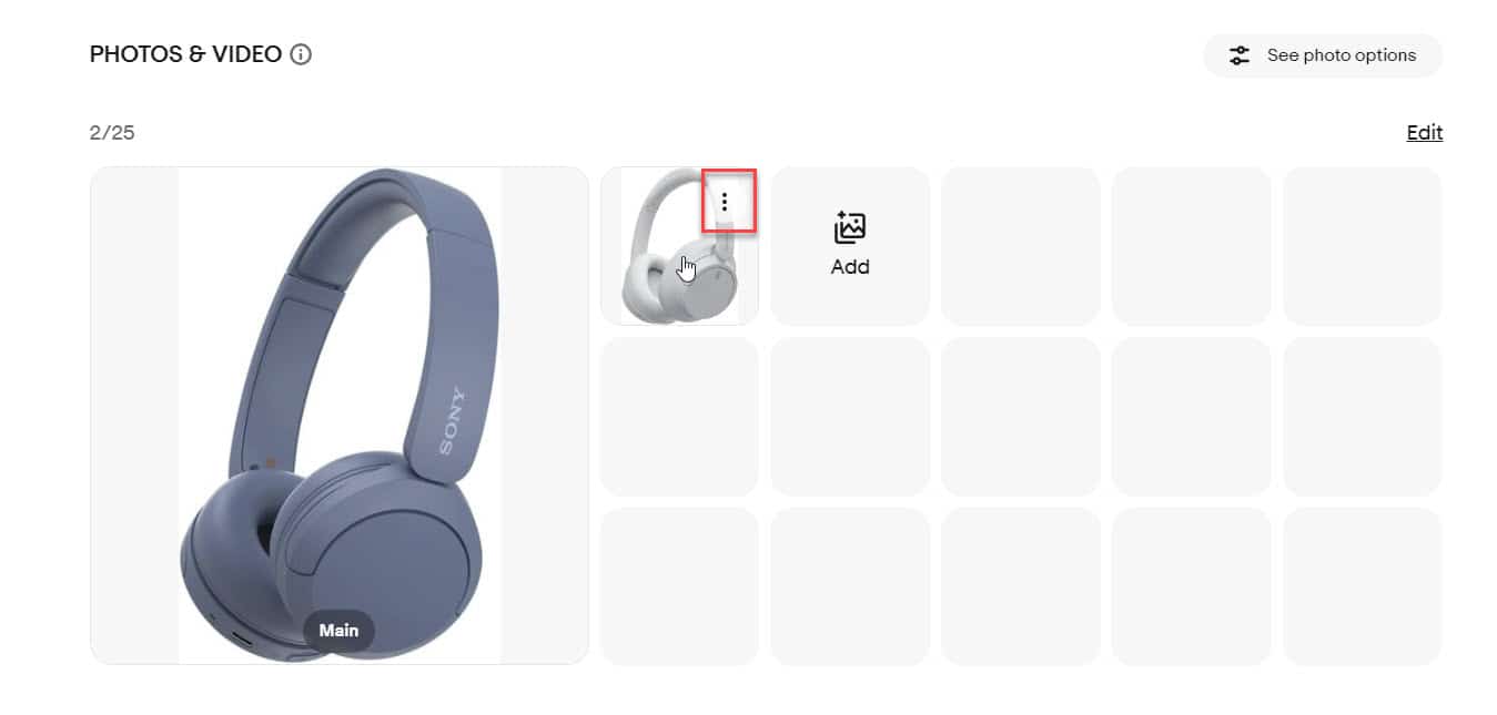
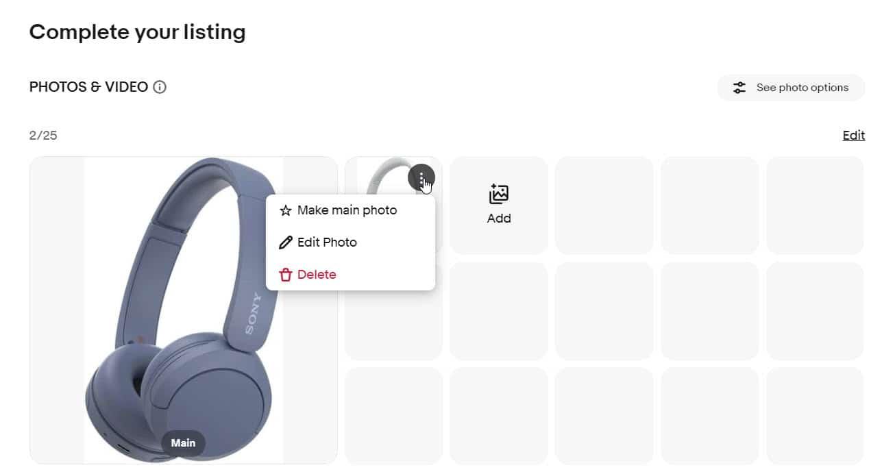
Not all users are seeing this new experience yet, so it could be a test or phased rollout, but the ones who are seeing it say it is an unnecessary change to their workflow that makes the listing process longer and less efficient.

Come on- this is just getting completely ridiculous now. We already had this fight with ebay when this tool rolled out 2 years ago to absolute hatred. Why is ebay making it take longer to do SIMPLE tasks again.
It is not industry standard to make a one click feature take 4 clicks instead!
Is the design team getting paid by how many extra clicks they add to the desktop experience? Full time sellers use desktops. All ebay employees use desktops, all companies use desktops to conduct business- we need the listing tool to act like a real tool optimized for business like we used to have with the classic tool.
If we are futzing around wasting time clicking here and there constantly- we are not adding new listings to ebay- what dont they get about that?
This "update" is so annoying and time consuming! Frustrating is the emotion I'm feeling when I go to start listing.
Another seller noted this new design is particularly problematic for them when using the "Sell Similar" functionality.

What Happened to the Remove Images when you use the sell similar feature. I listed this morning and it was there and working fine. As of 6:13 EST, 4/4/24 it's not there.
Many sellers will use the "Sell Similar" option as a shortcut when they have multiple similar items to list, basically using an existing listing as a template (with category, item specifics, shipping and other information already filled in), then just changing the pictures, title and description as needed.
This new layout now adds multiple extra clicks and mouse movements to remove existing images when choosing "Sell Similar", negating some of the time savings sellers previously had with that shortcut.
While it may not seem significant when looking at a single listing, over hundreds or thousands of listings those clicks and extra second add up - and as these seller comments indicate, there does not appear to be any good reason or positive benefit to changing the design in this way.
What do you think of this eBay Listing Tool design test/change? Let us know in the comments below!


