Is eBay's Search Redesign Really More Intuitive, Seamless & Rich?
The eBay Tech Blog published an article today about a "new" search redesign it claims will "elevate shopper experience" with seamless, intuitive features, but savvy users struggle to find anything actually new or innovative in this update.
Here's what's new, according to eBay:
Modern interface
The search page has been redesigned with a focus on visual clarity. Larger product images and streamlined menu buttons contribute to a user-friendly layout that simplifies navigation and decision-making.

High-resolution listing images
The page will now feature a visual-rich browsing experience, with high-resolution images that are larger in size, to enhance the listings without compromising site performance.
Shopping View
The new Shopping View replaces the previous gallery view, offering a full-width display without sidebar ads. This is particularly beneficial for categories like Clothing, Shoes & Accessories, and Toys & Hobbies, where larger images enhance the shopping experience.

Navigation and filters
The navigation panel and top-of-page filters now feature redesigned drop-down menus, making the browsing experience more intuitive.

Information layout
eBay has reorganized the presentation of listings with rounded image corners, uniform image sizes, and consistent font styles for a more cohesive and clear product display.

Centralized delivery and shipping options
All delivery and shipping options are now located in one convenient place, with a streamlined process for updating shipping locations. This centralization allows buyers to easily find their preferred delivery method.

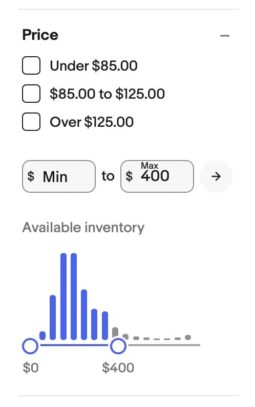
Interactive price graph
The price filter now includes an interactive graph, allowing users to adjust their price range with ease. The updated graph offers a clear visual representation of price distribution within search results.

Looking ahead
eBay will continue to refine the search experience, leveraging AI and machine learning to present relevant information, listing benefits, and seller details. These advancements aim to foster a more engaging, effective, and trustworthy environment for both buyers and sellers.
So basically, they've rounded corners on images and buttons, moved some filters and other design elements around on the page like shuffling deck chairs on the Titanic, and...what else, really?
Every screenshot provided shows the search experience that I and many other users have already been seeing for months, if not longer for some features like the interactive price graph.
Not only is there nothing really new here, none of these supposedly innovative transformations address any of the myriad technical problems that have plagued eBay search for years.
A few examples, just from the last few months alone:
Search By Image malfunctioning on multiple occasions, returning wildly varied and irrelevant results that do not in any way match the items being searched for.

Keyword searches for trading cards failing spectacularly during the largest annual sports card convention in the country.

Sorting function broken, either not allowing buyers to switch from default "Best Match" to any other sort option or massive amounts of results "magically" disappearing when switching to sort by "Lowest Price."

And if the glitches aren't bad enough, buyers and sellers are also often subjected to being involuntarily enrolled in site testing with no notice or avenue for redress if the testing has a negative impact on their accounts - like a recent test that removed seller names from search results.
One curious and glaring omission from the list of innovative new search features is the AI-powered search eBay has been testing for several months now.

eBay's reluctance to include this feature in their PR blog may have something to do with it's clearly not ready for prime time status.
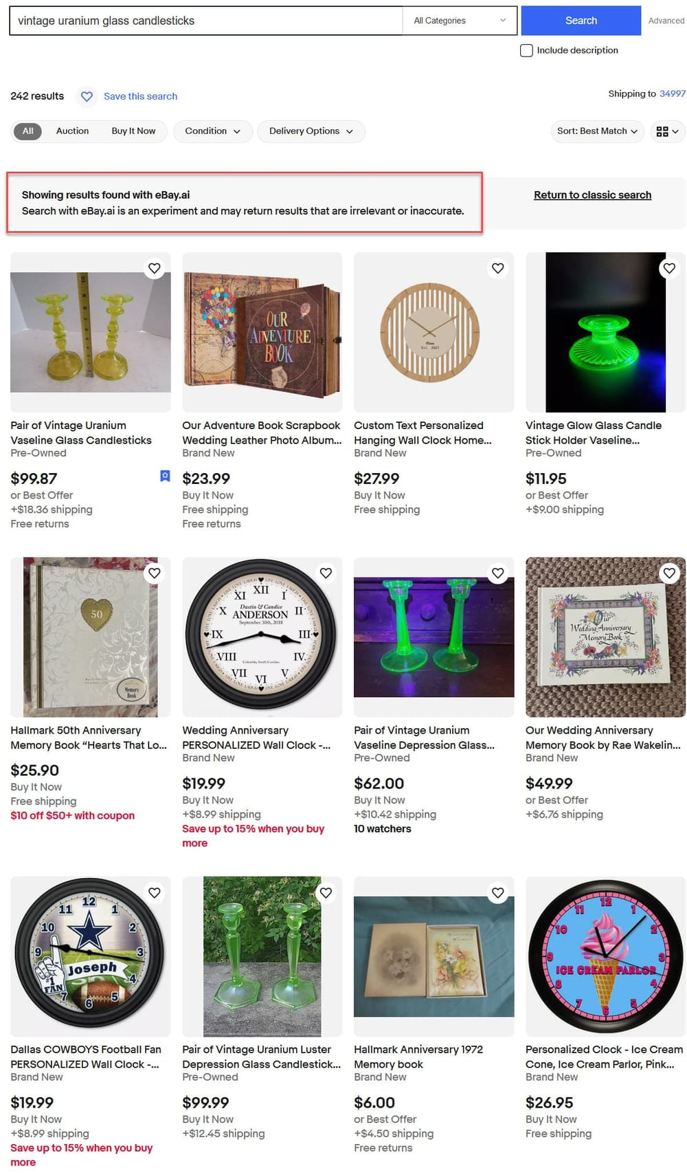
When I tested it 2 months ago, the first thing I noticed was a disclaimer that says "search with eBay.ai is an experiment and may return results that are irrelevant or inaccurate" - and boy they were not kidding!

Digging further into the functionality showed not only is eBay using AI to determine which items to show for a given query, they're also suggesting more generic, conversational questions in some searches, with AI then curating items based on the user's intent to enhance discovery of products they may not have thought to search for explicitly.
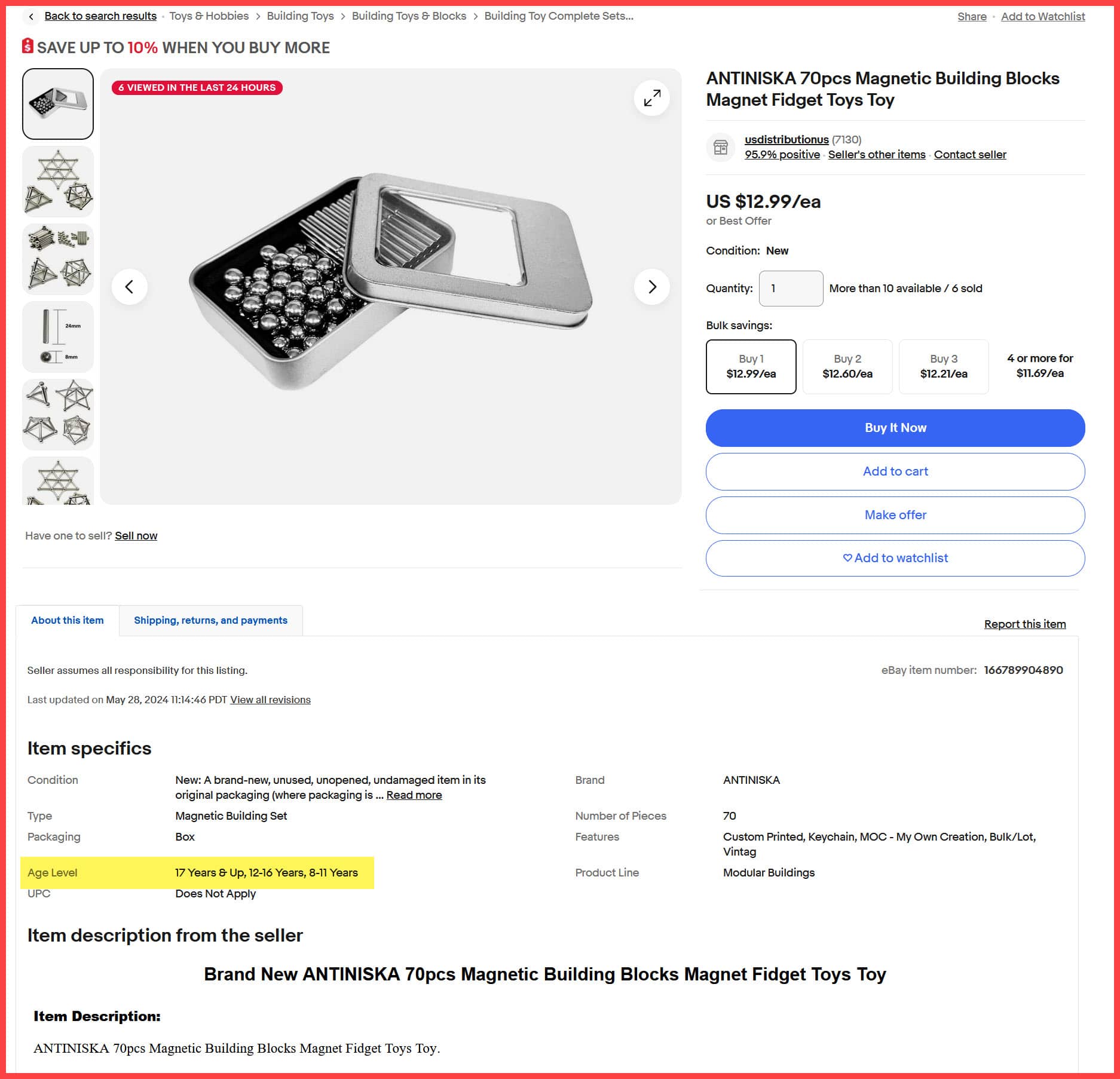
Alarmingly, eBay's experimental generative AI search showed troubling results for "toys to help a 3-year-old develop fine motor skills" - clearly ignoring age guidance in item specifics & suggesting items with small parts & magnetic pieces that could be dangerous for toddlers.


Could eBay be held liable for suggesting these potentially dangerous items in the future? The recent U.S. Consumer Product Safety Commission case against Amazon may be just the start of increasing scrutiny and efforts to make marketplaces accountable for dangerous or defective items sold on their sites.
Unfortunately, it doesn't sound like eBay.AI search has improved much in the last 2 months, with more comments posted yesterday in the eBay community bemoaning its terrible performance and calling it a "disaster."

I spoke to someone at Ebay customer support expressing my disgust with the Ebay.ai search. In my experience, with any given search, it will spew out mostly 100% unrelated results to any of the words in your search title.
He told me they were still trying to work out the kinks. My response, kinks are you kidding me. Please wait to release it until it is much more refined.
Any potential buyer is sure to be scared away when trying to find something. Sometimes I think Ebay is trying fail.
What do you think of eBay's "innovative" search redesign? Let us know in the comments below!


