eBay Quietly Unveils Final New View Item Page Design
UPDATE 1-2-24
eBay has scrubbed the original posts from the community that included the screenshots provided below, but luckily the original post was preserved in the Internet Archive Wayback Machine.

eBay's new View Item Page design has been finalized after 9 months of testing, with a silent pre-holiday launch.
The original announcement back in March laid out a list of "key highlights" that users could expect from the new design and created a private, invite only section of the eBay community for select buyers to provide feedback as eBay tested the new experience.

The item listing (also known as View Item) page on desktop will be going through a redesign this year. As part of this effort, we are going to simplify and modernize the user experience. To help be apart of this process please check out the new community board!
Here are some of the key highlights of what you can expect:
- Larger images
- Increased prominence of the seller information.
- Bring critical information like Item specifics and seller description higher up on the page before any modules that show other items & ads.
- Improve the hierarchy of the page, so we show the most important information in the right order.
Competitor ads displayed above seller provided descriptions has been a major complaint for years, so sellers were elated at the promise to "bring critical information like Item specifics and seller description higher up on the page before any modules that show other items & ads."
However, as the first iterations of the test started to show publicly, sellers were dismayed to find that those ads were still above their descriptions.

Sellers pushed for answers and eventually, eBay renewed their commitment to move the seller description above ads in this community post from buyer_team@eBay on June 13, 2023.

Hi All - this thread was recently bought to my attention. Sorry, it took a while for us to respond.
Please allow me to share an update.
Our plans have not changed - we are still working on improving the overall experience for View Item on Desktop. These changes are under development and we are testing with small percentage of audiences. You will observe that we don't necessarily test all the changes at once - these are usually done in steps and take some time. As we do these tests, we have start and end the test at times as we understand the results.
Our overall goal remains the same as follows:
- Larger images
- Increased prominence of the seller information.
- Bring critical information like Item specifics and seller description higher up on the page before any modules that show other items & ads.
- Improve the hierarchy of the page, so we show the most important information in the right order.
Please expect more tests over the next couple of months.
Hope this helps and thanks for your patience.
Sellers were still skeptical of eBay's intentions, but had no choice but to accept this answer and hope eventually when the final design was released, eBay would stick to their word.
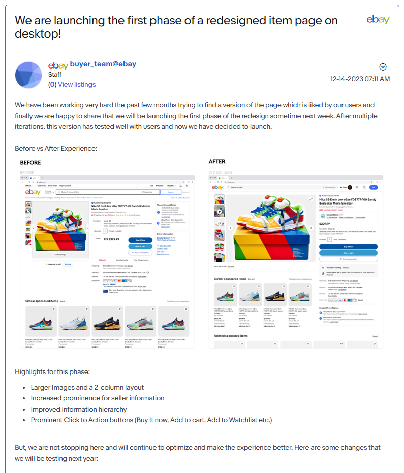
While there has been no public announcement yet, buyer_team@eBay posted in the closed community group on December 14, 2023 that the first phase of the new design has now been finalized and will be launched to all users "sometime next week."
A helpful community member, mcdougle4248, provided screenshots in one of the public threads about the redesign.
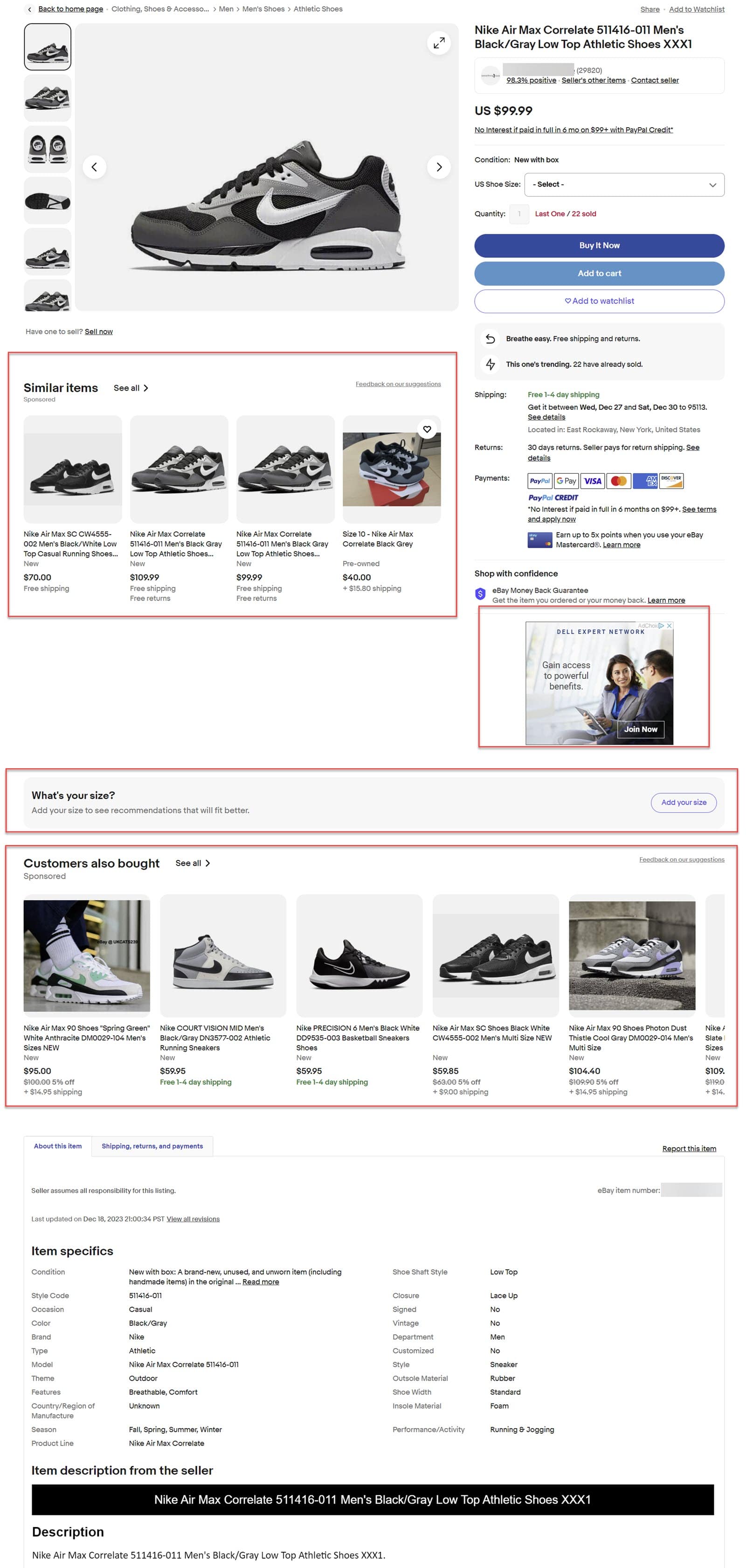
Unsurprisingly, there is no longer any mention of moving item specifics and seller descriptions above Promoted Listings ads in this phase of the redesign.

We have been working very hard the past few months trying to find a version of the page which is liked by our users and finally we are happy to share that we will be launching the first phase of the redesign sometime next week.
After multiple iterations, this version has tested well with users and now we have decided to launch.
- Highlights for this phase:
- Larger images and a 2-column layout
- Increase prominence for seller information
- Improved information hierarchy
- Prominent Click to Action buttons (Buy it now, Add to cart, Add to watchlist, etc.)
For those who may not be seeing the new design yet, here's a screenshot of a currently live listing with the new design:
eBay also gave examples of changes they will be testing over the next year, but did not give any specific timeline for when this testing would begin or when the next phase of the design will be finalized.
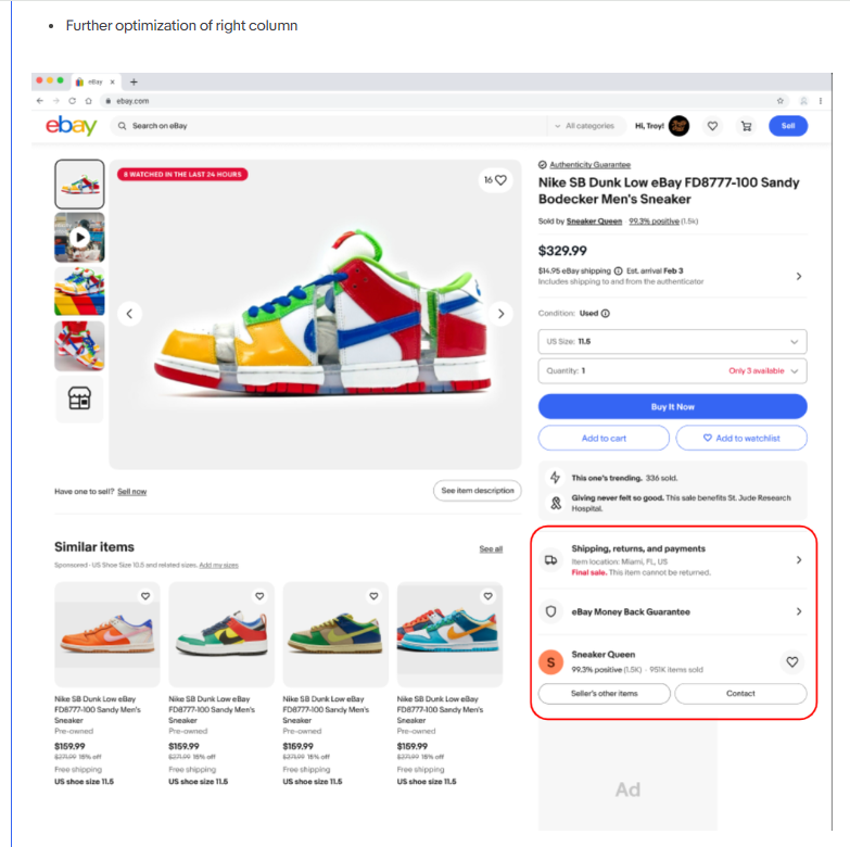
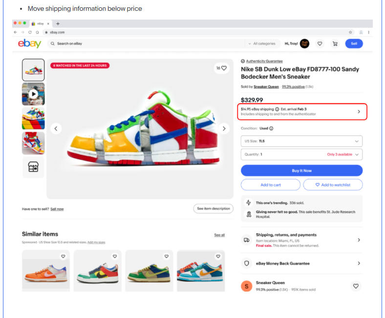
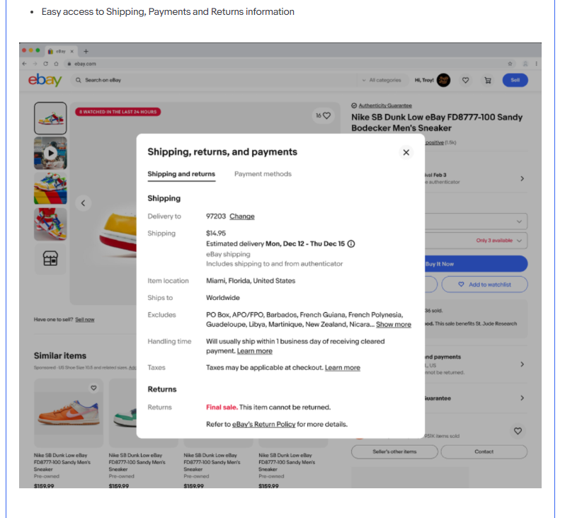
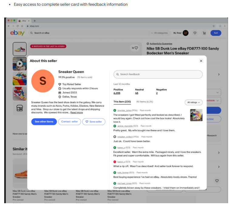
Changes to be tested over the next year include:
Further optimization of the right column
Moving shipping information below the price
Easy access to Shipping, Payments and Returns information
Easy access to complete seller card with feedback information
Bringing description higher up to the right column and open full HTML in modal.
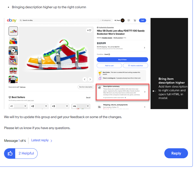
This will make the desktop display much more like how items are displayed in the mobile app and appears to be eBay's solution to be able to say they are technically fulfilling their promise to bring the description above the ads.
However, it's doubtful many sellers will be satisfied with their description now being reduced to a small summary which requires buyers to click to "see more."
In fact, an earlier test tried something similar with a tabbed display experience and it was very soundly rejected by sellers.
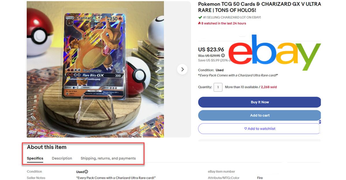
While the summary display is preferable to that tabbed display test, it still does not address the main concern sellers have - they want their full descriptions prominently shown to buyers with no distractions, interruptions or extra clicks or effort required...period.
Sellers feel so strongly about this that many are even willing to forgo any custom fonts or advanced HTML design elements specifically to make sure their full description shows in the mobile app with no extra clicks.

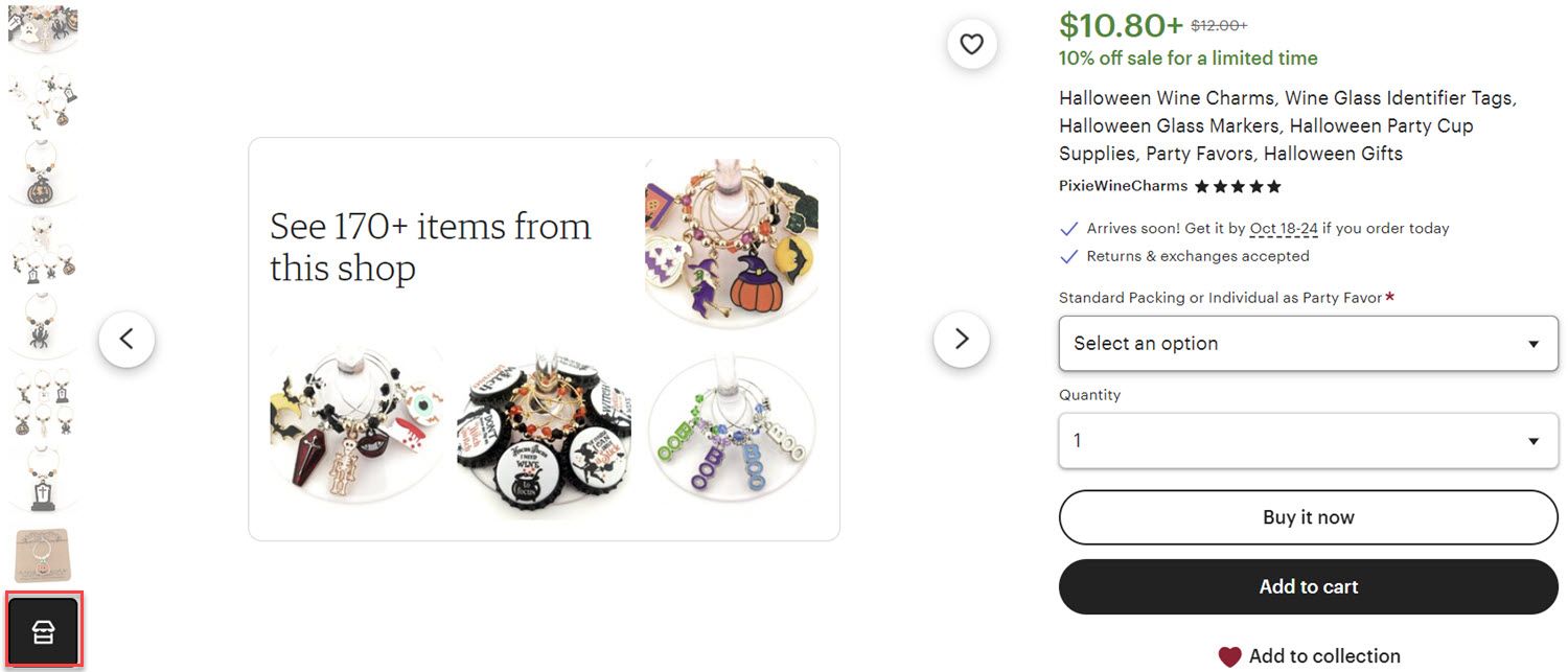
And finally, it appears eBay is stealing an idea from Etsy by planning to add a button in the image panel that will show the seller's other items.
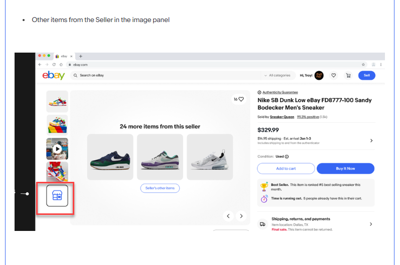
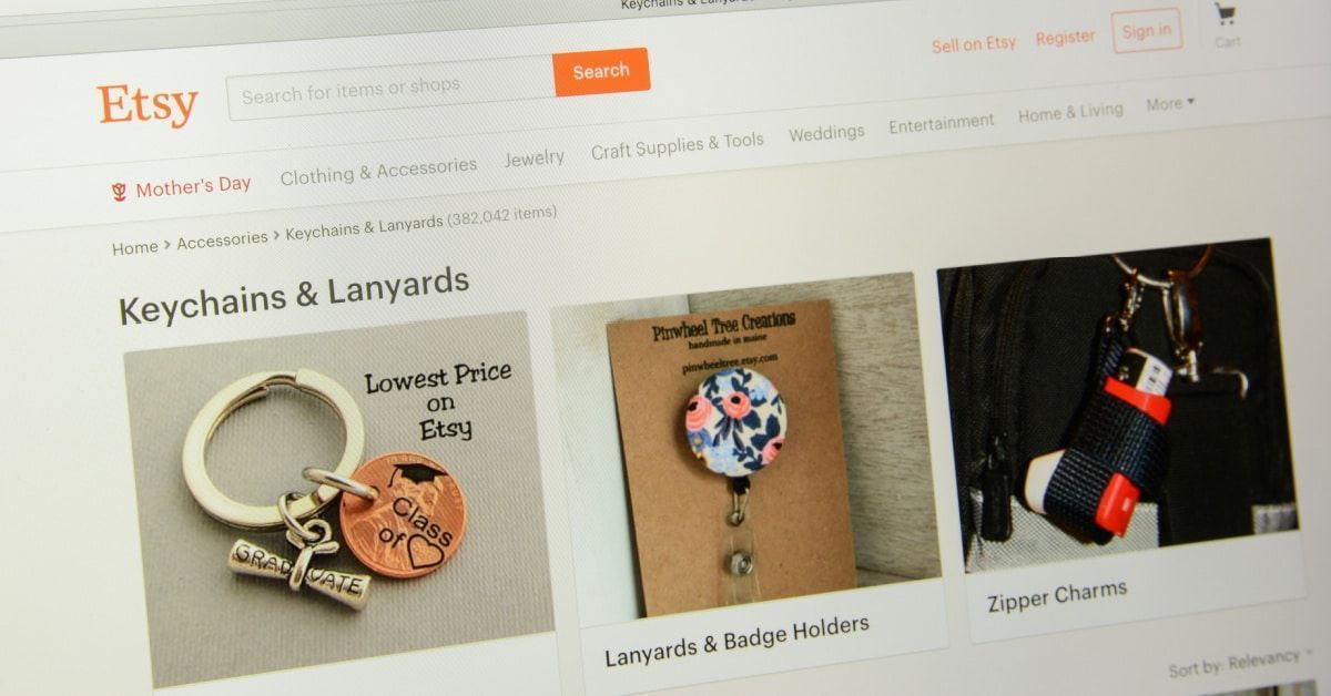
Etsy started testing a similar feature in October and this eBay mockup looks like an almost exact copy.
What do you think of the new eBay View Item Page design? Would you be willing to accept a smaller description summary with a click required to "see more" if it is above any competitor ads on the page?
Let us know in the comments below!


