eBay Reneges On Ad Placement Promise In New Item Page Design
UPDATE 6-14-23
After weeks of silence while sellers pushed for answers, eBay has finally bowed to the pressure and made a statement confirming they are still testing the new View Item page and still intend to move the item specifics and description above the ad modules in the final design.

Hi All - this thread was recently bought to my attention. Sorry, it took a while for us to respond.
Please allow me to share an update.
Our plans have not changed - we are still working on improving the overall experience for View Item on Desktop. These changes are under development and we are testing with small percentage of audiences. You will observe that we don't necessarily test all the changes at once - these are usually done in steps and take some time. As we do these tests, we have start and end the test at times as we understand the results.
Our overall goal remains the same as follows:
- Larger images
- Increased prominence of the seller information.
- Bring critical information like Item specifics and seller description higher up on the page before any modules that show other items & ads.
- Improve the hierarchy of the page, so we show the most important information in the right order.
Please expect more tests over the next couple of months. Hope this helps and thanks for your patience.
It's good that eBay finally addressed seller concerns on this issue - now we must continue to make sure they follow through.
eBay has unveiled the new View Item page design in a phased rollout. While there are some improvements, Promoted Listings ad stuffing continues to dominate the user experience.
The new design was teased back in March when an announcement was posted in the eBay community soliciting feedback from buyers as it was being developed.

The item listing (also known as View Item) page on desktop will be going through a redesign this year. As part of this effort, we are going to simplify and modernize the user experience. To help be apart of this process please check out the new community board!
Here are some of the key highlights of what you can expect:
- Larger images
- Increased prominence of the seller information.
- Bring critical information like Item specifics and seller description higher up on the page before any modules that show other items & ads.
- Improve the hierarchy of the page, so we show the most important information in the right order.
We will be rolling out the change in phases as we design the final experience. We will be running several tests and gathering user feedback.
Your feedback is valuable and will help us in creating a better eBay experience. Thank you for buying and selling on eBay.
Sellers were thrilled with the possibility of improvements highlighted here, specifically the part about bringing the Item Specifics and Seller Description higher up the page before any modules that show other items & ads.
CEO Jamie Iannone has made it no secret that his plans for the platform involve increasing ad revenue, with an average of 100+ Promoted Listings ads plastered on every item page and new ad types "coming soon."

Sellers are particularly sensitive to the fact that eBay shows rows of competitor ads above the description, which pushes critical seller-provided information down the page and may direct buyers away or cause them to miss important details buried in between ads.
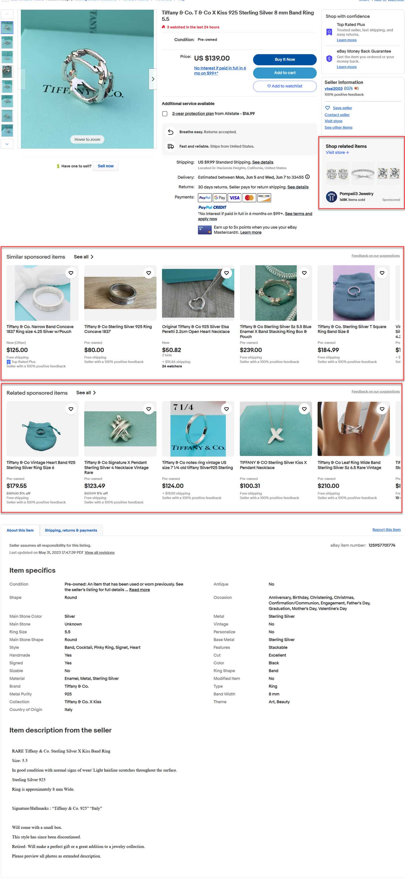
For reference, here's the old View Item page:
There's a competitor Promoted Display Ad under the seller information on the right and two rows of scrolling ad carousels above the item specifics and description - those are the rows eBay said would be moved in the new view.
There were also 9 additional rows of ads below the description and feedback modules on the page in this example.
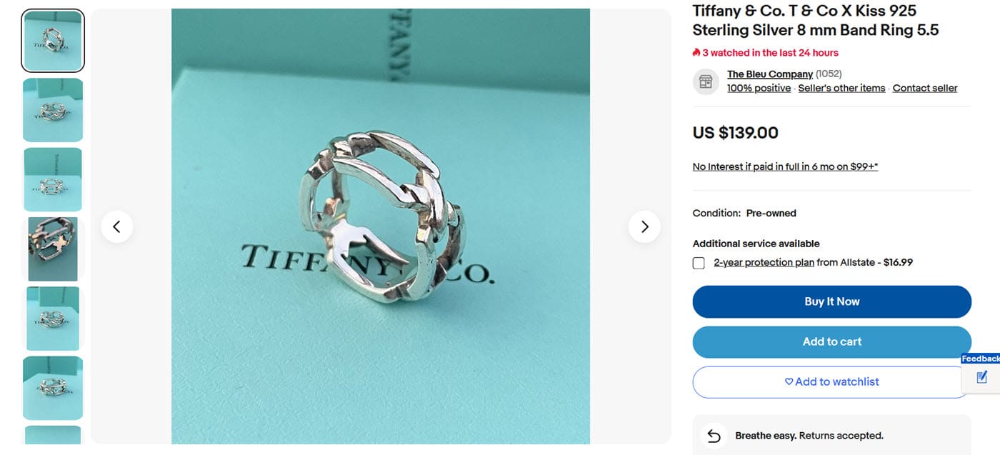
The new View Item Page starts off with some big improvements - the larger image in the middle really highlights the item and seller information on the right is much more prominent.
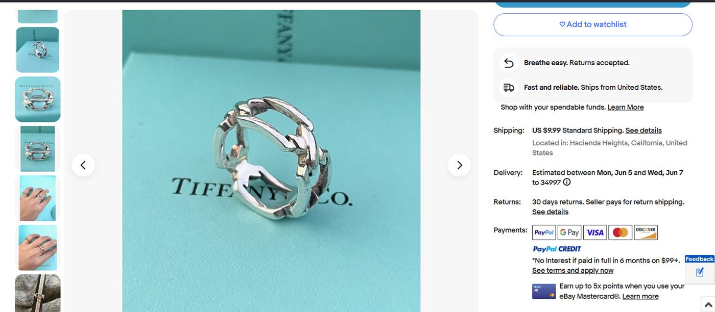
Both the image module on the left and the seller details module on the right scroll independently, so the image stays in the middle as those side modules scroll to reveal more pictures or information.
However - eBay is still inserting two rows of sponsored Promoted Listings ads before the Item Specifics and Description, despite the announcement saying they were no longer going to be doing this.
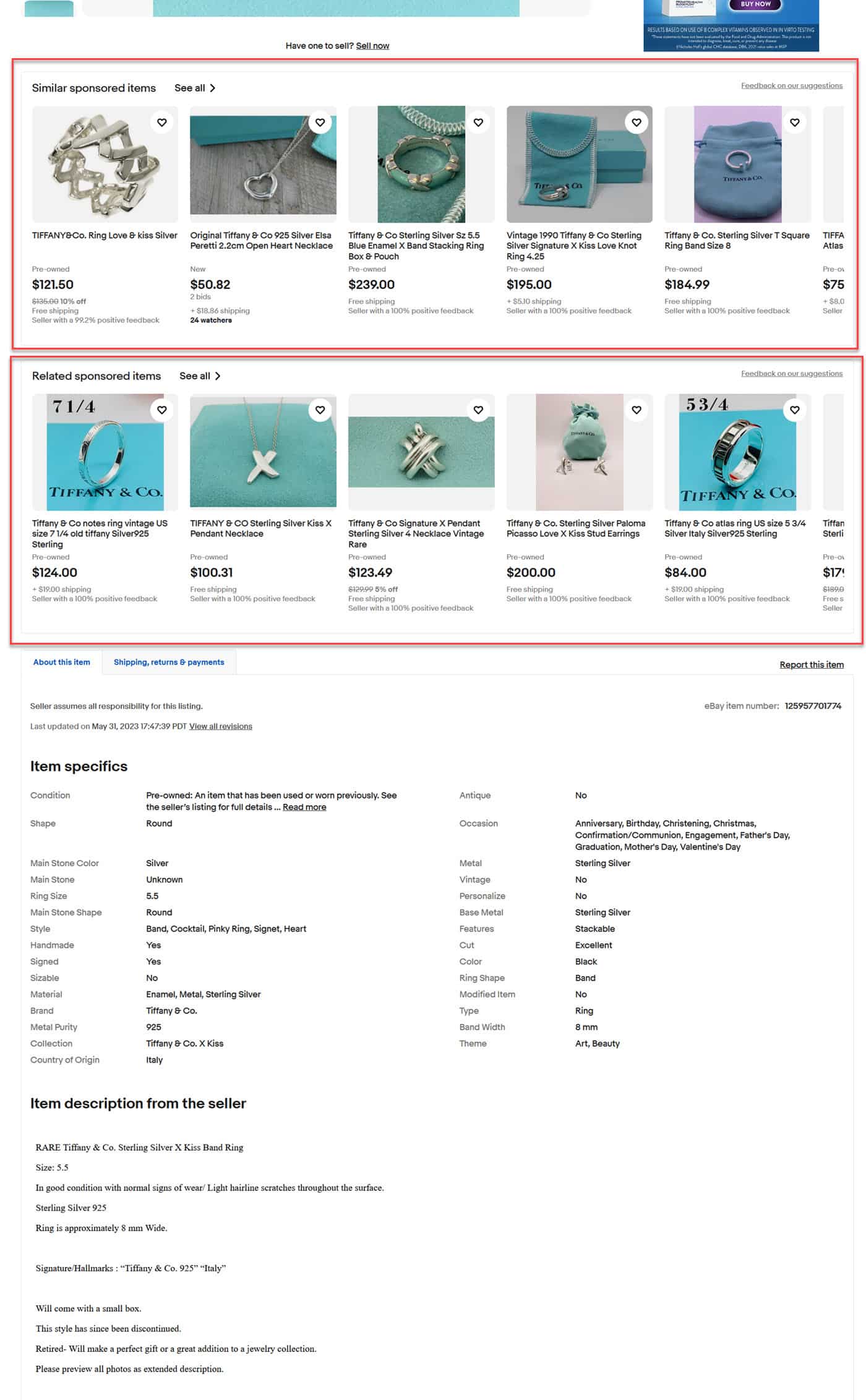
Video clip showing full page scroll experience in new eBay Listing View:
It's great to see that eBay is taking feedback seriously and working to improve the View Item page, but they must honor their commitment to move the item specifics and description above any modules showing other items and ads if they want to be the "seller partner of choice" they claim to be.
Hopefully this is still a test or perhaps a simple oversight on eBay's part that will be corrected before the new view is rolled out sitewide.
What do you think of the new View Item page? Let us know in the comments below!


