eBay Seller Hub Active Listings Page UI Update Consolidates Search & Filters
eBay is rolling out this Seller Hub Active Listings update to more sellers, with additional changes to the functionality that are even worse than initial reports had indicated.

Dear eBay,
You are wasting my time with never-bleeping-ending bleeping-clicks.
I cannot stand inefficiency.
From,
Unimpressed Seller
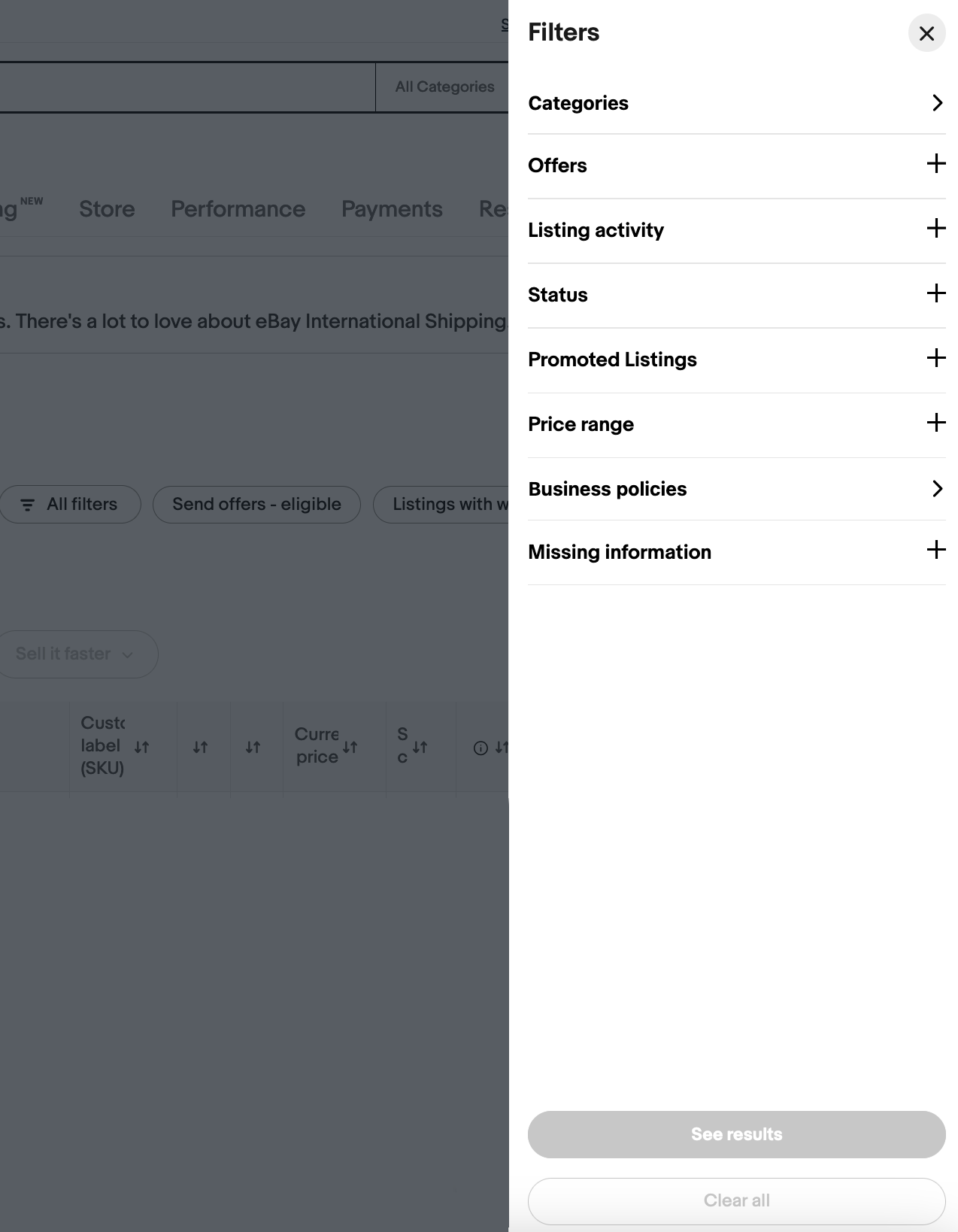
Seriously, who the hell thought nest inside of nest inside of nest side bar panel was a good idea? It takes 12 clicks what you used to be able to do in 2 clicks.
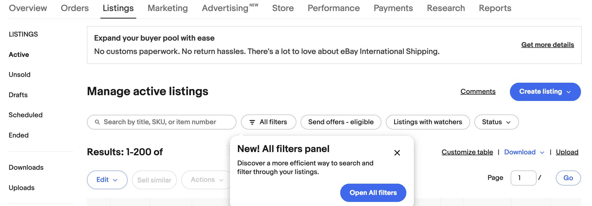
eBay is rolling out updates to the Seller Hub Active Listings page with consolidated search and filter functionalities to simplify the user experience.
Initially the changes have been applied to about 5% of seller accounts, with more being added over the coming weeks.
Longtime eBay community member WastingTime101 provided screenshots for those who have not seen the new design yet.

I heard from a seller that has the new view today, at least for Active listings. I forgot to ask him about the Orders page. (In the video I loved what eBay did with repeat buyers on the Orders page.)
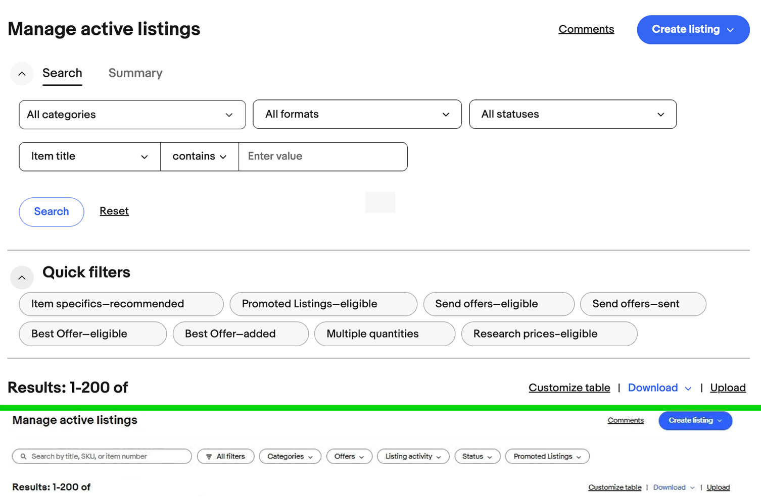
With my buddy's permission I'm posting screenshots from his new Active Listings view compared to the old view which most of us are still seeing. Green line is the divider. Top = current soon to be old view | Bottom = new view...
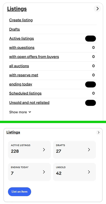
...He also sent me a screenshot of the Listings panel on the Seller Hub Overview page.
Green line is the divider. Top = current soon to be old view | Bottom = new view
WastingTime101 also shared some additional feedback from other sellers about the functionality of the new design.
RE: Active listings page
The search box is no longer compatible with browser auto-fill settings. Even after searching the same term a few times, that field appears to be exempt from working with auto-fill. As this rolls out I'm sure you'll be hearing that feedback from many users.
Side note: the new version of the feedback forum is no longer compatible with browser auto-fill and I've seen dozens of complaints about that the past 2 weeks.
The search box has no actual button to click with a mouse or trackpad which forces you to use the Enter/Return key. This has been called out as annoying. Not sure if eBay could move the magnifying glass over to the right of the box and turn that icon into a button with a submit function like we see up above here on the Khoros forum?
Several sellers expressed concern about there appearing to be no summary setting like there had been in the previous view.
The new one don't seem to have a summary setting to see if anything has a bid or the money total.
It has no summery setting? ... Is there no way to set it to show the only listings we have to keep track of - all auctions with bids - until that 'ending today' notice pops up and we reset it to show all 'buy it now - ending today' so we can end them before they auto relist.
Others were frustrated that they no longer had visibility to see Watchers or Auctions With Bids.

...the active listings page. A few days ago and for the longest time there was always a number of watchers link at the top of the page so you could see that at a glance. You could click on it to get a list of the watched items without having to scroll through all of your listings.
That is now gone as well as the links to see what items you have sent offers on. Just like that gone. Not user friendly to have to spend alot of time scrolling when we could be listing instead.

is there not a tab for auctions with bids where i can see my auctions that have bids without having to scroll through all my auctions.. i liked the old hub better.
Sellers can still use the Customize Table option to select which columns are displayed (including watchers) and then click those columns to sort by those variables, but that may still leave them having to scroll through a list of items rather than filtering down to show just the items they wish to see.

Are you seeing the new Seller Hub Active Listings page design? Let us know what you think about the updated experience in the comments below!


 Concerned


