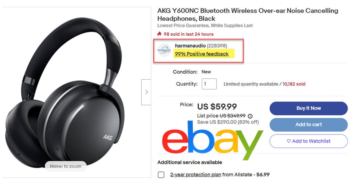
eBay Soliciting Buyer Feedback On New Item Page Experience
UPDATE 6-1-23
eBay's new View Item page is currently in a phased beta test and disappointingly still includes competitor Promoted Listings ads above the item specifics and seller description.

A pinned announcement in the Buying section of the eBay community may be good news for seller as eBay looks like improve the item page experience.

The item listing (also known as View Item) page on desktop will be going through a redesign this year. As part of this effort, we are going to simplify and modernize the user experience. To help be apart of this process please check out the new community board!
Here are some of the key highlights of what you can expect:
- Larger images
- Increased prominence of the seller information.
- Bring critical information like Item specifics and seller description higher up on the page before any modules that show other items & ads.
- Improve the hierarchy of the page, so we show the most important information in the right order.
We will be rolling out the change in phases as we design the final experience. We will be running several tests and gathering user feedback.
Your feedback is valuable and will help us in creating a better eBay experience. Thank you for buying and selling on eBay.
Bringing the item description above other modules that include ad is a huge and very welcome change indeed!
That is something sellers have complained about almost since the beginning with Promoted Listings and it's only gotten worse as eBay now stuffs over 100 competitor ads on the page.

Sellers have recently been concerned at seeing testing done on the item page that was hiding descriptions behind a "show more" button.

And a recent change that moves seller info to the middle of the page was met with mixed reviews.

While it's encouraging to see eBay taking feedback on this issue, it's also a bit disappointing they are apparently leaving sellers out of the discussion - the dedicated group for feedback on the new design is posted in the Buying section of the community and it is a closed group which requires eBay staff permission to join.

I'd love to see eBay take a more open and transparent approach to this topic and allow at least viewing capability for all community members, but preferably full access to provide feedback from multiple perspectives.
Sellers are discussing the announcement here:

Moving Seller Description up beyond all that 'other stuff' is HUGE and quite 'goodly' for sellers!
What is really galling is that they are the ones who began sticking ads in the middle of a seller listing and pushing the description down so far that buyers would not notice it was there at all. Its not as if anyone asked for that. They are using 'simplify and modernize' as euphemisms for 'correct and repair'.
On a related note I wonder why they are calling the new design 'the final experience' - that does not sound inspiring - and they have a history of constantly tinkering and 'fixing' what is not broken anyway. Putting 'final' in there is not really all that reassuring.
Please forgive me if I get a little skeptical when eBay starts talking about "improving" the user experience. Most recently they've loaded up the view item page with competitive ads, which I feel makes for a lousy experience whether I'm the buyer or the seller.
Also, on the eBay pages, my touchpad stalls out when scrolling past the rows of ads. I have to maneuver out to the edge in order to scroll up or down the page. Annoying enough for me to just hit the back arrow or close completely. Ugh.
What do you think of the eBay's new View Item experience? Let us know in the comments below!


