eBay Tests Banner Carousel For Stores Featuring About Info & Store Videos
UPDATE 2-13-25
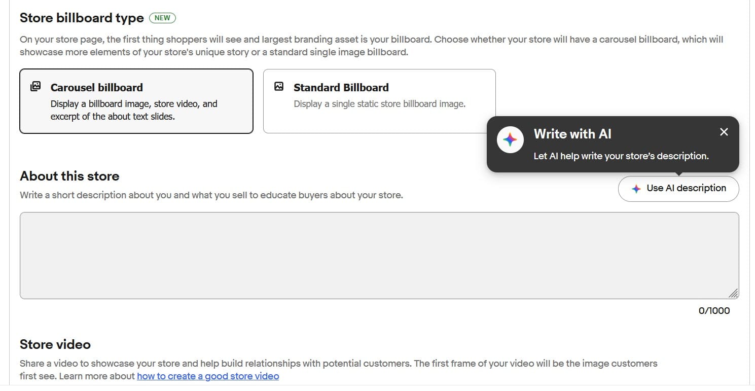
Carousel Banners for eBay Stores are now rolling out to more users and some even report seeing an option to use AI to help write their store description too.

eBay is tinkering with Store designs again, adding a rotating carousel featuring the seller's banner image, About information, and store videos.
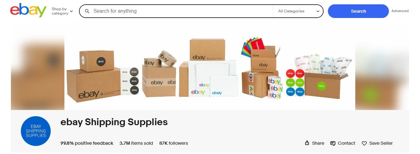
Previously, a seller's store page just displayed a single static banner image at the top, with potential buyers having to click on the "About" tab to see more information about the seller as well as the Store video, if the seller has uploaded one.
Now, some buyers are seeing an automatically rotating carousel that starts with the banner image, then shows the video (if there is one), and then another slide with some of the text from the About section.
Not everyone is seeing this new carousel all the time, with some reporting they only see it in some browsers or when viewing in an incognito window, so it may be a test or a slow rollout.
Sellers are discussing the new feature in the eBay community, with some saying it could be useful but it should be a optional, not forced, and that eBay should have proactively communicated about it so sellers could check to make sure their information displays the way they prefer.
And as should be glaringly obvious to eBay after almost 3 decades, unannounced changes being made in the Q4 holiday season are not the way to win sellers' hearts.
I recently looked at some ebay storefronts, including my own (Using a PC and Chrome, in case that matters)
I created a store billboard ages ago. And I have a video of sorts, and an "About" description on the About tab page.
Now, imagine my surprise and confusion, when, with no announcement and no explanation within the store help pages or the "Edit Store" page, my previously static billboard now scrolls, showing first my actual billboard image, then a clickable link to a pop up if my store video, and then partial text of my About description and a button to link to the whole thing.
Now, I actually like the scrolling billboard idea. But....
Seriously, once again, despite our never ending pleas, no announcement? And in the middle of Q4?
OK, that said, a couple points:
- There appears to be no seller choice here. I see nothing that indicates I can choose a static billboard OR a scrolling billboard. This seems to be scrolling, period. (At least, if the seller has a video and/or an About text description). Why no choice?
- My video was made as a slideshow, and the slideshow photos have had their dimensions altered to fit the pop up video size. So, tops and bottoms of some of the items are cut off in the pop up video, which is not the look I want.
- Obviously, there is a character limit for the text in the final video, and since as sellers, we have no warning about this, it cuts off the text abruptly. If ebay indicated the character number, we could probably revise the "About" text to fit better.
So, what's going on here? Is this a test? Is it an unannounced change that is in a gradual roll out? Are we going to be given any information about this?
Others tried to figure out what the text limit cut off for the About section would be, but unfortunately it seems to be random.
The About text doesn't have a fixed character limit as far as I can tell.
Looked at one store that ... after 101 characters. Looked at another that cut off after 88 characters, another 103 characters, another 92 characters, another 90 characters. You get the idea.
Sellers are encouraged to view their store page in multiple browsers, including possibly using a private or incognito window, to see how their information may display in this new experience - especially the aspect ratio for the store video.
What do you think of eBay's banner carousel for Stores? Let us know in the comments below!


