eBay Stores Sale Tab Expands To Include Markdowns, Gets Design Update
eBay is making changes to Stores Sale tab design, adding additional types of discount promotions and updating the look and feel of how markdown and coupon offerings are displayed.
The Sale tab was originally introduced in the Fall 2023 Seller Update in September, but was initially limited to only showing Coupons.
We’re making it easy for Store subscribers to highlight active promotions by rolling out a new Sale tab on the storefront. This tab will feature all your coupon sales in one place, and make it easier for buyers to find your sale items.
With this update, your coupon offers will automatically be front and center on your storefront—helping turn browsing visitors into happy buyers.
- The Sale tab will automatically appear for store subscribers who’ve created at least one promotional coupon offer.
- We’re exploring ways to include other promotions, such as markdowns, under the Sale tab in the future.
- If you want to create a coupon offer that’ll show up in a Sale tab on your storefront, visit the coded coupons page to get started.
Sellers have been eagerly waiting for the Sale tab to include other types of discounts like markdown sales, buy x get x, and free shipping promotions and it appears that day has finally arrived!
eBay community members who noticed the change are sharing their thoughts - while they are happy with the update, several were surprised that the page is limited to only 5 or 6 campaigns instead of showing all of their active promotions.

Thank you Stores team. Previously the sale tab featured coupons exclusively.
I'm now seeing the sale tab on accounts that aren't using coupons and it's advertising markdowns and order discounts.
Although ... it's only displaying 5, regardless of how many promotions the store is running. Why only 5? And how is eBay determining which 5?
Take that back - some are showing 5 and some are showing 6 - even though checking the sellers promotions page there are many more promos than that running.
Further investigation revealed eBay appears to be showing them in order of the ending date/time, with promotions ending soonest at the top.
In light of that, longtime community member WastingTime101 offered several suggestions for enhancement eBay could make to make this welcome new feature even better.
Because the sale tab is limited to showing only 6 promotions, there should be a link at the bottom to SEE MORE which can take the buyer to the main offers page.
On the main offers page it shows the seller's title of the promotion. On the store sale tab it does not. I would like the black boxes on the sale tab to display the title of the promotion.
On either the manage store page, or the promotions manager page, give sellers the option to pick which promotions are shown and in what order.
This update to the Sales tab also comes along with a facelift, adopting the fresher look and feel that users started seeing for the markdown sales module on the View Item page last month.
Unfortunately, one small UI difference makes a big difference in the intuitiveness of the design.
On the View Item page, this module shows an on the right side to scroll to see more items.

But on the Store's Sale tab, the module does not have an arrow - instead users only see a scroll bar under the module once they hover and have to click and drag that bar to see more items.
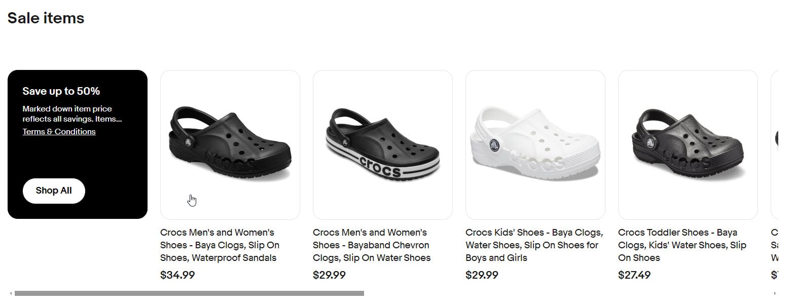
The Terms & Conditions link also still goes to a page that has outdated and/or inaccurate information, such as stating the offer is valid only when you pay with PayPal even though it is not possible for sellers to limit purchases to a specific payment method with the way Managed Payments works.
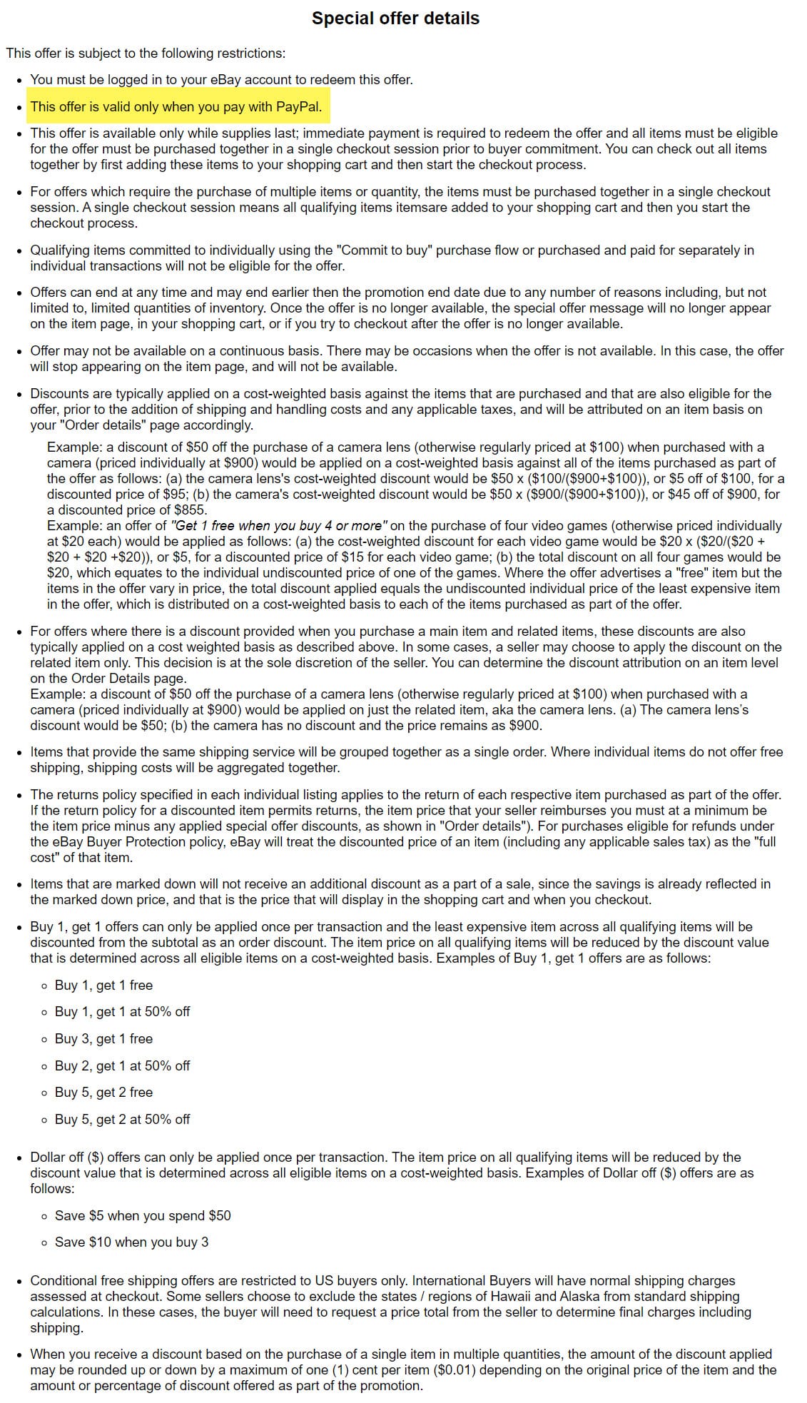
eBay is aware of these UX and terms and conditions issues, so hopefully we'll see them corrected soon!
What do you think of the new eBay Stores Sale tab? Let us know in the comments below!


