eBay Testing New Image Viewing Experience In App
In a rare display of transparency, eBay is communicating with users in the community about new functionality being tested for the app experience.

My name is Alex, I am a manager of the iOS/Android application at eBay. I specifically work on the Item Viewing experience -- think the page you land on when you see the title, price, photos, description, etc.
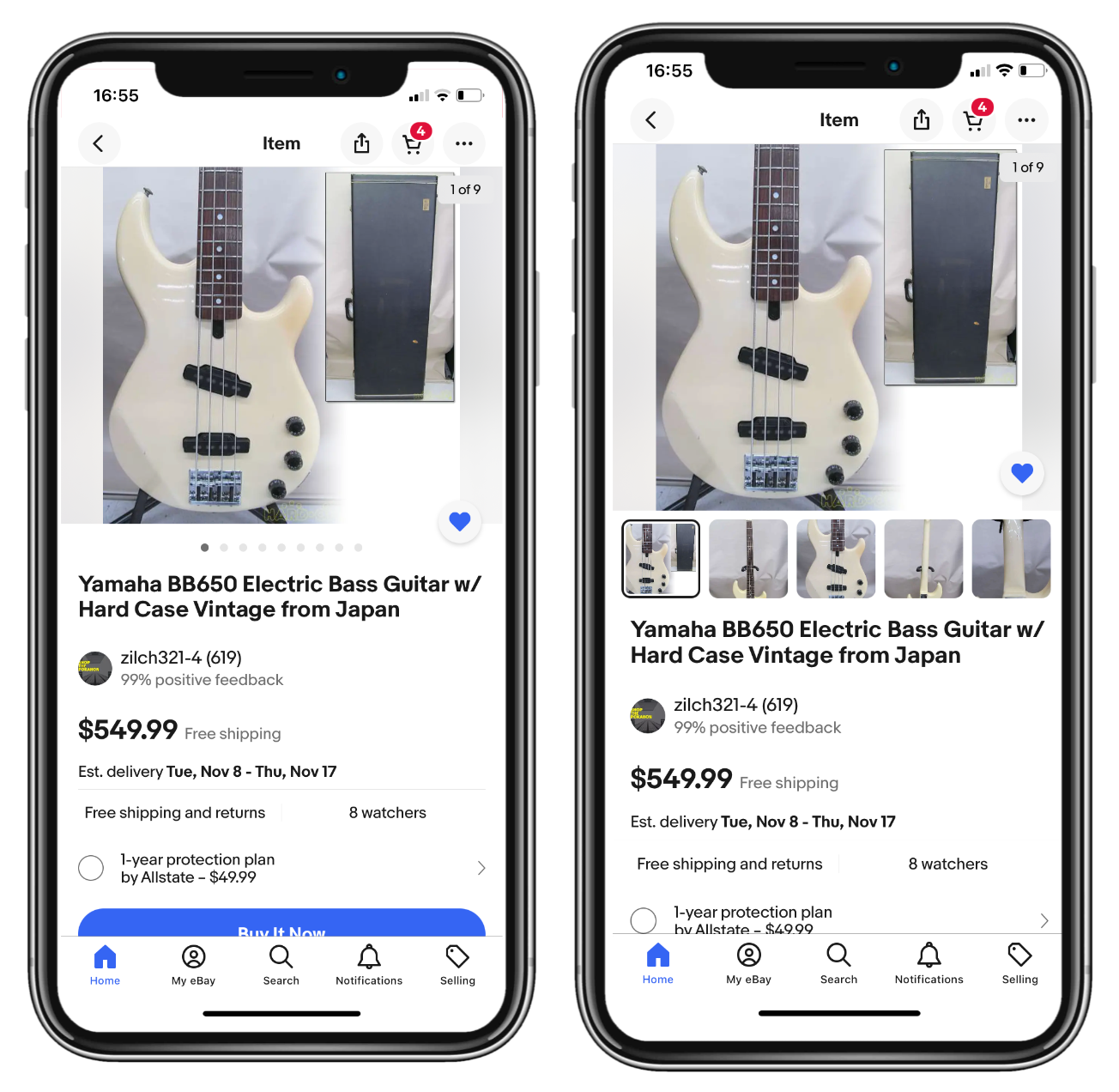
We recently started testing a new experience, where we display image thumbnails below the main photo. We know how much our buyers love seeing all images, and we thought this would be a great way to engage with all photos.
I wanted to make this post to see if any of you all are seeing this experience in the app ( you might need to download the latest update ) and have any thoughts/feedback?
Last year, we have tried several different things to improve the experience (making images taller, adding the photo counter, a new gallery view, etc.) and are really excited to hear how you all feel about this new experience!
Sellers reacted positively to displaying image thumbnails, but expressed their desire to also see more emphasis and attention put on descriptions as well.
Hi alex_buyerteam@ebay , thanks for posting about this.
Easier access to the pictures can only be a good thing, but, I don't see any way to access the description in either of your screenshots, and that is even more important.
Encouraging buyers to read the description is the single most important thing that you should be doing with the apps. Bar nothing. The link to the description should be visible and prominent on the first screen, without any scrolling whatsoever.
This is what your team should be working on, and in all honesty, nothing else will have a significant effect until buyers are encouraged (or even better, required) to read the description before they can purchase something on eBay.
"... I specifically work on the Item Viewing experience..."
Well, alex_buyerteam@ebay, looks like ^^^ you've done your job. Personally, I can't see them on my phone yet, but probably need to "download the latest update", as you've suggested.
I'm old school, in that I'm still going to tap/enlarge and scroll through the pics anyway, but, heck... I'm so old school that I don't buy with my phone, either.
I wish (as @lacemaker3 does) that you worked on the "Item Description Reading experience". That'd really impress.
What do you think of the new thumbnail image display for the eBay app experience? What other design changes would you like to see for the app or desktop view?
Let us know in the comments below!


