eBay Tests New Homepage Design With Plenty Of Room For More Promoted Listings Ads
At eBay Open 2023, CEO Jamie Iannone announced the company would be undertaking a revamp of the homepage design for the first time in 5 years, promising the new experience would "completely modernize the look and feel" of the site of to "make the experience more interactive for your buyers offering them new and more efficient ways for them to find the items they want and need."
I caught a glimpse of what appears to be the new design today and honestly, it looks like the only thing eBay is really interested in is finding more efficient ways to stuff more Promoted Listings ads into more spaces on the site.
The old design has a rotating banner carousel at the top, with about 8 rows underneath showing recently viewed items, recommended items, recommended sellers, save searches and daily deals.
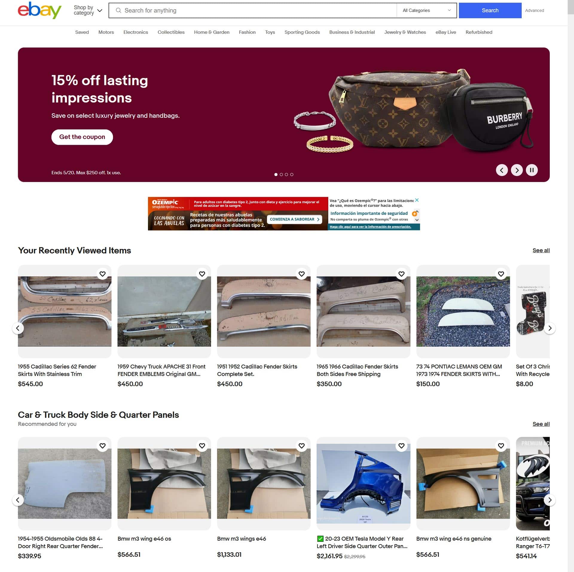
The new design doubles the real estate with about 16 different rows or modules and replaces the larger banner at the top with a smaller module on the right, leaving room to add Recently Viewed, Picks For You, and Continue Searching sections followed by more rows of suggested items, some of which are Sponsored Promoted Listings ads.
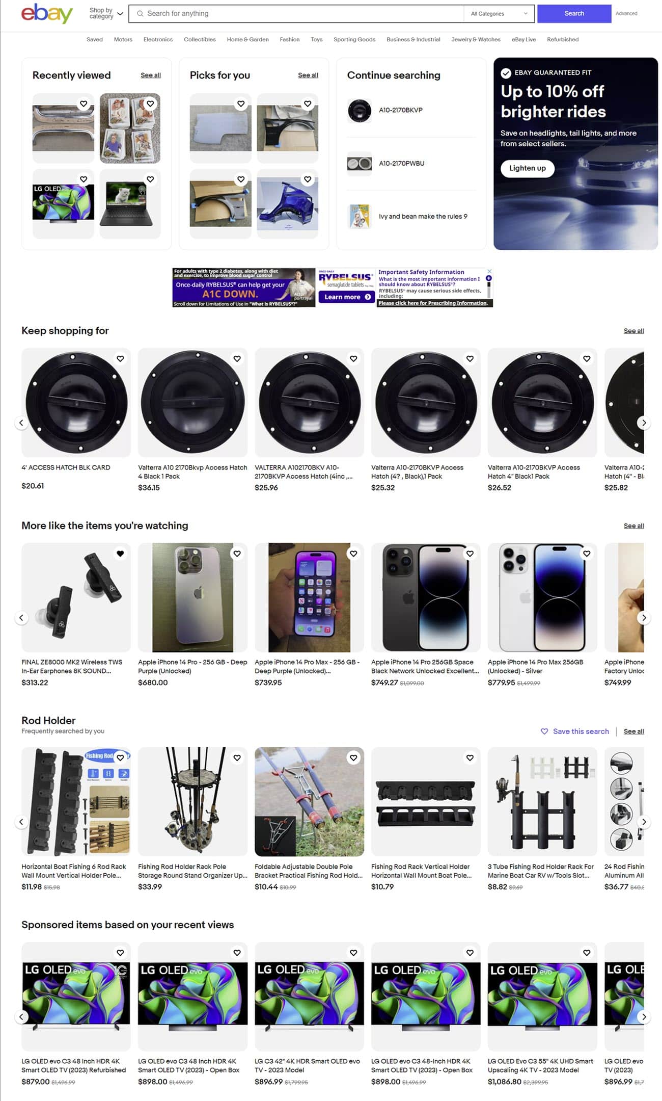
The full width rotating banner carousel has been moved down to the 6th row, followed by more recommendations and saved searches.
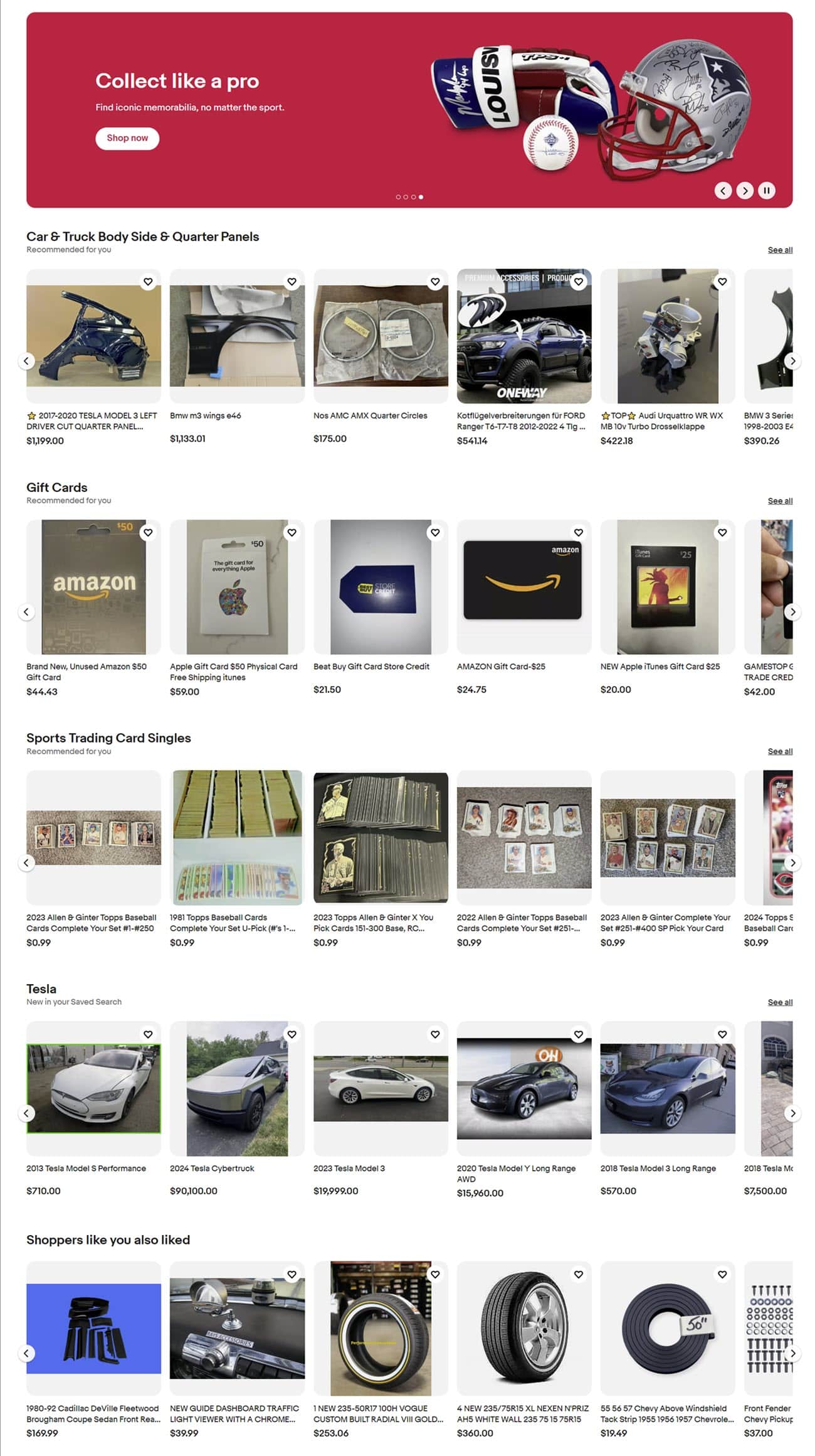
Then another banner with a coupon for Luxury Watches followed by Recommended Sellers, more recommendations based on past searches, gift suggestions, and My Garage.
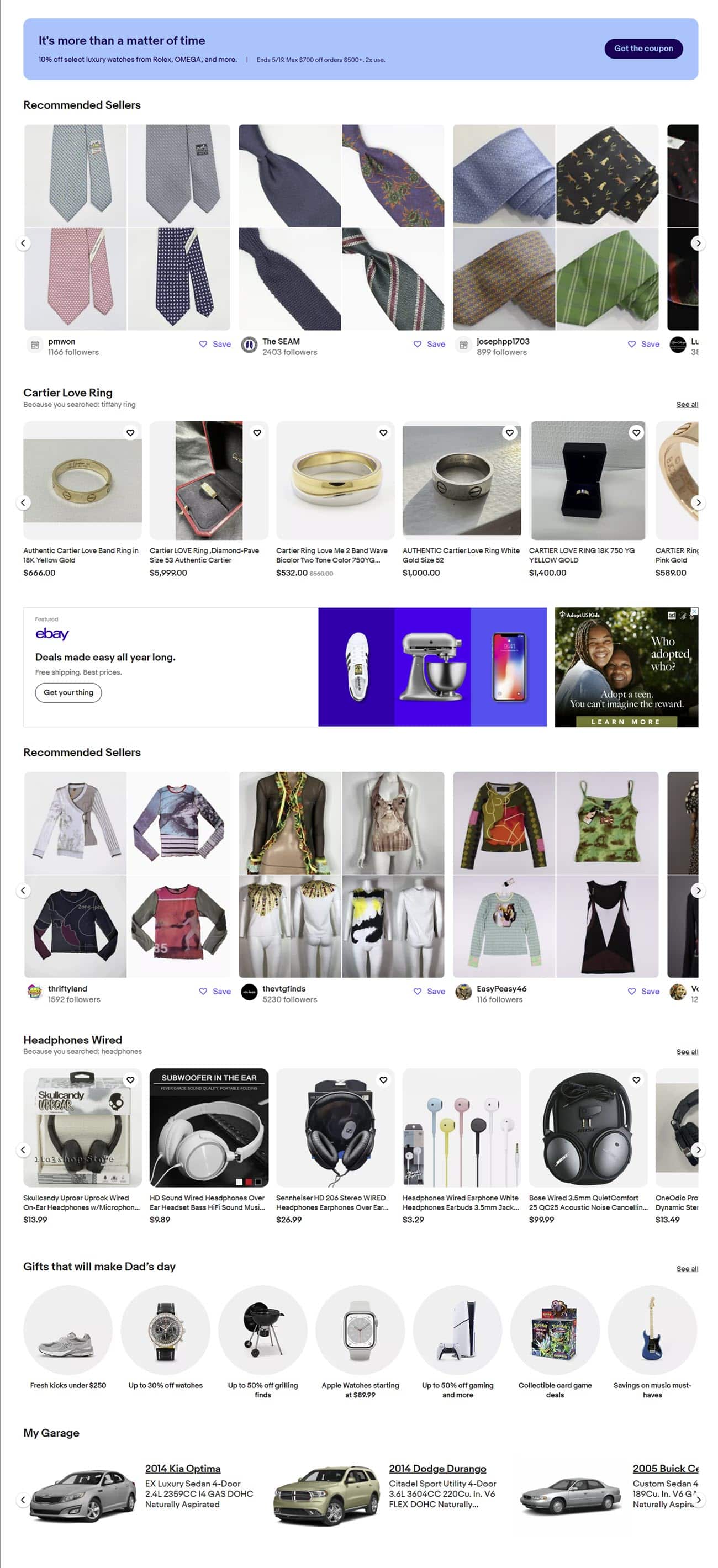
And finally, more banner sections, Daily Deals, the Brand Outlet, and more recommendations that "shoppers like you also liked" with an option to click to see more.
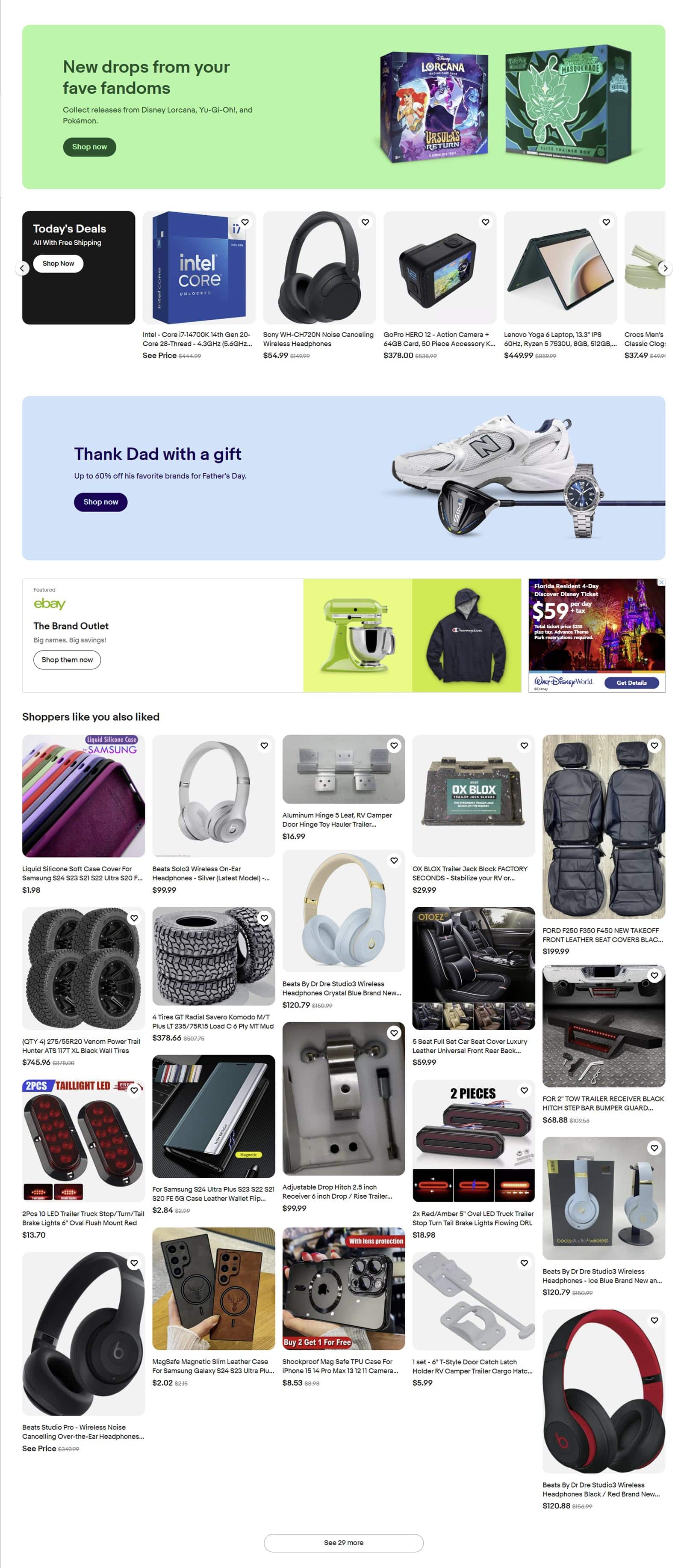
This cluttered mishmash of item thumbnails is hardly a magical experience, nor does it really offer me new and more efficient ways to find what I may be looking for.
What it does offer is expanded real estate for eBay to show more Sponsored Promoted Listings to feed their insatiable desire for increasing ad revenue.
The new design test is not being shown to all users at this time (I'm only seeing it in Chrome while logged in, but not incognito and not in any other browsers) and eBay has made no official announcement yet, so the design could still change before the full release.
While currently many of the modules appear to be showing organic placements, I have no doubt the final version will see that balance tip in the favor of paid ads over time like much of the rest of the site has done.
From over 100 ads plastered on every item page, ever expanding placements in search, to doling out free ad credits to get sellers hooked, using ethically questionable dark design practices to trick sellers into signing up for Cost Per Click ads, massively expanding which sales have ad fees applied with Halo Attribution and more - eBay is on a mission to keep the ad rev rolling in to satisfy Wall Street and this new homepage seems to be designed with that goal in mind!
But the focus on ad revenue growth is missing a key component - the role that Promoted Listings plays in driving higher prices to consumers and how that can actually undermine sales across the site.
I also have to wonder if this testing and tweaking is behind the influx of reports over the last few weeks from buyers and sellers receiving "server down" and page loading errors when trying to access the eBay homepage.

Trying to list for the 2nd day in a row on my anchor store. Keeps saying eBay's Home Page is down. C'mon eBay! Paying $299 a month for my store I need it to work please.

Where's all the stuff?
Our homepage is down, but the rest of eBay is fine. We'll have it back up in a moment.Does anyone know what causes this and how to fix it? It started to happen to me in the last two weeks and seems to get getting worse. I get locked out of ebay and my items do not list.
What do you think of eBay's new homepage design test? Do you have suggestions for how eBay can make the homepage truly modern, efficient and magical? Let us know in the comments below!


