eBay Tests New Variation Listing Form Design; Sellers Say It's Inefficient & Difficult To Use
UPDATE 10-23-24
Sellers continue to be frustrated with changes being made to the listing form design for creating variations as eBay introduces new image upload process that disrupts workflow during critical Q4 holiday selling season.

YOU'RE &()#$(!@$%!892#)(^#@)%*(@&#%(%#@$ KIDDING ME, RIGHT, EBAY??
Every single variation.
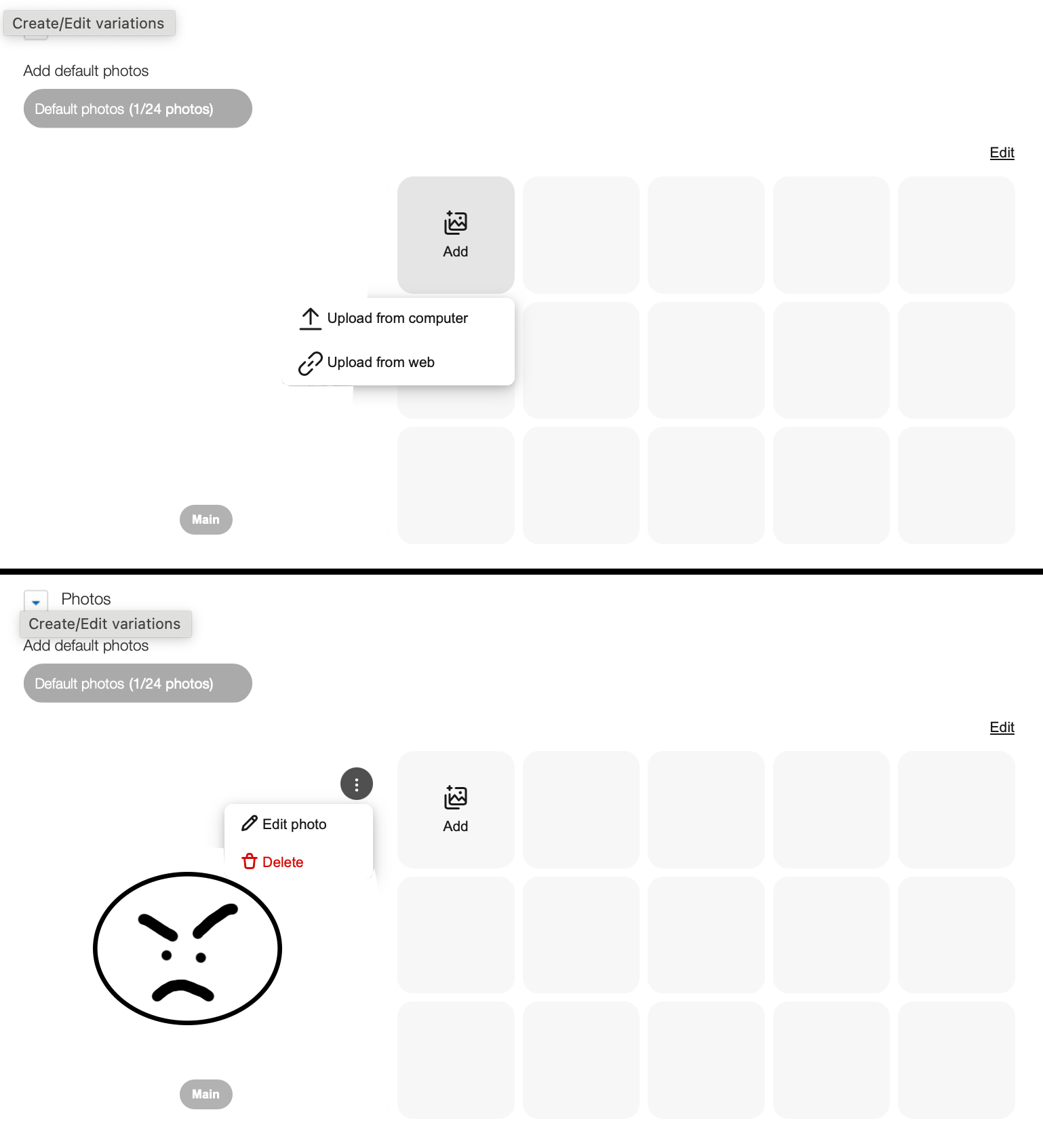
Creating a listing with 12 variations and I have to deal with this bull on the default photos and photos for every single variation. Way to make a 5 min process take a bleeping hour. This is the most inefficient change - even more so than all the other recent idiotic function changes eBay has made lately.
THIS IS UNACCEPTABLE - can you do anything to help us get this reverted kyle@ebay ?!
Why does eBay think it's acceptable to torture sellers that use variations after this bull was already rejected on single item listings?
I cannot take this garbage in the middle of holiday! This big batch of items I've been planning to list this week? Yeah .... hello Amazon, you're the new home for all this new product.
As WastingTime101 mentioned - this change to the image upload function was tested earlier this year in the standard listing form and was pretty much universally panned by sellers at that time.

It's disappointing to see seller feedback ignored yet again and disruptive changes being made at the worst possible time of year.
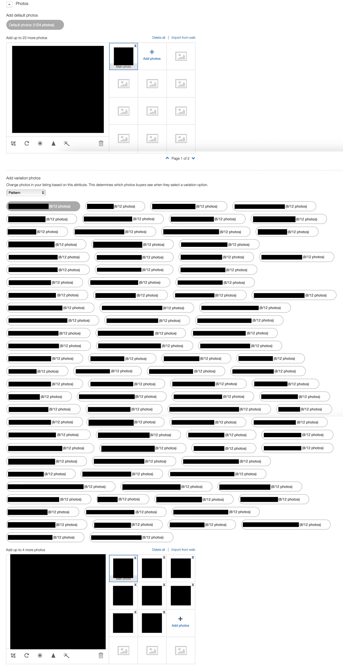
eBay sellers have spotted what appears to be another test of changes to the listing form design, this time replacing the previously straightforward variation creation process with a difficult to read "bubble cloud" experience instead.
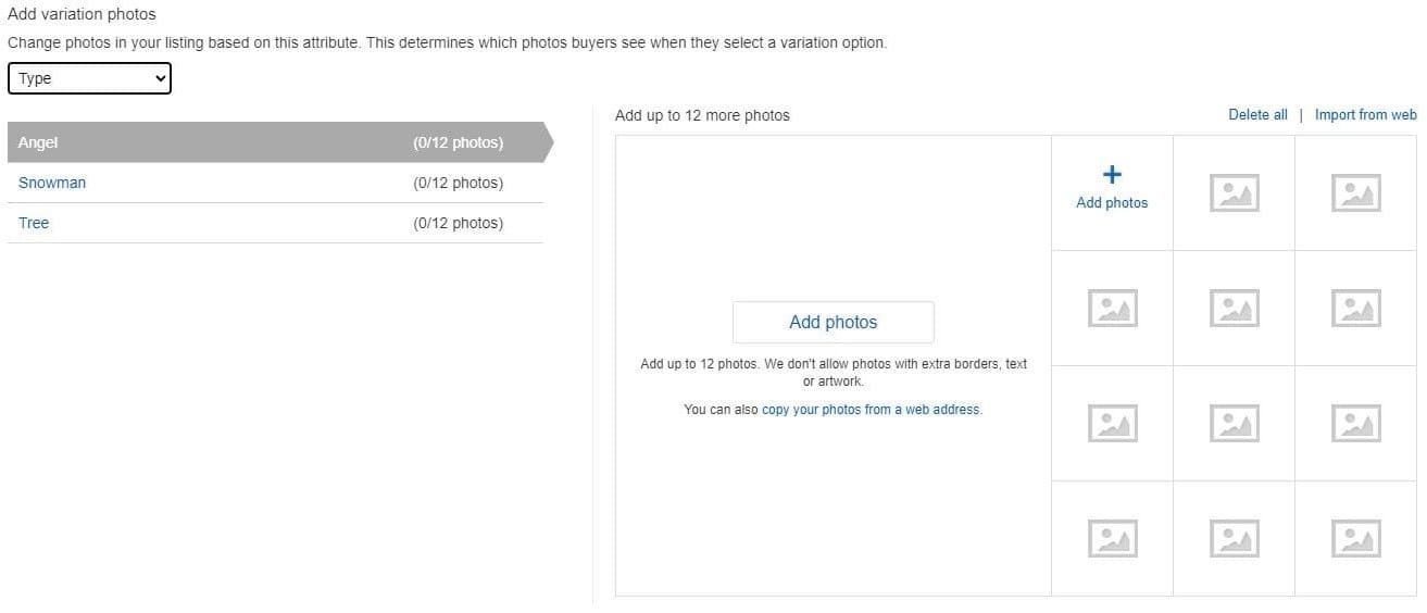
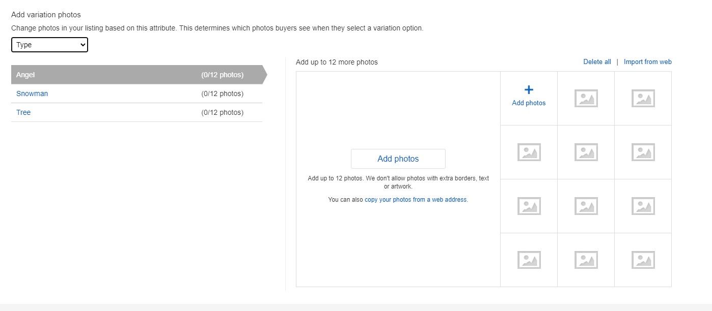
The old (and still current for some users) design uses an easy to follow list flow, where the seller creates the variations by type and then uploads the proper photos for each variation.

But that simple process has changed for some reasons, replaced with a much harder to navigate design.
Longtime eBay community forum member WastingTime101 noticed the changes today, saying they unnecessarily complicate the process and, ironically, waste time.

Is anybody else hating this change as much as I am? Variations are now in a bubble cloud instead of a list. When a listing has a lot of variations it takes forever to look through the bubbles to find the new ones you added just so you can upload pics.
What the hell is with all of these time-wasting changes by eBay? I swear the people in charge of these things do not use the tools they are changing. If they did there's no way they'd move forward with this garbage...
...I get this ridiculous abstract bubble cloud that's difficult to read through and makes the listing and editing process much longer.
I cannot stand inefficient changes that don't improve any part of the process!
Product development team failed with this.
Others did not have the new design (yet), indicating it's likely either a test or phased roll out, but that didn't stop them from expressing their opinions about what WastingTime101 shared.
I can only hope this change is only a test. I remember when the Unified Listing tool came out and I was so relieved that they had not changed this page...and now this piece of carp comes along. I just bought new glasses to read the computer screen, and I can already tell they will not help with this abomination.
This change will be a real nightmare for me when (if) it rolls out on my account. Because my ornaments never come out the same every time I make them, when one sells I make another to replace it. I have to edit the listing and change the photos so buyers will see what they are purchasing.
All of those little bubbles are very difficult to track with my eyes to find the option that needs new photos. Many of my variation listings have 40+ options...that is a lot of little bubbles to track with my eyes. The list view is much easier to view for me.
This test appears to be just the latest move in eBay's recent efforts to tweak the selling user experience, with often disastrous results that are widely disliked amongst the broader seller user-base - like recent changes to the Active Listings page and other areas of Seller Hub.

Are you seeing this test of a new design for creating variation listings on eBay? If so, let us know what you think of it in the comments below!


