eBay Updates Listing Page To Highlight Descriptions
Buyers not reading description information is a perennial eBay seller complaint and now it appears eBay may be tweaking the listing page design to try to help.
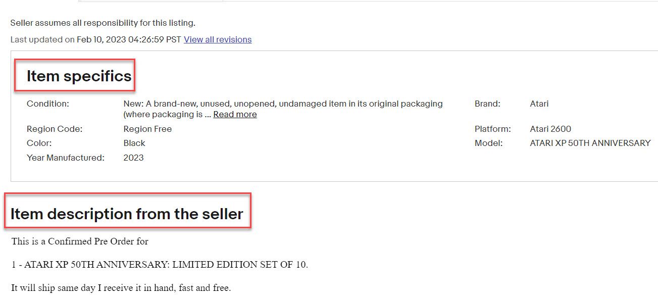
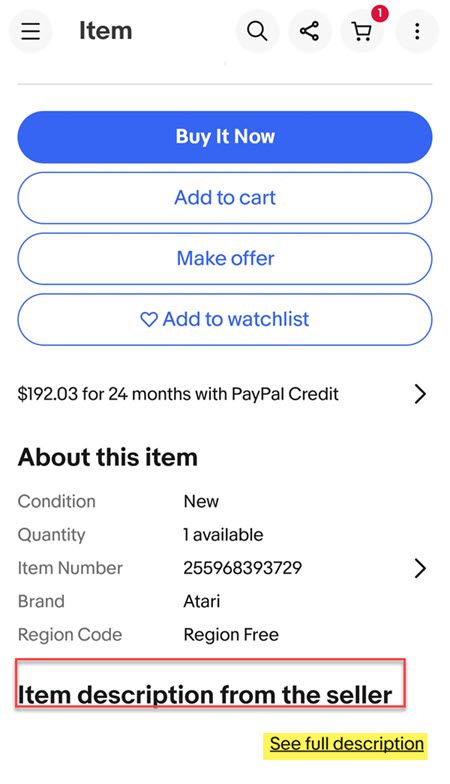
Sellers in the eBay community are discussing the change which makes the seller description heading in a large, bold font to draw attention.

I think it's new unless it's been rolled out to others first, but I noticed a short time ago that eBay has now added a notice beneath the item specifics to let buyers know what follows is...
Item description from the seller
yep-----saw that, I'm guessing they finally realized that description is hard to find if it's only one line....amongst all the other "stuff" they throw into listings........ I think it's a good change.
I agree...and it's even more useful on a phone, where it definitely helps the description to stand out.
But I admit, I do wonder....is this the first of a number of changes coming to the listing page display? Probably a good idea to keep an eye on the listing page....
Here's what the new design looks like on web:

And on the mobile app:

While this is a welcome update, it remains to be seen how effective it will be at alleviating issues with buyers not viewing important seller provided description information.
eBay is still testing Quick View in Stores that bypasses the description all together and allows buyers to skip right to checkout without ever even viewing the listing page.

And with so many promoted listings ads plastered on every page, it may take more than a larger bold font to cut through the distractions.


What do you think of the larger bold font to draw attention to item descriptions? What other changes would you like to see eBay make to the listing page? Let us know in the comments below!


