eBay Updates Saved Search Experience
eBay has changed the way Saved Searches are displayed on the site and many users are not thrilled with the new experience.

Did anyone else get the New Saved Search Page .Instead of being able to stroll down to get to the search I want,now I have to close my bookmarks or half of them are cut off.
I hate the pics/searches going across the page like that and telling me its a better experience for me.
I haven't seen a better experience on here buying or selling for years.

I just woke up to find ebay's latest monkeying around. I absolutely hate the new look of the My Favorite Search page! Not only the look, but also the the two options of Date Added or By Name option. Apparently, they want you to only use Date Added. I prefer the orderly By Name that is in alphabetical order, but everytime I would look at an entry it would change back to Date Added.
Leave Things Alone! If it ain't broke .... don't mess with it!

I just got a load of the new saved searches page and I have to say ebay has outdone itself on this one - what a horrible design and complete mess! It looks like a page for idiots. Why do they feel the need to change things that are just fine the way they are?
I actually deleted all of my saved searches because I cannot stand looking at that mess. Ebay is slowly losing me as a user - really been going downhill for the past several years now.
Here's what the new saved search page looks like, with the previous text/list design replaced by images instead.
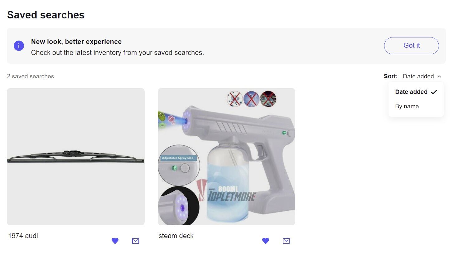
I tried to test out the sort option but got an error message, which may be what some users were complaining about with not being able to sort by name.

Another user suggested using the link to the Saved Searches feed as a work around, but it isn't much better (I've been told it's been this bad for a while now - yikes!)
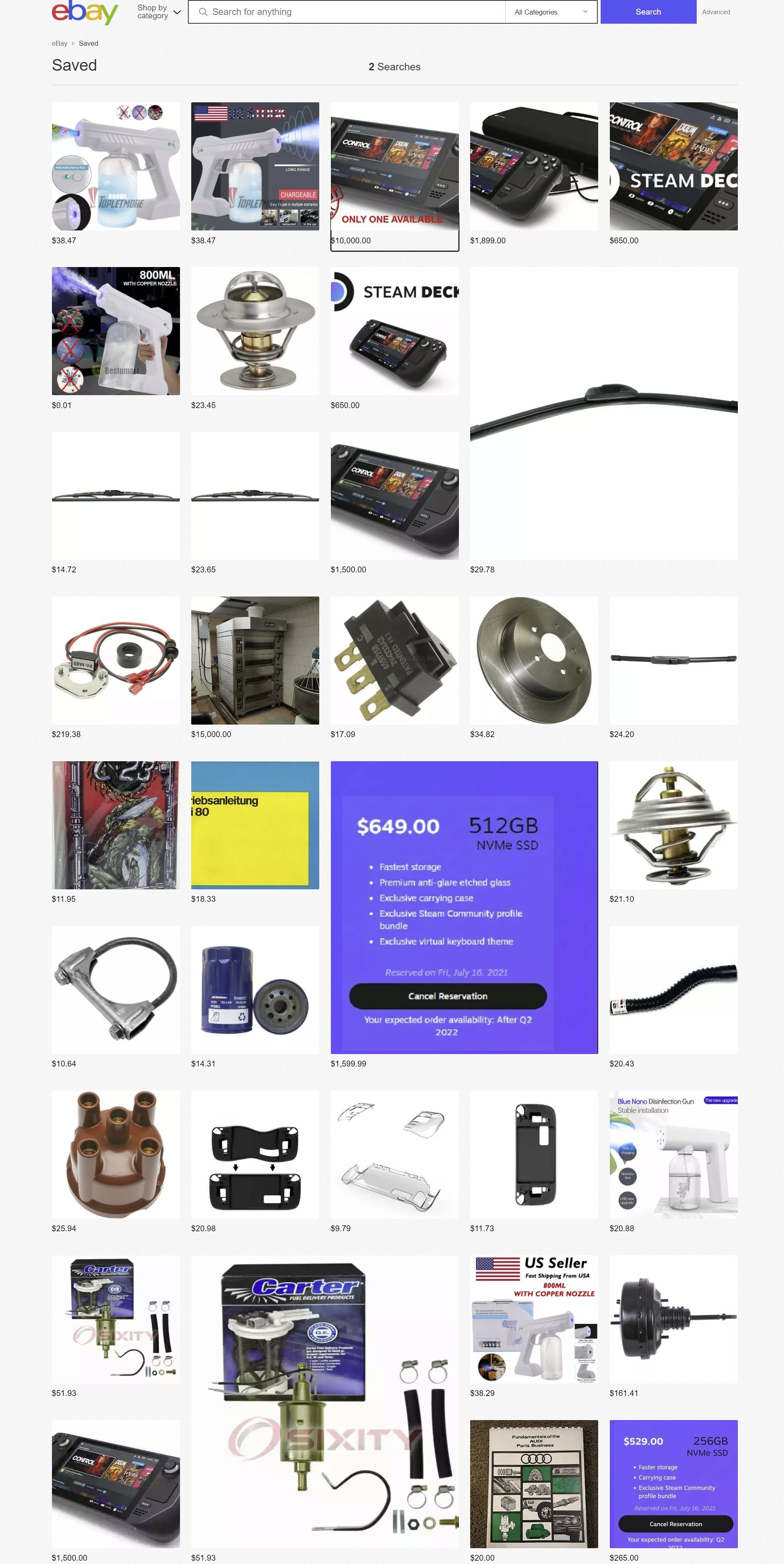
This lay out is clunky and not a great user experience at all. For example, you have to hover over each item to see a partial title.

Even worse, when you click on it, it doesn't just immediately take you to the listing - instead it pops up a screen where you can add to cart and check out all without being bothered with seeing pesky things like an actual product description, which would require an additional click.
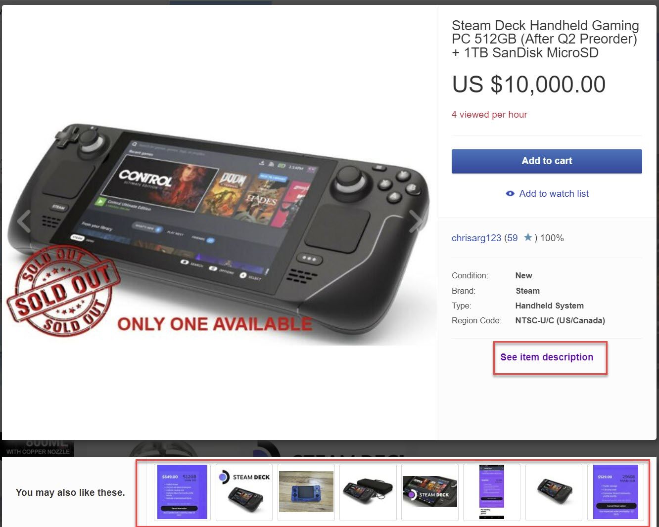
The fact that there's apparently no room on this screen for even an excerpt of the description but plenty of room to stuff in 8 Promoted Listings ad slots tells me everything I need to know about eBay's priorities with this new design.
Unfortunately, without seeing the description, you could be missing some very important information - like the fact this listing violates eBay's presale policies, doesn't include certain items and does include a not manufacturer supplied MicroSD card.
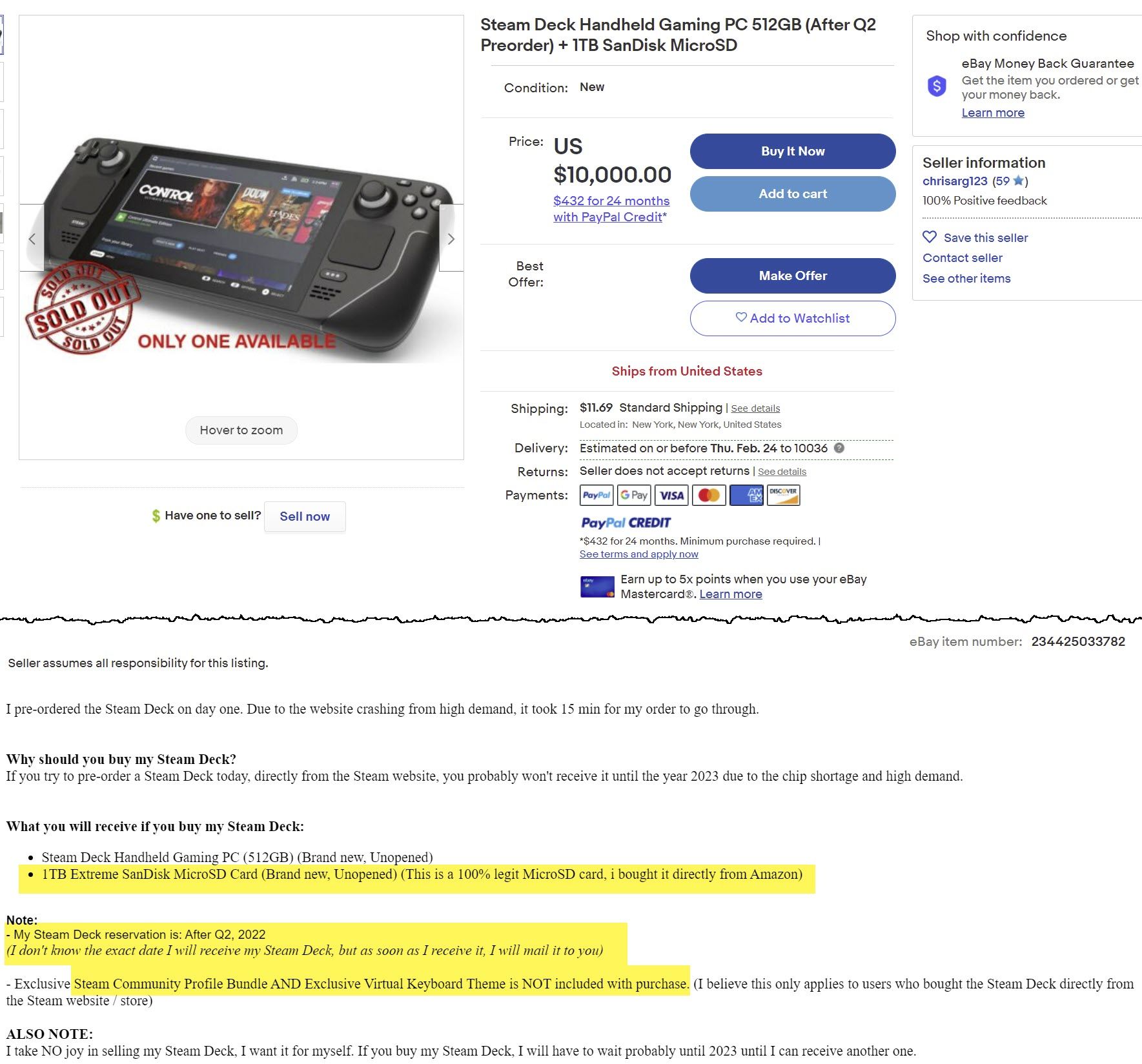
Despite the seller's statement to the contrary - buying it directly from Amazon is no guarantee of it being "100% legit", as my friends at The Counterfeit Report can attest.
Are you buying your computer memory on @Amazon? This 64GB microSDHC memory card is a #COUNTERFEIT and may install malware. @Amazon is flooded with fakes, #fraud, and scams. @SD_Association pic.twitter.com/ERBbUIqJ1z
— Counterfeit Report® (@Counterfeit_Rpt) December 24, 2020
What do you think of the new Saved Search experience? Love it or hate it? Let us know in the comments below!


