eBay Testing New Thumbnail Display For Variations
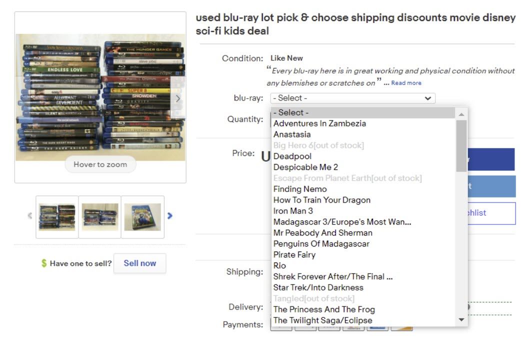
It looks like eBay is testing out some changes to how variation listings are displayed. Previously, if a seller used the variation option it would show as a drop down menu on the listing.

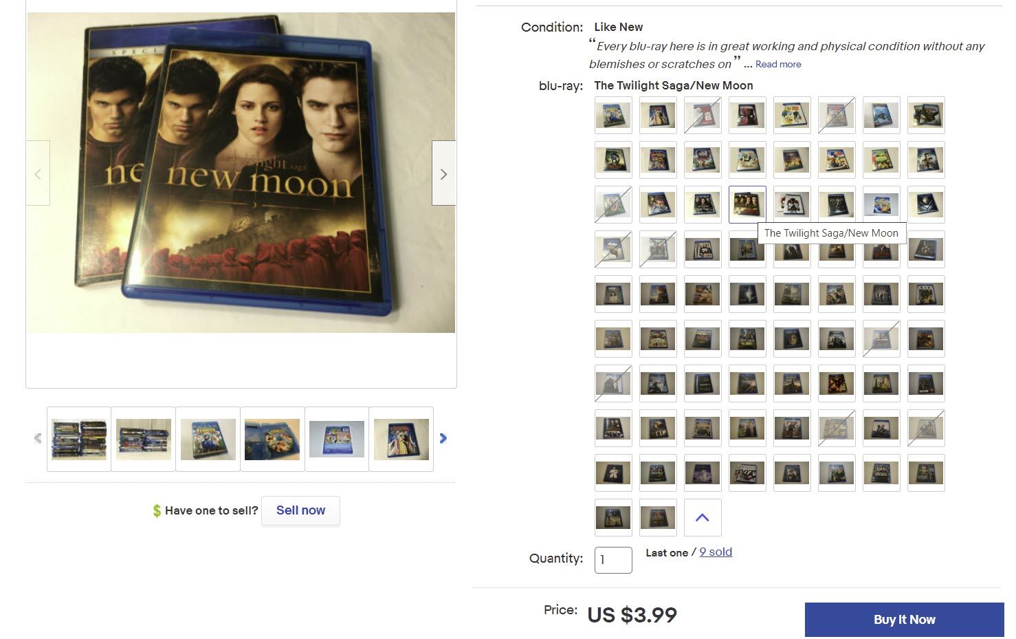
eBay appears to be moving toward a thumbnail based experience instead. For listings with a large amount of variations, it lists shows a few thumbnails and then a + icon to indicate there are more options.

Clicking the + option pops open a full list of thumbnails. The main image on the left automatically changes as you cover over different thumbnails.

On the mobile app, there is still a drop down menu, but once you select it, the list now also has thumbnails.


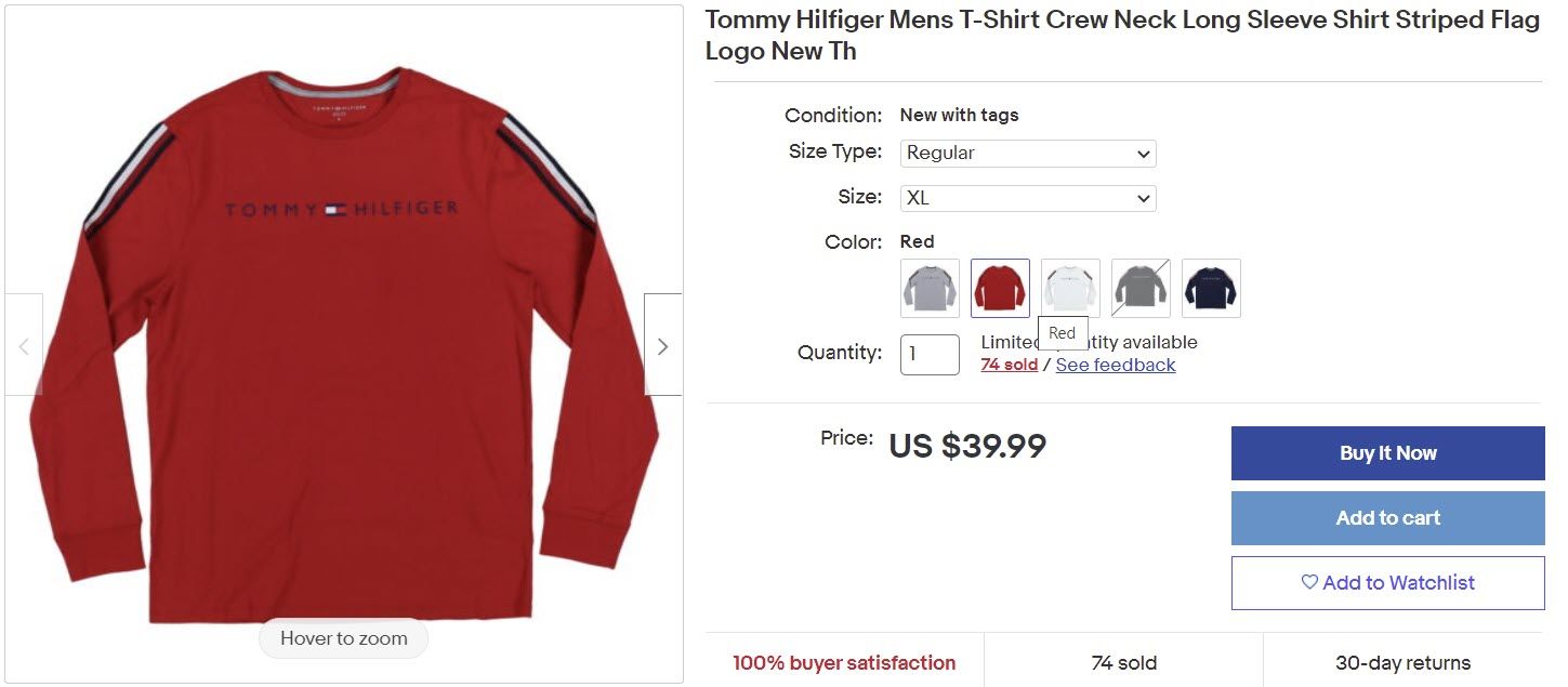
In some categories like clothing, it looks like there are still text drop down menus for attributes such as type and size, but color has thumbnails.

This doesn't appear to be a sitewide change just yet. I'm not seeing much rhyme or reason - some listings still have the old view and some have the new view across multiple categories when using the same browser, so the test doesn't seem to be category or browser specific.
What do you think about variation listings with thumbnails? Love it or hate it? Sound off in the comments! 👇
Follow Value Added Resource on Twitter & Facebook ✔
Subscribe to receive eBay news, tips, and insights in your inbox 📧


 BtrS
BtrS


