eBay's Fresh Design For Seller Markdown Sales Dredges Up Old Terms & Conditions
eBay has been on a yearlong journey to completely revamp the View Item listing page and a new change spotted today brings a fresh look to how seller's markdown sale discounts are displayed, but the terms and conditions section is a blast from the past.
Sellers generally like the new design, saying it is eye catching and draws more attention to their discounted items.

I was shopping a few minutes ago and noticed a new row of listings (new to me anyway) right under the feedback module on the listing page.
It appears the row is dedicated to the seller of the listing to showcase items that are in the same promotion (coupon code, markdown, shipping discount, etc) as the original listing. Although I am not a big fan of all the listings cluttering listing pages, at least this row shows items from the same seller as the original listing.
The row itself is not new. The visual display is new.
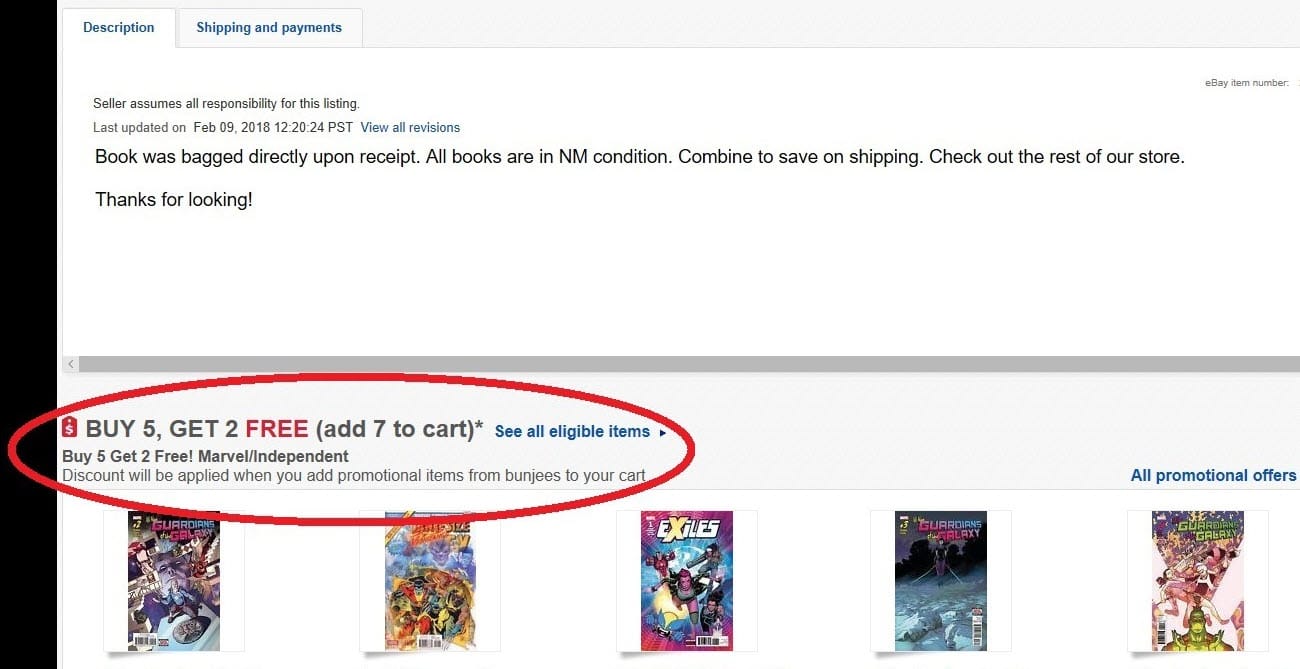
Previously you had a slim banner advertising the promotion with listings below.
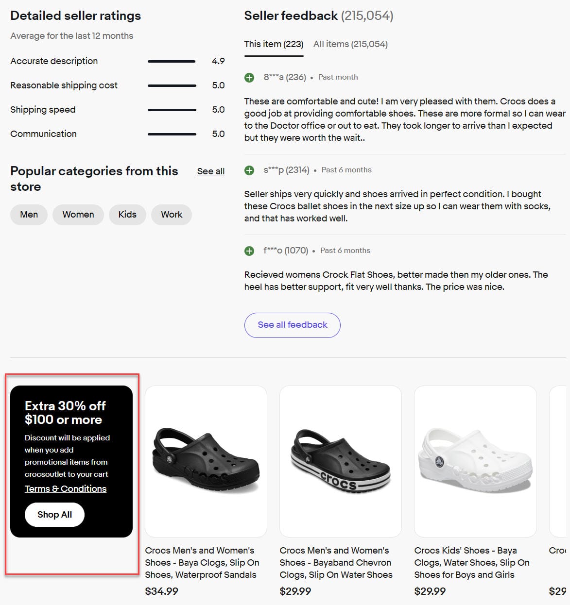
Now you have a black box taking up the first listing slot with listings to the right.
I primarily use Markdown Manager, and something similar has been around for a long time. However, the overall design---the black box on the left, for example, is new. I would say it is an improvement in an existing feature.
The old version looked similar to this:

And the new version looks like this:

The buyer can click Shop All to see all items included in that particular sale offering or scroll right to see more items.
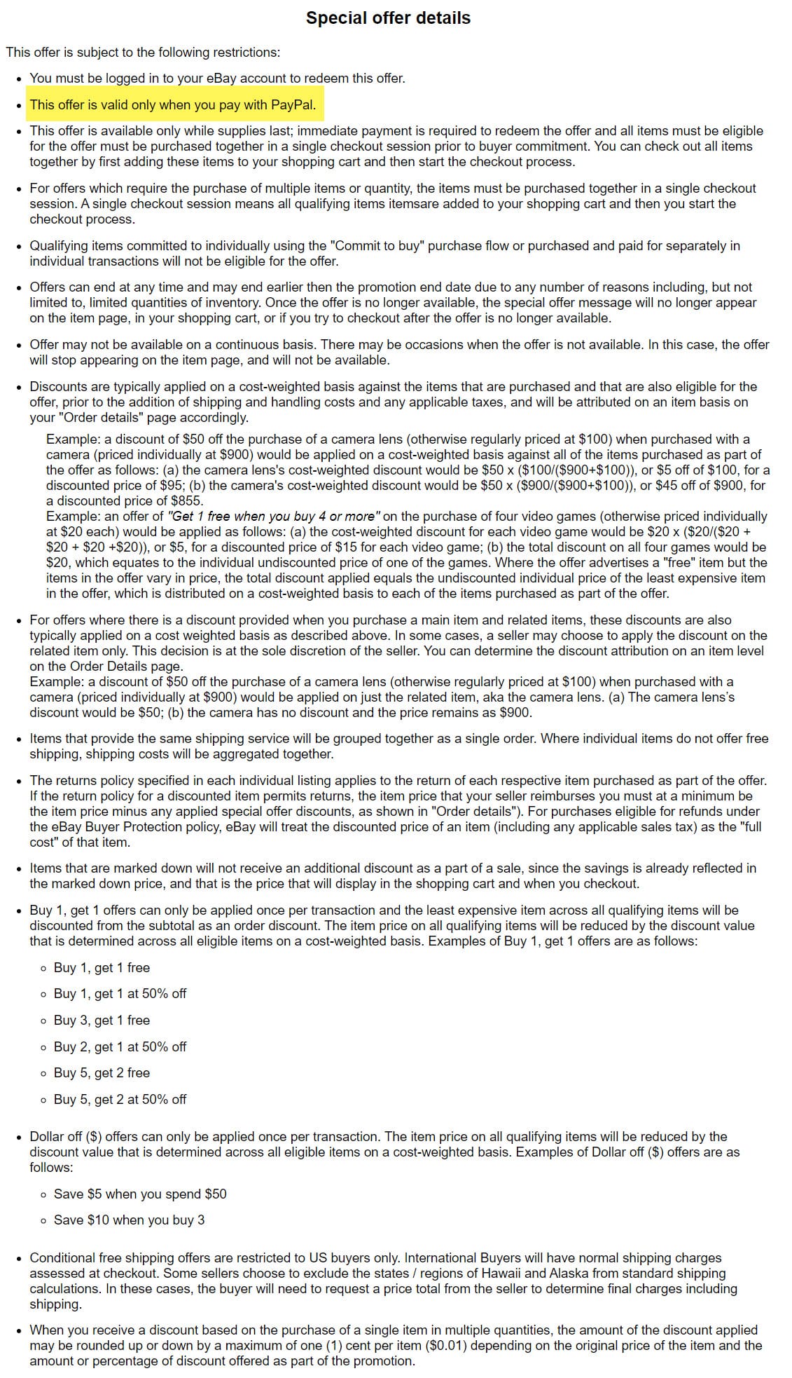
The Terms & Conditions link is also noteworthy. Within the Seller Hub flow for creating markdown sales and promotions there isn't a section for sellers to set their own terms and every listing we've checked shows the exact same verbiage, which begs the question - where is eBay pulling this information from?
A quick scan pulls up some obviously erroneous and outdated information, like the discount only being valid when buyers pay with PayPal.

Hopefully eBay intends to allow sellers to actually enter their own terms and conditions here and this is just an embarrassing premature launch gaffe, otherwise we can expect to see a lot of confused buyers trying to figure out what the terms actually mean and whether or not they really apply.
What do you think of the design change for display selling markdown sales on listing pages? Let us know in the comments below!


