eBay's Unified Listing Experience
As part of the Spring 2021 Seller Update, eBay is rolling out a new listing tool. Here's what eBay has to say about the Unified Listing Experience.
In today’s digital world, it seems as if we are constantly shuffling between devices, whether it be the phone in our pocket, computer on our desk or tablet when we are on the go. With all of these devices at our disposal, it’s important to have systems in place that provide the same user experience no matter the device we’re on. That’s why we have launched a new unified listing experience for our sellers that is seamless across all platforms.
Public reaction from sellers who got an early look at the new experience was not positive. eBay's VP of Seller Experience Harry Temkin even got involved in one discussion and promised seller feedback on key issues would be addressed before the experience was rolled out to the masses.
The main point of criticism from sellers has been about the design. In attempting to make one experience for all devices, eBay has clearly favored mobile over desktop design and functionality.
I won't go through each step, as that would make for a very long post, but just as an example, here's what the old business listing tool looked like:

In the Unified Listing Experience this same section now takes multiple clicks.

Clicking edit pops out a side curtain.
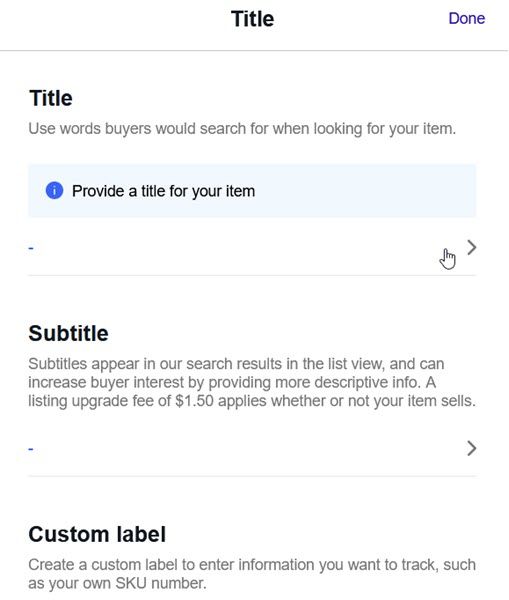
And then you have to click again to get to the box to actually type your title.
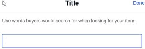
The entire listing tool is like this - every section now requires pop outs and additional clicks just to enter information that used to be all on one page.
I'll focus mainly on pictures now (pun fully intended). We all know just how important pictures are to the success of your listing - they can literally be worth a thousand words, or a thousand dollars.
The old business listing tool picture upload section looked like this. Again, everything in one place and it was easy to see how to delete pictures if needed or copy photos from a web address (helpful for multi-channel sellers who may have pictures hosted on their direct ecommerce sites).
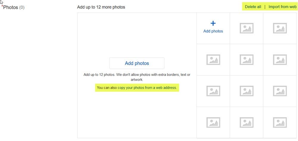
If you're missing either of those functions in the new Unified Listing Tool, here are a couple tips.
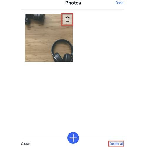
There's no obvious "delete" button - you have to click "edit" first. Side note - I really wanted to crop out all the white space in these pictures to save space, but apparently eBay has no such concerns for their own pages.
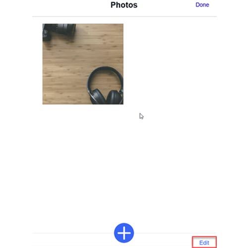
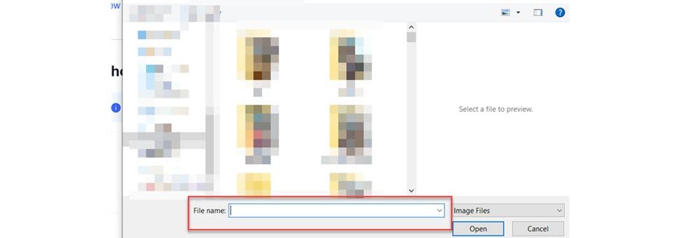
If you prefer to add pictures using an image URL, there's no obvious way to do that any more either. However, the few tests I did with random image URLs seem to indicate if you paste the URL in "file name", that should still work.
Harry Temkin has spent a lot of time talking about the Image Clean Up tool for removing backgrounds in images to make them more web friendly. Bringing this tool to desktop users was supposed to be one of the main benefits of the Unified Listed Experience.
I chose a stock photo of headphones and a camera on a table to test it out - seeking to replicate what some sellers may try to do with this tool.
How it started:
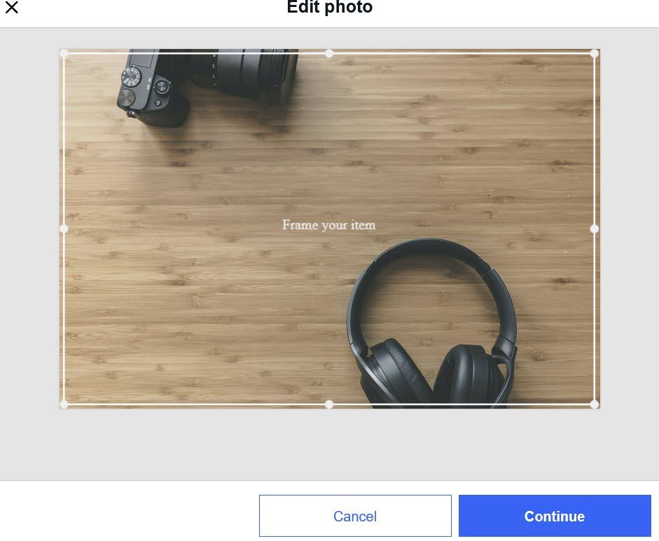
How it's going:
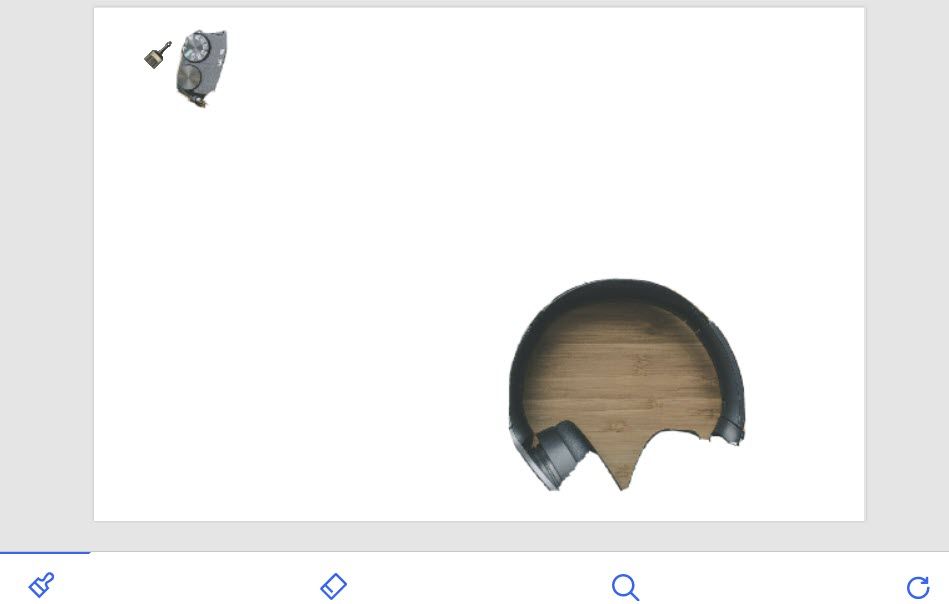
Ok, so the tool obviously had some difficulty separating the background and foreground colors in this one. eBay has built in some tools to help with that too.
The brush icon on the left allows you to "paint" an area that was deleted to bring it back. The problem is, since it was deleted, it's impossible to know exactly where to paint to get only the areas you want back in the picture. You can't control size of the brush and there's also a bit of lag, so it's difficult to get consistent results.
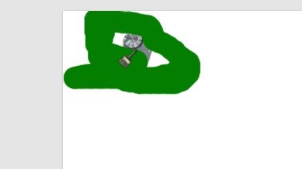

The eraser icon allows you to "paint" an area to erase. Zooming in helps a little, but again you can't control the size of the brush and it's very difficult to cut out just the area you want, but leave the rest.
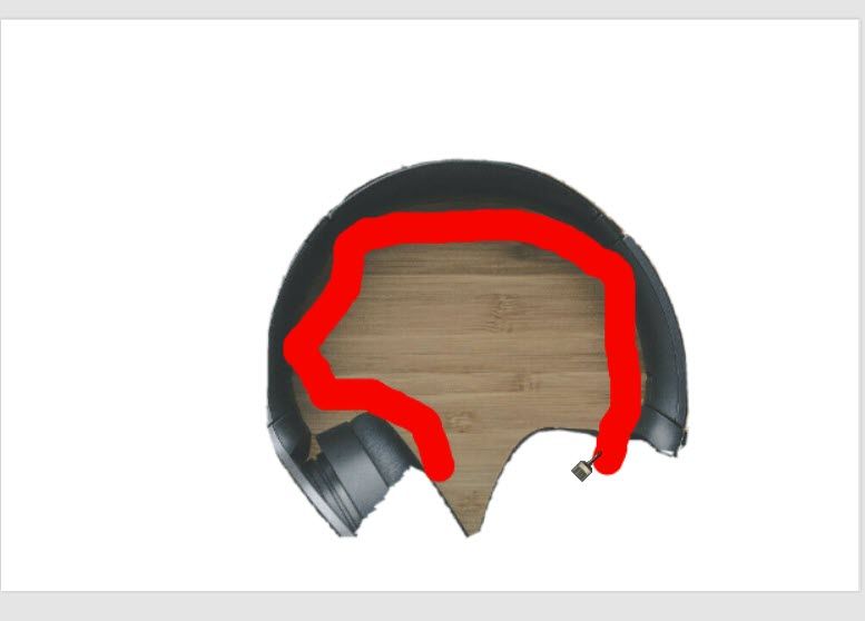
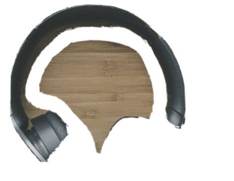
Bottom line for me - I will personally never use the Image Clean Up tool. If it's likely you may end up having to retake the picture on a different background, or spend a lot of time trying to edit and refine the results, you might as well save yourself the time and frustration and just use your favorite photo editing tool in the first place.
The new Unified Listing Experience seems to continue a recent trend at eBay of rolling out new experiences and tools that don't appear to have been fully tested (like the Listing Quality Report). There also appears to be a pretty big disconnect between the product development teams and actual users when it comes to "how things should work" on eBay.
Too often it seems eBay chalks these things up to sellers simply being resistant to change rather than taking the time to understand what it is that sellers really need and how they use the platform on a daily basis to conduct business.
If Harry and his team are serious about creating useful tools for sellers, it would be in their best interest to get more sellers involved during the product development and testing phases, rather than having to go back to the drawing board after releasing a "not ready for prime time" product.


