Etsy Adds Compare With Similar Items Module To Listings In App, Directing Buyers To Competing Items
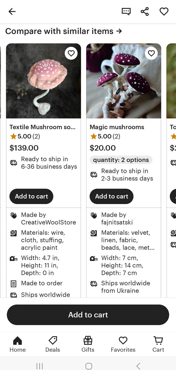
Sellers have noticed a new way Etsy may be directing potential buyers to competitors, with a new "Compare With Similar Items" module added on listings in the app experience.
Ads for competing products and other "see similar items" features have been standard for years or tested at various times on the platform.
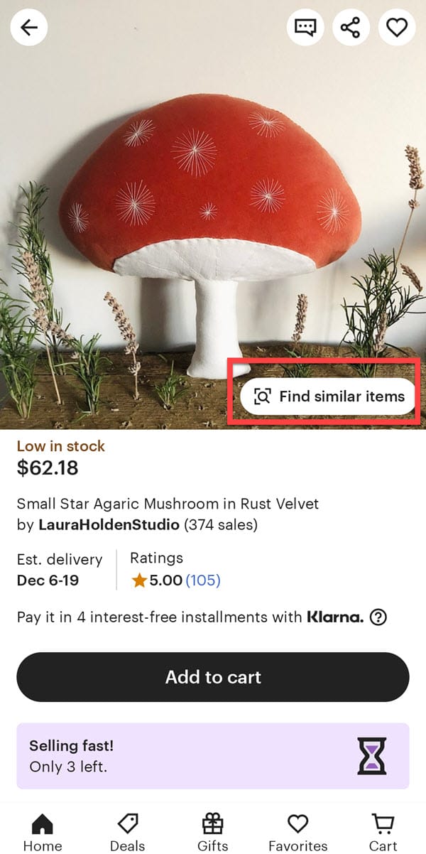
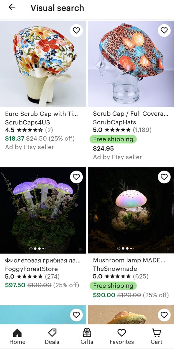
In fact, currently in the app experience, Etsy also adds a "find similar items" overlay on the listing images that takes the user to a Visual Search - though clearly the AI still needs a little work to understand what the item actually is beyond just the general shape.
Note - this listing was chosen at random from items offered on the main home page while not logged in.
But this new addition expands on the idea by allowing buyers to directly compare main images, ratings, prices, materials, shipping speed and other details in a side by side scrolling display.
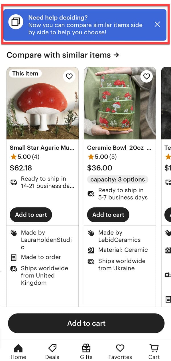
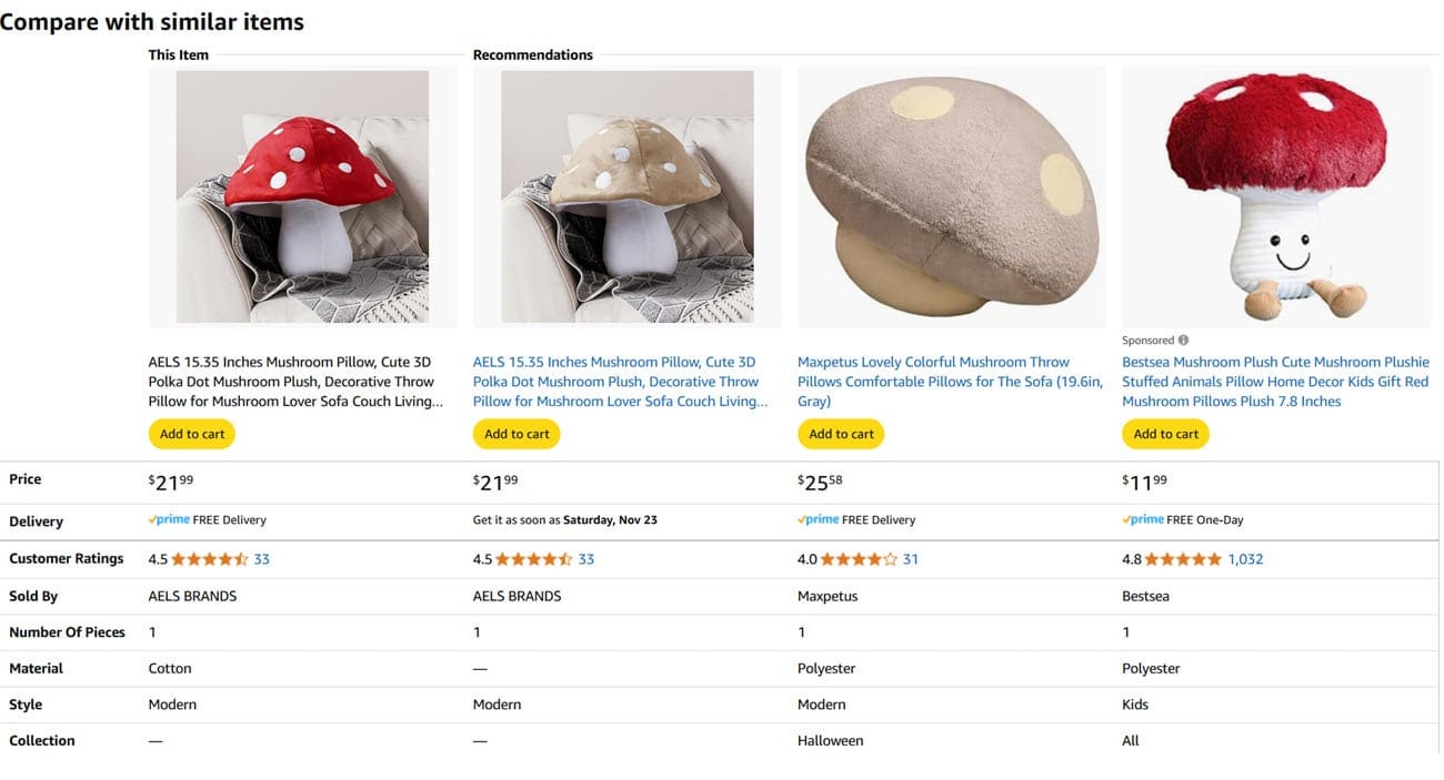
If you think that looks somewhat familiar, you probably shop on Amazon too.
Online marketplaces of course generally don't care much about which merchants get an eventual sale, only that a sale takes place on their sites so they can collect their fees, which can often put their goals/ideas about what is most likely to convert a browser into a buyer in opposition to sellers whose primary concern is growing their own individual businesses.
But the incessant influx of advertising across these sites can also backfire or reach a point of diminishing returns if they lead to "analysis paralysis" where potential buyers are overwhelmed or distracted by too many options being presented or if the ad placements become disruptive - like eBay has done with 300+ ads on every listing page, plus encroachment into watch lists and purchase history pages.

What do you think of Etsy's new Compare Similar Items module in the app? Let us know in the comments below!


