Etsy Testing Hides Seller Descriptions Behind A Click Wall
Etsy is once again testing changes to the item page display that hide important seller provided description information, forcing buyers to take additional action to display the description - if they even notice it at all.
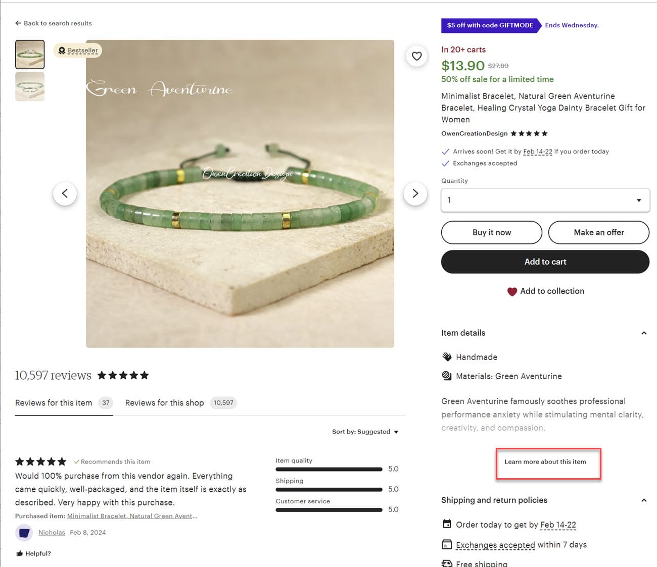
Here's what the existing item page display looks like with item details on the right showing the beginning of the description and only requiring a single click if the buyer wants to read the rest.

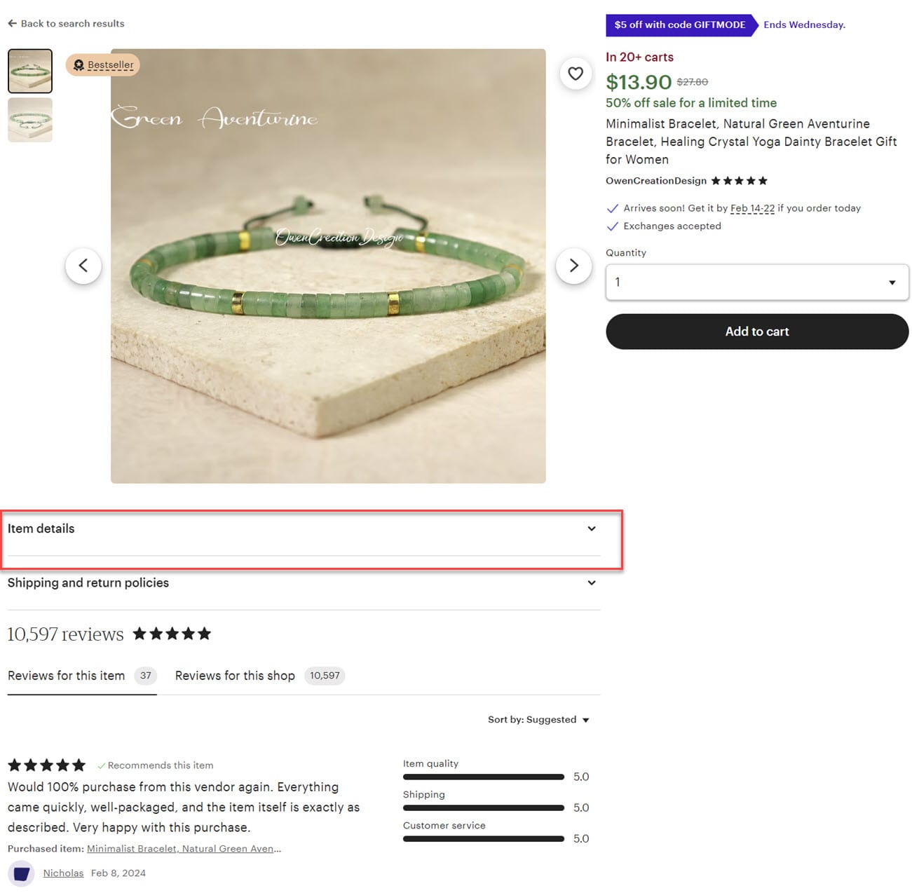
In the current version of the test we are seeing, the item details have been moved below the image and above the reviews in a separate section that does not show any part of the description text without clicking the down arrow.

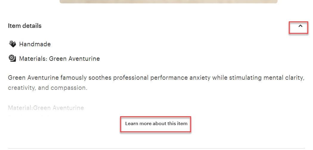
Once you click the down arrow, you then see the truncated description.

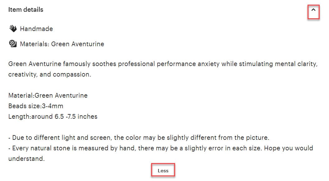
And another click is required to see the full details.

Etsy has tried similar changes at various time including January 2023, June 2023, and September 2023, all with significant pushback from sellers concerned that hiding their descriptions will increase returns and cause negative buyer experiences.
Predictably, sellers are not thread with this most recent attempt to force their descriptions into hiding, airing their concerns in the Etsy community.

Once again...descriptions & shipping info are “hidden” directly above reviews rather than on the right of item page as before.
PLEASE fix this stuff Etsy. Finding a tech person that can properly write HTML is a great start. Someone that has Actually Sold on this platform (lately) would be fabulous. [extreme eye roll]
Soooooo Frustrated with all of the Etsy issues in the past year or so.
I don't have it in this shop but I have it in my other shop. Totally blank on the right side. Left side reviews as big as ever and description and shipping hidden under tiny links. sigh.

I was just looking at a listing to see where it shipped from. Couldn't find it. At some point today they moved everything again (hopefully it's just another stupid test and only temporary). Everything is now again under the photo and collapsed. It's the collapsed that really bothers me. Want to put it under the photo? Fine. Just put it under the photo. I shouldn't have to click every time I need a speck more of information.
Who at Etsy believes these are a good idea?
So if we did happen to get an increase boost because of the big ad yesterday, is that now going to count as increased sales in this stupid test? Sorry, I mean 'experiment'.
Yeah, just noticed it a few minutes ago.
The first time they hid the important info this way, I said ''wth? where is it?!''
This time, I said ''oh come on! Not this **** again.''
All that blank space on the right side of the main photo in the listing! Why would a buyer even think to look UNDER the photo for the description and shipping details which are both HIDDEN unless you click on the tiny arrow? This is a really bad change, and I hope it's just a glitch that gets fixed very quickly!
Etsy resorted to spending money on a Super Bowl commercial and "gift mode", but did they ever stop to think that stability and consistency are the keys to getting buyers to purchase and come back to be loyal customers? People do not like change. If it is a good change and a slow change, they love it. But changing just to try "things" is not good for anyone.
Now I am in this ridiculous test - and I hope not many of my buyers are. Just stop this Etsy! It's hard enough to get buyers to read descriptions and now it's practically an Easter egg hunt to find product information. Enough already.
One seller says they hope if anything positive comes from Elliott Investment taking a 13% stake in the company and a board seat, it should putting a stop to this type of testing.
If the only thing Marc Steinberg (Elliot Investment Management) does is pressure Etsy to stop or slow testing, I’d be a happy camper (well, that and fix search….oh and kick off resellers/infringers…and maybe, I don’t know, communicate). From a customer standpoint, it’s infuriating…like trying to pin the tail on a moving donkey. Nothing is in the same place two months running.
ETA: I’m also back in this test - sigh. We really, really need a break. Etsy should just pick a lane and stick with it.
Are you seeing this new Etsy item page test? Let us know in the comments below what you think of the description being hidden behind a "click wall".


 cwi
cwi


