Etsy Sellers Cheer New Test Directing Buyers To Shops
Etsy testing is usually dreaded by sellers, but this time a new test directing buyers to view the full shop is being enthusiastically received by sellers.
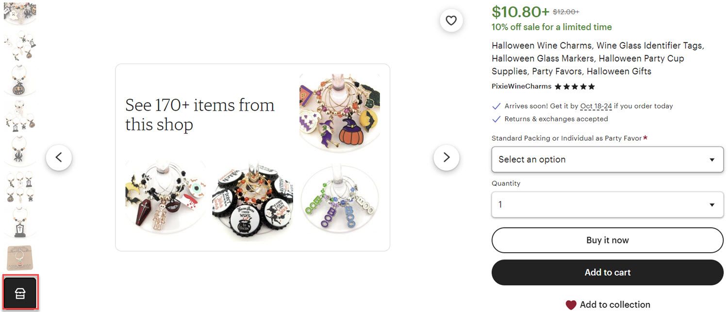
Users who are currently in the test are seeing a Shop icon at the end of the list of images.
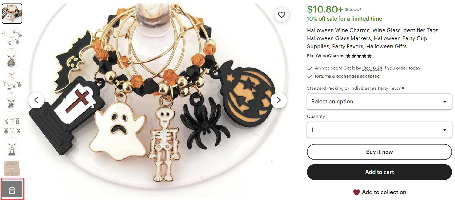
Clicking on that icon presents a clickable image with thumbnails of other items that leads the buyer to that seller's main Shop page.
Etsy has previously toyed with similar tests that were not so well received by sellers, including linking titles back to search for competing items and adding a search icon in the same place as this Shop icon diverted buyers back to search, again for competing items.
Using that space to help buyers find more interesting items offered by the same seller is a different, and welcome, approach.
Here's what sellers in the Etsy Community had to say:

Finally, something that is not sabotaging our stores.
I noticed this last night, and was pleasantly surprised! A fabulous way to keep a buyer in a certain shop (if the buyer is interested in viewing everything in that shop, that is), so they aren't led away by other shops' ads, "you may also like", and end up down the Etsy rabbit hole, and they've already forgotten what shop they were in first.
I also like the clean white background, and how minimal it is.
Just saw it on my listings - great job, Etsy!!! Clicking into a listing, a black picture with a white storefront logo has been added as an additional 11th picture (I always use all slots). Clicking on it shows a collage of 4 items from my shop. Clicking on that takes me to my store.
Looks clean, and works intuitively. If this is a test, I sure hope they keep it!
I just saw this also, Yay- progress! Please keep this version for us, makes so much sense to bring potential buyers to the shop for more items by the same maker.

Is anyone else in this test? I just clicked through the photos of one of my listings and it was a pleasant surprise. Thanks Etsy! That's quite helpful.
I just looked and yes I am also in the test. Love it, very very cool!
This is finally something that etsy has done right! I love it and from other posts, it seems that everyone is quite enthusiastic about it.
However, one seller cautioned the "good news" may come with a catch - they say they are seeing more ads on their item pages now, though it's not clear if this is related to this test or not.
I'm in this test I saw it yesterday for the first time in my shop and thought that's great.
I then went looking and noticed that I now have an additional 6 more ads from other sellers at the bottom of my listings where it says
"YOU MAY ALSO LIKE"
It used to be 12 other sellers and now it is showing 18. 12 of these are paid etsy ads and 6 are random sellers.
I checked other seller shops who had the new black box and most now have 18 ads below their listings but not all.
I checked other sellers who did not have the new black box and nearly all but one that I checked still had the 12.
I have not sat down and looked more closely as it could be in the process of being rolled out but this is one observation that I noticed.
I don't want to advertise an additional 6 sellers on my listings that I , I have paid for, when is it going to stop? 24, 32, 48, 56, ????? When?
Is this what paid ads on Etsy mean = poaching customers from one seller to another, paid ads get your items seen on other sellers listings pages rather than search because the search is crap and does not work so it's easier to put your ads under other sellers listings and take their customers, use their traffic to drive sales to paid ads sellers and now we have to put up with an additional 6 more chances to take customers away from our shops.
What do you think of this new test adding an "image" button to direct buyers to Shops? Let us know in the comments below!

