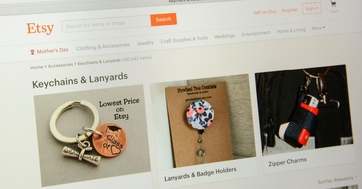
Etsy Test Links Titles Back To Search For Similar Competing Items
Etsy continues testing new ways to redirect buyers away from item pages to similar competing items, now turning the seller titles into clickable links diverting back to search.
Sellers are discussing the apparent test in the Etsy community.

We noticed that the first words in listings are now a link back to search...
this is on a browser.
whatever the first words of your title is, it's now clickable and brings the customer back to search.
I have the exact same thing and seeing it in other shops. On the orange App for buyers and the website online version. It’s taking buyers to other listings using my title when they click on it
When will etsy stop all this nonsense. They are doing everything they can to drive customers out of our stores. That part of the title is very important not only for etsy search but is indexed by google search, so letting it drive customers away is another stupid move by etsy.
Spending ad dollars here is a complete waste, well we've know this for quite some time, but more and more they prove this over and over again. Everyday it's something new, I can't even keep up with it any longer.
It's as if we have to hold on for dear life (by our fingernails) to keep buyers in our shops.
Etsy is just thowing more and more sh!t at the walls to see if it sticks.
Here's an idea....fix search and let us SELL and boom - profits for all.
Etsy is like a kitten on steroids with all these tests, ideas, moving pieces, changes, etc.
I know I am annoyed when I click on something and it takes me someplace unexpected. I can't imagine potential buyers being happy with this.
And, if something isn't good for sellers, how can it ultimately be good for Etsy? Another idea I really hope they reconsider and toss it.
So when you click on an item of interest, Etsy offers to redirect you back to where you came from or to somewhere else? Who dreams up this stuff to send our customers on a merry go round?!!
Other recent "tests" have added a blank image to listings with clickable related search terms and adding a "find similar items" button overlaid on images that uses images recognition technology to suggest visually similar items.

In addition to these changes that direct buyers to other listings, Etsy has also been testing Make An Offer, changing photo ratios to square, Local Shipping badge, and moving seller descriptions further down the page below reviews.
What do you think of these tests? Is Etsy going to far in diverting buyers to competiting listings? Let us know in the comments below!


