Mercari Tests Showing Buyer Fees On Item Pages To Avoid Cart Abandonment At Checkout
UPDATE 12-9-24
Mercari is finally backtracking on fee changes it made earlier this year, announcing new fee structure that splits fees between buyers and sellers will take effect January 6, 2025.
Mercari US is tweaking the item page design to provide buyer fee transparency before checkout as major strategy shift fails to deliver hoped for short-term GMV results.
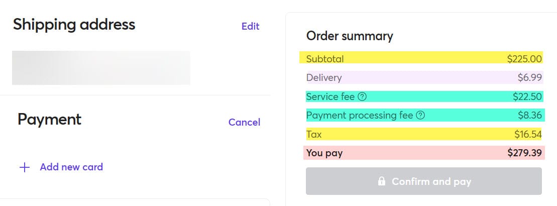
Since the marketplace dropped selling fees and instituted buying fees in March, consumers have experienced massive sticker shock at checkout with multiple additional fees tacked on, prompting unflattering comparisons to airline fees or worse yet - buying tickets from Ticketmaster!
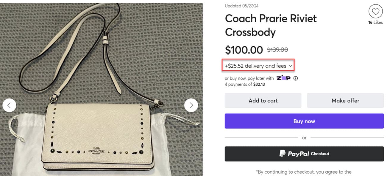
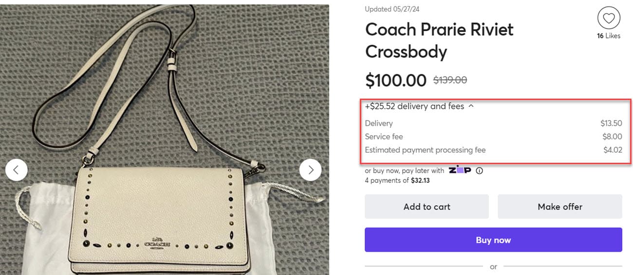
After months of public complaints and lagging buying activity, Mercari appears to be trying something new by testing out showing an estimated fee breakdown on the item page for users who are logged in to their accounts.
Here's what the buyer experience with the new fee structure looked like in March:
Item Page

Add To Cart

Buy Now (highlighting added for illustration purposes)

And here's the new design being tested in both desktop and app experiences:


Currently the estimates only show when logged in with a Mercari account, suggesting the fees being shown to buyers may be dynamically customized based on various criteria that depends on account specific information.
The move comes as Mercari US leadership desperately tries to buy its way into a GMV and active users bump as the end of quarter is fast approaching and pressure to show this new fee strategy is working mounts with Mercari US CEO John Lagerling shared the news of a ~45% reduction in US staff internally via Slack messages earlier this month.
Lagerling praised employes for "show[ing] up with talent, professionalism and grit during some tough times" but said"the business has not performed well amid macro headwinds and, admittedly, some strategic mistakes."
He went on to list some of those strategic mistakes, explaining that the company grew too quickly in the belief they would have continued growth from pandemic era highs that ultimately did not materialize and taking responsibility for not successfully navigating the post-pandemic landscape.
Lagerling also admitted what many have feared since March - the fee structure changes may have convinced sellers to list more items on the site, but have not had the hoped for impact on active buyers and GMV.
"More recently, changes to our fee structure have helped us increase listings, but have not yet delivered the short-term results that we had hoped for on the buyer / GMV side. To remain viable in the U.S. market and ultimately get back on track, we must cut costs and consolidate quickly."
Increased transparency and fee visibility is a good place to start, but honestly should have been built into the design from day one as a significant rise in abandoned carts was an entirely predictable outcome of springing extra fees on buyers during the checkout process - which should have been obvious to anyone with ecommerce UX and design or consumer behavioral analysis and businses strategy experience.
Will seeing the fees estimated upfront on the item page convince consumers to start buying again? Let us know what you think in the comments below!


