New eBay Promoted Display Ad Banner Placement Revives Complaints About Competing Ads On Listings
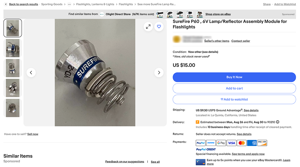
eBay appears to be testing a new placement for Promoted Display Cost Per Click Ads, stirring renewed seller complaints about competitor ads taking over view item page space and directing buyers way from their listings.
The new ad placement was reported earlier this week by some users, though it may be an A/B test or phased rollout as some users see it in one browser but not others and some users are not seeing it at all.

What the hell is with this new banner? There isn't even a space between the banner and the item so it's completely distracting and encroaching. Makes it harder to see the item you're looking at and reading the item title is difficult.
The spacing issue may have been a coding error only affecting some browsers but even when it was displayed with slightly more padding around the banner, sellers still questioned why a competitor's store was being promoted in such a prominent area directly above their item details.
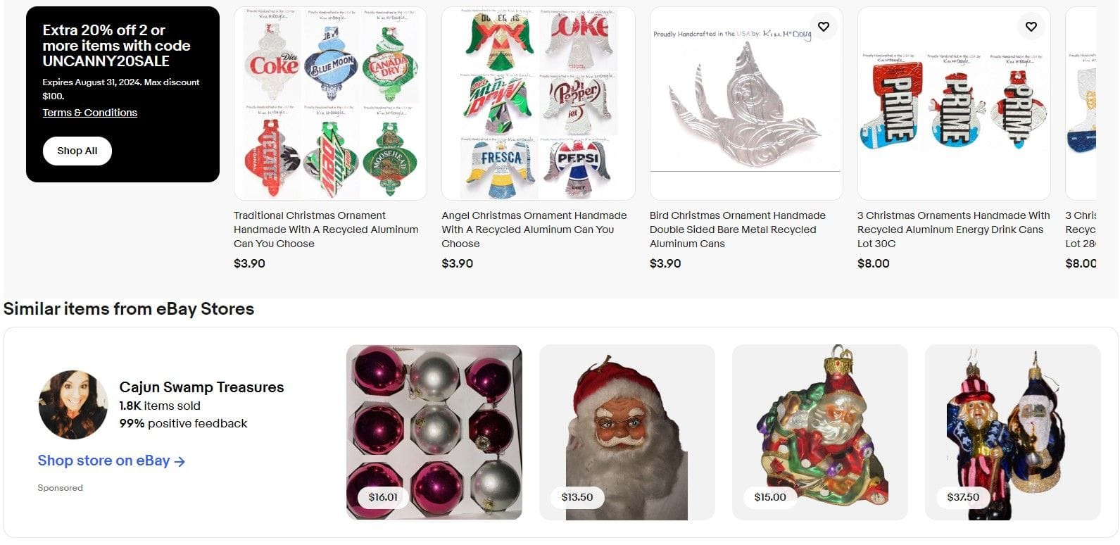
Previously, Promoted Display ads were typically shown in a larger ad module below the description and feedback modules - that larger ad is also still in place and as one seller points out, now the same competitor may have two placements on the page.
Yep, I can see the banner on my listings when using incognito with Firefox and Chrome, but not when signed in using the same browsers.
I agree with you regarding the placement of the banner. I do not like it. It looks like a crammed-in mess to me!
Also, the same seller is getting two placements on my listing.
eBay also recently expanded Promoted Display Ads to include the ability to advertise a coupon code, not just store pages.
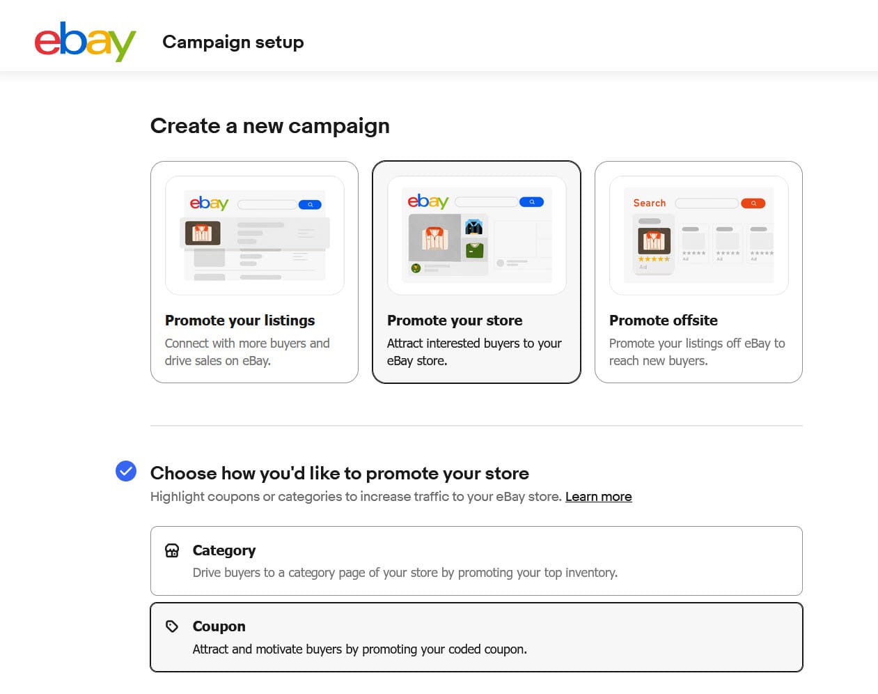
I've yet to see a Display Ad for a coupon in the wild, but as another seller points out, it could cause some serious confusion in this top of view item page placement.
If eBay started advertising other stores' coupons in that space, it could get really confusing which coupon is for the listing you're looking at and which is for the advertising competitor.
There is no space between the seller's promotion and the competing store ad.
Unfortunately, while putting these specific kinds of Display Ads in this area appears to be new, eBay has been putting other ads there for years, making this just another step in eBay's ad stuffing strategy to continue increasing Promoted Listings revenue.
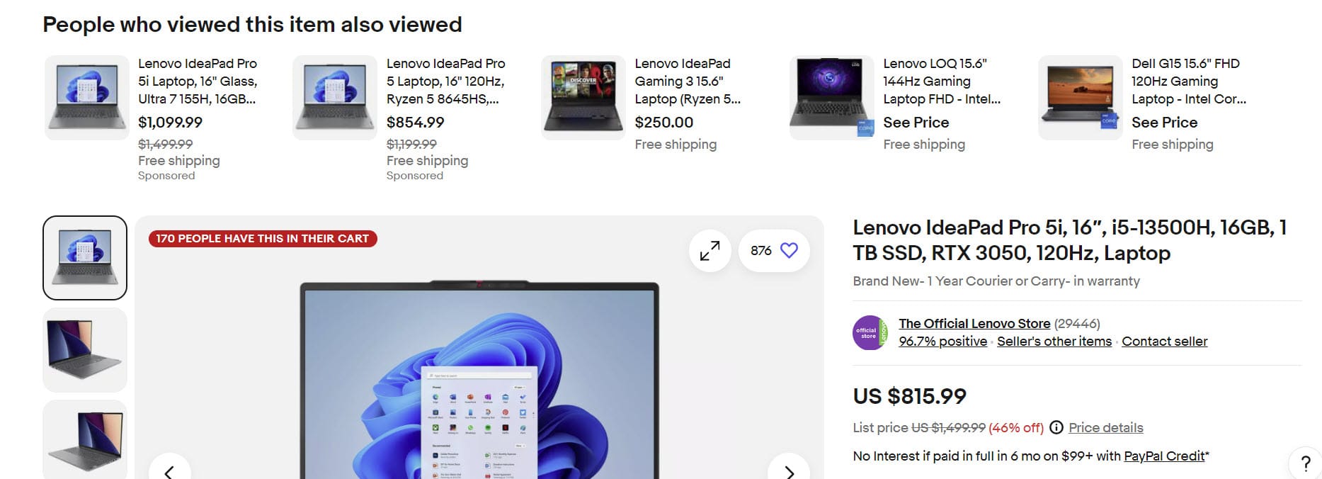
It's been over a year since eBay started redesigning the View Item Page, with the initial announcement specifically promising to "bring critical information like Item specifics and seller description higher up on the page before any modules that show other items & ads."
However, eBay has since backtracked on that promise, not including it in the finalized first phase of the redesign but still stringing sellers along by saying it may be in the next phase....which of course has no specific timeframe for testing and implementation.
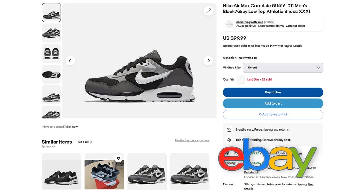
What do you think of eBay showing competitor Promoted Display Ad banners at the top of listing pages? Let us know in the comments below!

