Why Are eBay Store & Search Images So Small?
eBay sellers are once again asking "is it a glitch or test?" as store and search thumbnail image display shows large borders and small images.

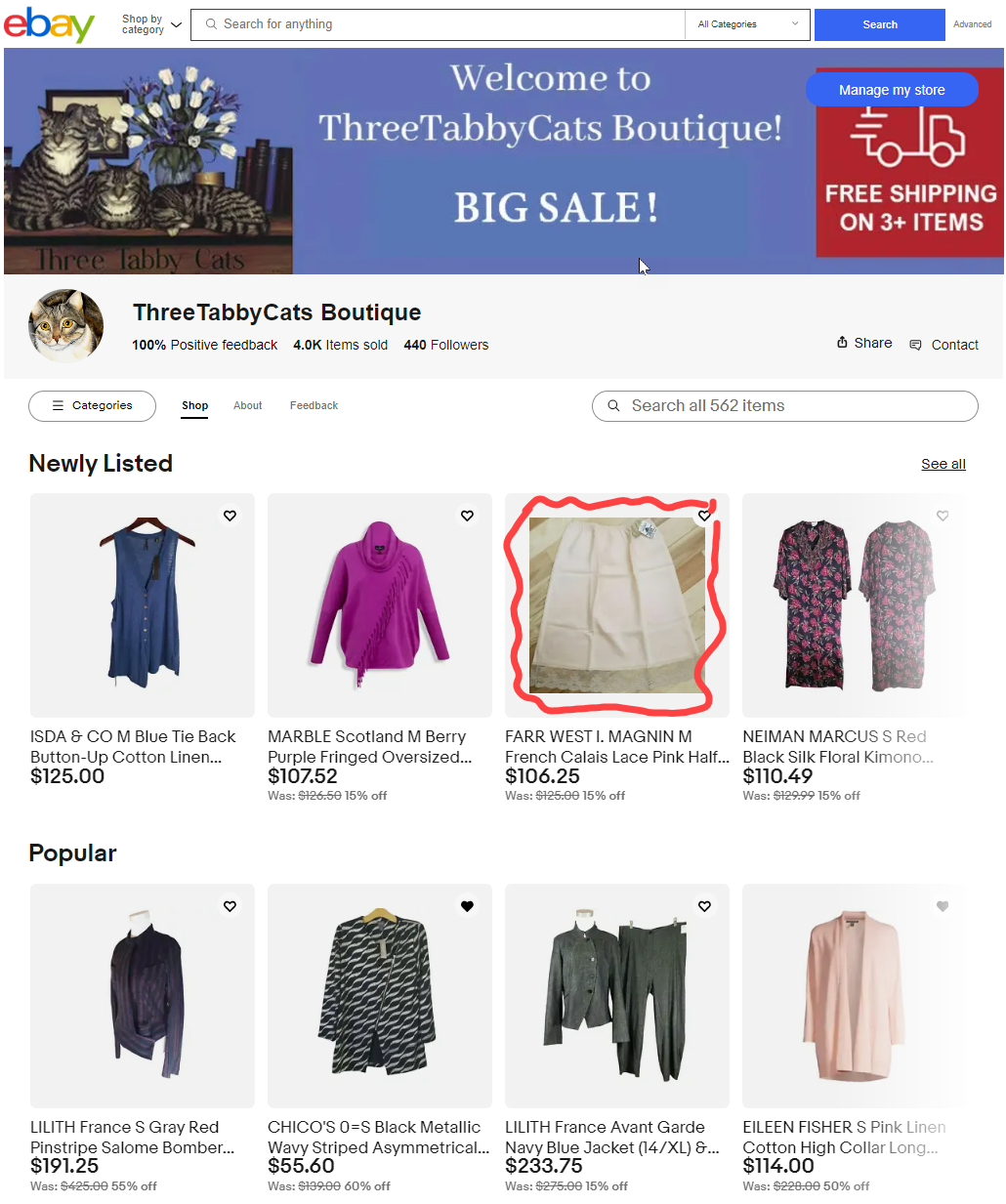
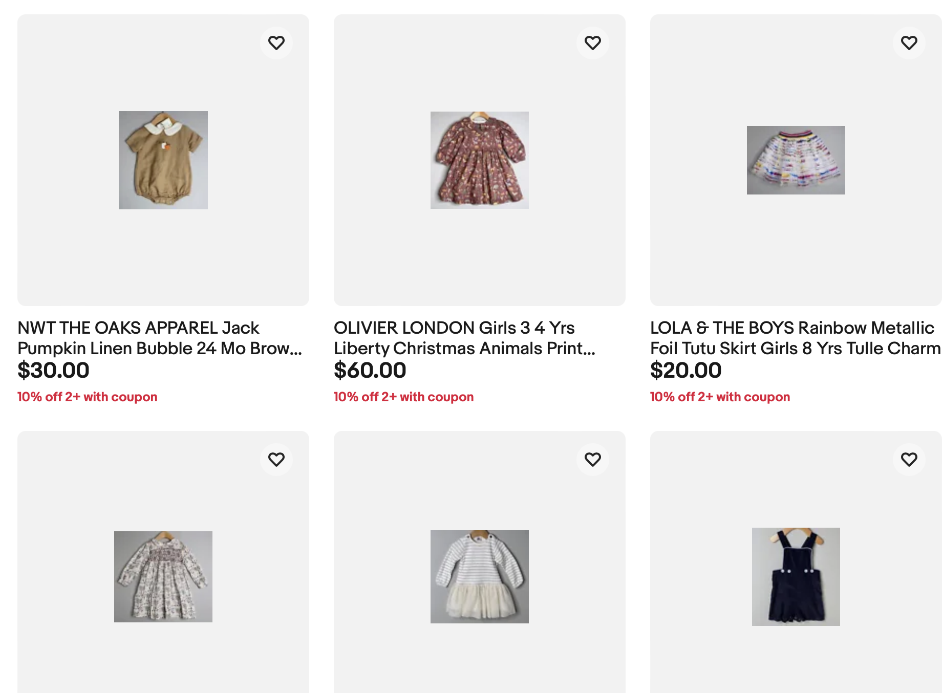
Why are "my store" images so small all of a sudden?

All of my images have an extra amount of padding or gray space around them when I look at them in my store. The product images I uploaded on eBay do not have this extra space! Why is eBay adding extra padding around the product? It's making the item hard to see details. My items look like they are floating in the far distance! See screenshot below.
Is anyone else seeing this on their listings? Does anyone know if eBay is aware of this issue? Thanks in advance for any insight you can provide.
Came here to ask maybe the same thing? Within the past week, all of my storefront images pictures went from normal size to thumbnail size. It doesn't look great!
Gosh, that's too bad; it doesn't look professional at all! No actual online store has images that small. It's giving me "internet in the early 2000s" vibes.
Same issue with all of my listing pics being displayed on my store page as very tiny images surrounded by gray. It started roughly 7-10 days ago and I believe it's technical issue.
Longtime eBay community member ShipScript shared some interesting details that tend to indicate this is an intentional design change, rather than a technical issue, noting a similar change was made to how images display in search results as well.

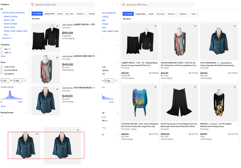
Search on the left, below, is in list view.
Search on the right, below, is in gallery view..
Gallery view does have extra padding in the picture holder, but the underlying image is the same size in both views (lower left).
However, if you change the width of your browser by dragging the edges inward, notice how that extra padding shrinks? eBay is employing a web technique to flex the content. So, the image holders shrink smoothly, as the number of tiles across decrease from 4 to 3 to 2, while the image remains the same size most of the way.
This is by design and is not a technical issue.
However, one could make the argument that the design itself is flawed. eBay could flex the images within the cells by providing a photo that matches the largest cell, and then shrinking the image as the cell gets smaller, rather than holding the image at one size and flexing only the outer cell. However, the page layout would be more complex, and perhaps they have found browser scenarios that render differently with that more complex coding.
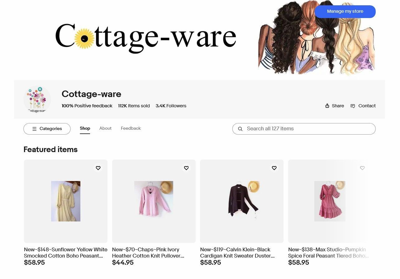
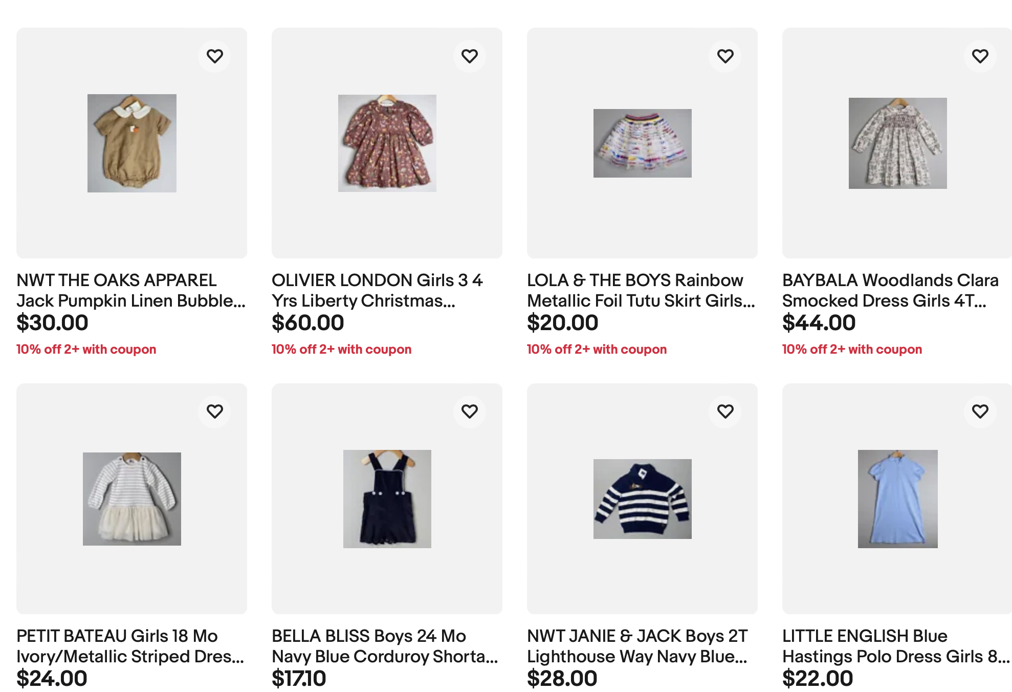
While that explanation does make sense, others gave examples that showed extremely large grey borders with tiny images in the middle, saying surely that can't be what eBay has intended for how this design is actually supposed display to buyers.
Same issue with all of my listing pics being displayed on my store page as very tiny images surrounded by gray. It started roughly 7-10 days ago and I believe it's technical issue.
Increasing/decreasing the page zoom doesn't make it look any better. The images stay relatively proportional, and the larger you make the print, the larger the pictures become. When it reaches the point where you could actually make out some details, it's too blurry to see much. Seems hard to believe that eBay wants it to look like this.
@community_team Is it possible to get confirmation as to whether this is technical issue vs. an actual change to storefront design?
I'm going to attach two screenshots here to make sure that I'm seeing what you're seeing - one of my normal four-tile view, and then what it looks like when I narrow the browser window to get only three tiles:
It doesn't really seem to me like the padding around the images is changing. Is this working how it is supposed to? The pictures themselves don't appear to increase in size, either.
A similar issue occurred back in April that was eventually acknowledged as a glitch and fixed.
eBay has been making other tweaks and changes to the Stores pages this week as well, including one that caused Featured Categories to randomly disappear from the Store view for some users.

As usual, eBay's lack of transparency and communication leaves sellers in the lurch, wondering if they need to make changes to adapt to a "new" design or if it's a technical problem they just need to wait for eBay to resolve - just like last week's "test or glitch" game involving Item Specifics.

This kind of testing and tweaking, and the unintended technical issues that often result, or incredibly frustrating and disruptive to sellers, especially as we head into the all important Q4 holiday shopping season.
On Day 3 of eBay Open, Senior Director Trust, David Newman said eBay has four key trust points they are focused on for the seller experience:
- eBay does not disrupt my business
- When I sell something, I will get paid
- eBay protects me from bad actors and the latest scams and threats
- eBay has my back and treats me fairly and transparently when issues arise
Those are all great sentiments to have as a goal, but eBay still has a long way to go toward making them a reality.
If eBay is serious about winning seller trust, the endless testing, tweaking and technical issues with zero transparency cannot continue.
Are your eBay Store and search images being impacted by this design change? Let us know in the comments below!

